
You can inject color without painting a wall by swapping in bold props, reimagined accessories, and colorful storage that instantly shift mood. Use lightweight, movable items like lamps, throws, and vases to cue color psychology, then layer textures for depth. Upcycle quirky finds into statement pieces and mix patterns with cohesive palettes. Add vibrant textiles and programmable lighting to wash rooms with hue, and seasonally swap accents to maintain energy. If you keep exploring, you’ll uncover even more vibrant strategies.
Key Takeaways
- Use props and accessories (bold lamps, throws, vases) to create instant color shifts without permanence.
- Upcycle or repurpose vintage items as focal points and storytelling elements with cohesive palettes.
- Incorporate textiles and lighting (bold fabrics, layered LEDs) to quickly alter mood and hue perception.
- Leverage nature and seasonality (plants, seasonal swaps) to subtly influence color and ambiance.
- Apply strategic grouping and arrangement (color coordination, modules) to guide mood and visual impact.
Why Color Props Beat Paint in Everyday Decor
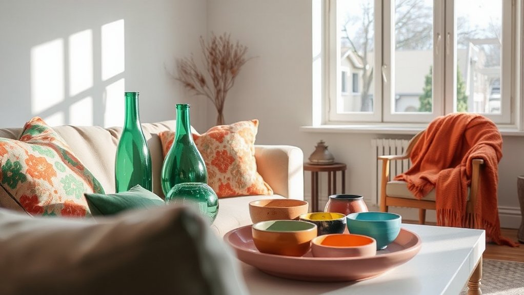
Color props have a speed and versatility that paint often lacks. You’ll notice instant impact: you can swap a bold lamp, a patterned throw, or a sculptural vase to shift mood without prep or permanence.
Color psychology guides choices, letting you align hues with feelings you want in a room. You reflect on how prop colors cue energy—warm tones energize, cool tones calm—and how contrasts direct attention to focal points.
Props offer texture, form, and scale that paint can’t guarantee, enriching space without slipping into overkill. You leverage repetition and rhythm by repeating a color family across objects, creating cohesion.
Color psychology appears again in how props keep your decor fresh, flexible, and truly personal.
Upcycling Color: Turning Junk Into Statements
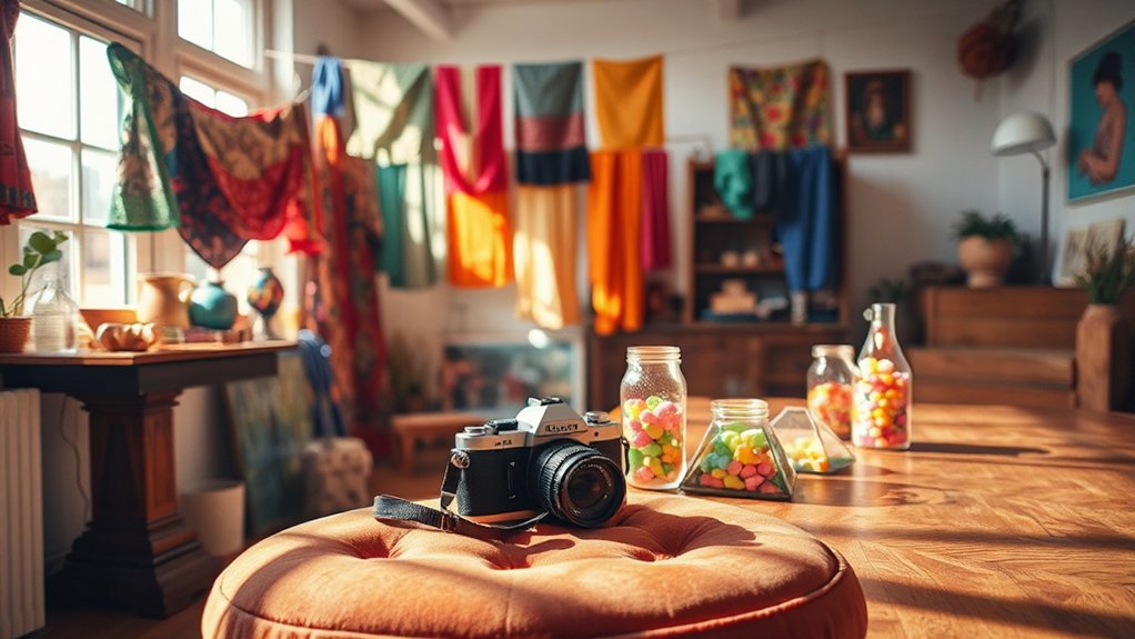
In upcycling color, you turn what others discard into bold statements that refresh a room without buying new. You transform everyday detritus into curated focal points, letting texture, patina, and color do the talking.
Start with vintage furniture as your canvas: a chipped cabinet becomes a gallery of character, its imperfections earning respect rather than excuses. Layer in artistic signage that hints at whimsy or history, using typography and hues to steer attention.
The magic lies in restraint: select pieces that harmonize rather than clash, so the overall palette remains cohesive. Treat each object as a dialogue starter—not merely decoration, but a narrative cue.
Bold Fabrics for Instant Hue
Bold fabrics offer an instant hue, turning rooms from bland to bold with minimal effort. Think bold patterns, plush textiles, and bright vibes that immediately shift the mood.
You’ll feel the impact fast, with striking visuals that stay polished and purposeful.
Bold Patterns, Instant Hue
Even a single bold pattern can transform a room, delivering instant hue without a drop of paint. You harness contrast and rhythm, letting the pattern do the talking while you guide perception through color psychology.
In bold patterns, you create focal points that energize spaces without abandoning cohesion, especially when you reference monochrome schemes to temper impact.
- Choose a dominant pattern with clear repeat and scale to anchor the room.
- Pair the bold print with subtle backgrounds to maintain balance and focus.
- Use color psychology cues—temper with neutrals to avoid overwhelm.
- Create a cohesive gallery by repeating small accents across textiles, walls, and accessories.
Plush Textiles, Bright Vibe
Textiles with plush textures instantly inject warmth and personality into a space, because tactile richness signals comfort and luxury without a paintbrush. You’ll notice how plush textiles transform atmosphere with minimal effort: a velvet pillow, a shearling throw, or chenille upholstery can shift mood from clinical to cozy in seconds.
The key is contrast and balance—pair soft surfaces with streamlined shapes to avoid overwhelm and preserve clarity. A single statement piece creates a bright vibe, while complementary curtains or a rug anchor the look. Choose colors that echo nearby accents to maintain cohesion, not clash.
With deliberate placement, you’ll experience tangible depth and significance, rendering rooms more inviting without bulk. Plush textiles offer instant impact, delivering texture-driven color without traditional hue changes.
Lighting Tricks That Drench Rooms in Color
Ever wonder how light can flood a space with color without a single painted surface? You’ll tap into Color psychology and deliberate lighting design to choreograph mood, depth, and focus.
1) Choose programmable LEDs that shift hue with time, aligning color shifts to activities.
2) Layer light sources—ambient, task, and accent—to wash walls with complementary tones.
3) Use warm vs. cool contrasts to sculpt perceived space, avoiding noise.
4) Dim strategically; reduce intensity to let color saturate without glare.
This approach respects restraint while delivering impact, letting color feel intentional, not accidental.
Reimagined Accessories: Color You Already Own
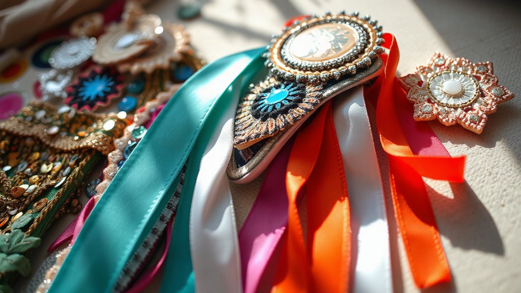
Color doesn’t have to come from new purchases; you can reshape what you have to sculpt mood and cohesion. Reimagined accessories prove that restrained changes beat cluttered buys. Start with what already sits in your space: a scarf, belt, or vase can become a color cue, not just a prop.
Consider color psychology: warm tones evoke intimacy, cool hues calm focus, and saturated accents energize a paneled corner or console. Your accessory versatility shines when you mix textures and finishes—matte beads with gloss metals, or cotton with silk—to alter perception without repainting.
Replace a single throw pillow to shift a scheme, or group statements to guide the eye. With intention, you create harmony, depth, and personality, using what you own to craft a deliberate, color-rich environment.
No-Paint Accent Walls: Wallpaper, Decals, and Panels
You’ll explore how wallpaper options, decals, and panels can transform a space without paint, offering texture, pattern, and personality in one swap.
Consider how bold wallpapers or subtle decals set a mood, while panels can add depth and architectural interest with minimal commitment.
Let’s compare practicality, maintenance, and cost to determine which no-paint option best aligns with your room’s scale and light.
Wallpaper Options Unveiled
Wallpaper offers a quick, striking way to transform a space without committing to paint, with options that range from bold patterns to subtle textures. You’ll feel the impact immediately, yet the change remains flexible as trends shift.
- Bold prints can energize a room, aligning with color psychology to influence mood and activity.
- Subtle textures add depth without overpowering, echoing historical color trends that favor timeless elegance.
- Peel-and-stick options simplify swaps, letting you experiment without commitment.
- Custom wallpapers offer tailored palettes that reflect your space’s lighting and function.
This approach balances style and practicality, delivering dramatic effect while preserving resale versatility and easy refresh.
Decals And Panels Ideas
Decals and panels offer quick, reversible ways to define zones, add texture, and echo your room’s style without a drop of paint. You explore decals for focal accents that shift with mood and lighting, guided by color psychology to stimulate calm or energy. Choose bold graphic decals for a playful dash, or muted geometric shapes for subtle structure.
When planning, consider decal installation specifics: surface prep, adhesive type, and ventilation to guarantee clean removal later. Panels deliver tactile rhythm—slat, 3D, or hinged options that transform ceilings and walls without committing to permanence.
Use panels to cradle shelving or create intimate alcoves, aligning texture with existing finishes. Pair with contrasting trim to sharpen edges and balance color. Always test samples, measure carefully, and enjoy the reversible, expressive versatility.
Kitchen Color Play WITHOUT a Brush
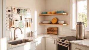
If you’re chasing color without committing to paint, you can transform a kitchen’s vibe in minutes by embracing texture, fixtures, and subtle contrasts that don’t require a brush. You’ll leverage color psychology and paint alternatives to shape mood with intent, not effort.
- Layer textures with woven textiles, countertop mats, and tactile backsplashes to cue warmth or freshness.
- Swap hardware and lighting finishes to signal contrast and focus points without altering walls.
- Introduce vibrant, climate-appropriate accessories—utensil jars, bar stools, and fruit bowls—for instant energy.
- Use erasable, colored glassware or ceramic wares to quietly shift tone during the day.
This approach keeps lines clean, outcomes intentional, and the kitchen’s personality readable at a glance.
Seasonal Swaps: Budget-Friendly Hue Refreshes
Seasonal swaps let you refresh hue without a full makeover, keeping costs low while you lean into the mood of the moment. You don’t need a major remodel to align your space with current vibes; small, intentional shifts make a big impact.
Begin with accent pieces—throw pillows, vases, or a rug in a seasonal shade—to pivot the room’s energy without overwhelming it. Lean on color psychology to guide choices: warmer tones invite coziness in autumn, cooler hues foster calm in spring, and vibrant accents spark energy in summer.
Observe seasonal color trends and calibrate your selections to your taste, not trends alone. Keep balance by repeating a unifying color through textiles and key furniture.
Subtle, purposeful swaps yield fresh atmosphere, not clutter.
Digital Color Magic: Rugs, Curtains, and Cushions
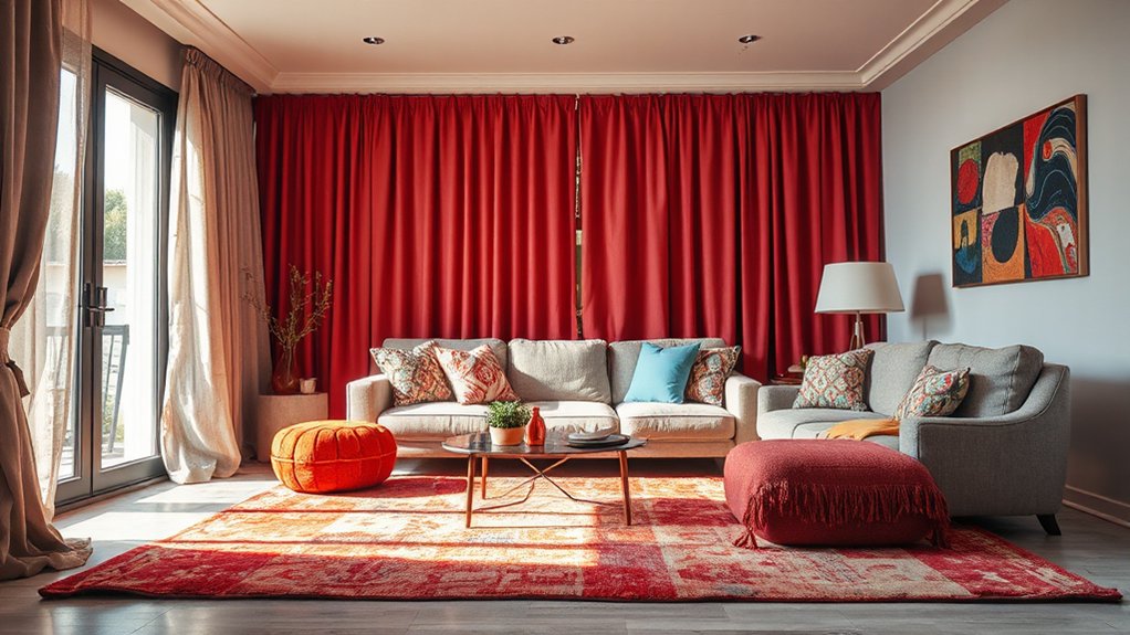
Rugs, curtains, and cushions are your fast-track to a cohesive color story, because textiles absorb and radiate hue more intimately than walls or large furniture. You’ll leverage texture, pattern, and scale to nudge ambiance, not overwhelm it, while color psychology guides your choices.
Vintage textiles offer depth and character, grounding modern spaces in memory and nuance. Use them as focal accents or harmonizing threads, then refine with neutral backdrops to preserve balance.
- Mix vintage textiles with contemporary pieces to blend eras.
- Pair cushions in varying saturations for depth without noise.
- Let curtains frame light, shifting mood across the day.
- Refer to Color psychology to tune intensity by room use.
This approach keeps pockets of color intentional, crisp, and timeless.
Nature’s Palette: Indoor Plants for Subtle Color
You’ll discover how subtle plant hues can shift a room’s mood without overpowering it.
By choosing verdant color creations and careful placements, you create quiet moments of color that feel natural.
These restrained choices let your space breathe while hinting at nature’s palette.
Subtle Plant Hues
Ever wondered how to introduce soft, reliable color into a room without painting a thing? You’ll lean on Subtle Plant Hues to shape mood with quiet confidence. By choosing leaves and stems with gentle tones, you cue Color psychology without shouting.
You’ll pair foliage that echoes wall tones, or just adds a whisper of contrast, guiding the eye with restraint. Your plant care becomes a daily practice of balance, light, and hydration, reinforcing calm rather than clutter.
Small texture shifts—matte pots, airy planters—amplify subtle color without dominance. The result is a refined, livable space that feels thoughtful, not staged.
- Select foliage in soft greens and muted blues to temper bold furniture.
- Use clay or matte pots to mellow color impressions.
- Rotate plants seasonally for evolving ambience.
- Track light and water to protect color integrity.
Verdant Color Creations
Choose foliage with varied leaf tones—moss greens, olive tints, and slate highlights—that shift under light, creating quiet drama without shouting.
Pair plants with vintage textiles to echo underlying warmth while keeping walls uncluttered; a muted runner or a softly patterned throw can pull the palette together without overpowering it.
Integrate artistic sculptures as focal points that cast subtle shadows, enhancing depth and mood.
Maintain balance by rotating specimens seasonally, preserving cohesion while inviting fresh texture and color currents into your spaces.
Colorful Storage: Bins, Boxes, and Baskets
Colorful storage instantly brightens a space, and bins, boxes, and baskets offer practical, decorative options without painting a single surface. You’ll see how color reinforces order, guiding daily use and reducing clutter through intentional placement and accessibility.
Color psychology enters as you pair hues with function: soft tones calm, vibrant shades energize, and neutral bases stabilize combinations, all while storage organization remains efficient. By choosing containers with clear fronts or labeled interiors, you enhance quick retrieval and maintain visual harmony.
Use contrasting lids or coordinated palettes to create focal points without overwhelming the room. Your approach should be deliberate: consistent sizing, thoughtful grouping, and accessible stacking. This elevates both mood and usability, proving storage can be stylish and purposeful.
- Pick a unified color family for core bins
- Use accent lids to signal hierarchy
- Label fronts for quick retrieval
- Group by function and frequency of use
Artful Arrangements: Grouping for Maximum Hue
Building on the idea that color guides daily use, artful grouping sharpens impact by deliberately pairing hues with function. You arrange objects and spaces so that each cluster communicates purpose at a glance, avoiding random splashes of tone.
Color mixing becomes a deliberate tool: place complementary pairs to sharpen attention, or stack analogous hues to create calm continuity. Think in modules—each grouping forms a mini palette that supports activity, not distraction.
When you group by monochrome schemes, you elevate texture and form, letting light, shadow, and material take center stage. You don’t chase novelty; you curate consistency that feels intentional.
The result is intuitive harmony, where color guides behavior and elevates both utility and mood without extra effort.
Quick-Start Weekend Roadmap: Implement These Hacks Now
If you want results this weekend, start with a focused, low-friction plan that translates color strategy into immediate actions. You’ll implement a quick-start mindset by pairing color psychology with concrete steps, prioritizing perceptual impact over perfection.
This roadmap delivers rapid wins while reinforcing color symbolism across everyday decisions.
- Identify a single hue family for your space or project and map it to moods you want to evoke.
- Swap one accessory per room or page for a contrasting accent that reinforces the chosen color narrative.
- Create a quick-brand or room-rule sheet listing dos and don’ts grounded in color psychology.
- Test small, iterative tweaks and document reactions to refine symbolism and cohesion.
Frequently Asked Questions
Can Color Hacks Affect Room Acoustics Without Painting?
Color hacks can affect room acoustics indirectly through materials and arranging items, you know. Color psychology influences perceived space, while acoustic impact comes from soft furnishings and texture choices, not paint, shaping sound absorption and mood.
Are Color Props Safe for Households With Kids or Pets?
Initially, yes, color props can be safe when you choose non toxic materials and child proof options. You’ll make mindful selections, avoid small choking risks, and keep routines calm while still adding vibrant mood without harmful tradeoffs.
Do These Methods Work in Small or Rented Spaces?
Yes, these methods work in small or rented spaces. You’ll rely on temporary decor and portable solutions, swapping them out as needed without tape or nails, keeping walls pristine while you personalize the space.
Which Color Schemes Avoid Overwhelming a Room?
Color schemes that avoid overwhelming a room rely on color psychology: choose soft neutrals with muted accents and ample white space to maintain visual harmony, avoiding high-contrast pairings. You’ll create calm, balanced spaces you intuitively sense as harmonious.
How Long Do Color-Change Effects Typically Last?
Color fade typically lasts from minutes to hours, depending on method and exposure, though effect longevity can extend with controlled use. You’ll notice Seasoned contrasts fleeting, while deeper hues linger; you’ll smartly manage light to sustain Color fade over time.
Conclusion
You are the captain of a ship named Everyday, steering through rooms that crave color but dislike mess. Each hack becomes a compass—colorful props, fabrics, light, and storage—guiding you toward brighter shores without a brushstroke wasted. Like a lighthouse’s glow, these choices don’t repaint your hull; they reveal it. Embrace the voyage: let repurposed bits and thoughtful arrangement chart emotion, and your home will radiate confidence, texture, and warmth—without lifting a paintbrush.