

To hang a gallery wall like a pro, start by evaluating your wall space and the art you’ll display, then choose a cohesive frame mix and a layout—grid, salon, or freeform—that fits your room. Plan a color rhythm across pieces, balance scales, and use consistent spacing. Light strategically to highlight focal works, and layer textures for depth. Rotate and refresh with simple, repeatable methods, avoiding common missteps. Keep a cohesive rhythm, and great walls follow. If you keep going, you’ll learn more.
Key Takeaways
- Plan the wall: map space, ceiling height, and create a rough layout before hanging for cohesion and flow.
- Choose a layout style (grid, salon, or freeform) and mock up on the floor to refine spacing and alignment.
- Establish a color rhythm: start with a dominant hue, test 3–4 hues, and vary saturation for cohesion.
- Use consistent framing and hanging methods: same matting, level lines, and repeatable hardware for balance.
- Lighting and accents: employ adjustable lighting and layered details (matte frames, trims) to highlight focal pieces.
Why a Gallery Wall Transforms Your Space

A gallery wall instantly adds character and cohesion to a room by turning disparate pieces into a curated, intentional display. You gain a focal point that guides flow, balances scale, and unifies colors and textures you already own.
When you assemble thoughtful groupings, you create narrative, mood, and rhythm that elevate everyday spaces. The effect isn’t just aesthetic; it signals care and curation, making guests feel considered and welcome.
To sustain impact, you treat each piece with purpose: vary shapes, align margins, and respect negative space. Focus on Art preservation by selecting durable frames and stable hanging methods to protect your collection.
Pair strategy with gallery lighting to highlight texture and detail, ensuring every item reads clearly without glare or harsh shadows. Your wall becomes a practical, enduring statement.
Assess Your Wall Space and Artwork Inventory
Start by mapping what you have and what you need. You’ll perform a precise wall assessment and build a clear artwork inventory to guide placement, scale, and balance. This keeps the process efficient and prevents mismatches.
- Measure each wall area and note ceiling height to determine hanging options.
- List every artwork you own, including size, weight, and framing, then flag pieces that need resizing or reframing.
- Prioritize by visibility and theme, creating a rough layout plan that pairs works with spaces.
Use the inventory to prevent duplicates and to spot gaps. A thorough wall assessment and artwork inventory streamlines decisions, reduces trial-and-error, and yields a cohesive gallery wall strategy from the start.
Choose a Frame Mix That Feels Cohesive for Your Gallery Wall
If you want a cohesive gallery, mix frames thoughtfully instead of random selection. Start with a unified backbone: choose one or two frame styles that feel like “the core,” such as a slim black wood or a natural light-toned frame.
Then layer depth with complementary accents—think a third frame that echoes texture or color without overpowering the main set. Aim for balance in scale: mix larger and smaller frames, but keep the surrounding matting consistent to preserve rhythm.
Color coordination matters: align frame finishes with key colors in your art or wall surfaces to avoid clashes. Use a subtle rule of thirds approach to placement, letting occasional bold pieces breathe.
This strategy delivers cohesion without monotony.
Create a Color Rhythm Across Your Gallery Wall
Color cadence helps you guide the eye across the wall, using color blocks and shifts to create a rhythm you can read at a glance.
Start with hue harmony rules to anchor the palette, then vary saturation and value to keep the eye moving without shouting.
Use deliberate repetition and contrast to reinforce a cohesive flow that feels intentional, not random.
Color Cadence Techniques
A color cadence guides the eye across a gallery wall by balancing hue, value, and saturation so the sequence feels intentional rather than random. You craft rhythm with technique, not luck, using color psychology to predict reactions and mood shifts.
Implement patterns that glide between tones, then land on complementary schemes to reinforce contrast without jarring shifts.
- Identify a dominant hue and map its light, medium, and dark values.
- Pair adjacent pieces with accent colors drawn from the opposite side of the wheel for subtle tension.
- Place high-saturation pieces at focal points, easing into muted pieces for cohesion.
Hue Harmony Rules
Hue harmony is the backbone of a cohesive gallery wall. You’ll create a visual rhythm by pairing pieces with a deliberate color strategy, not by chance.
Begin with palette selection: choose a dominant color family and two supporting accents, keeping shadows and highlights in balance. Consider color psychology to evoke the desired mood—calm blues for serenity, warm ochres for vitality, or monochrome for sophistication.
Limit your palette to three or four distinct hues to prevent clutter; vary saturation, not tone, to maintain cohesion. Test alignments on the wall before committing, and guarantee frames echo main colors for unity.
Use contrast strategically to highlight focal works, then let negative space breathe. Finally, document choices for consistent future rotations.
Plan Your Gallery Wall Layout: Grid, Salon, or Freeform
Decide how to arrange your gallery wall by choosing a layout that matches your space and style: grid for clean, formal lines; salon for a curated, cohesive look; or freeform for an eclectic, spontaneous vibe. Plan with purpose: consider color blocking and frame layering to add depth and visual interest without clutter.
- Grid approach: align frames by level, use uniform frame sizes, and repeat colors for cohesion.
- Salon method: mix sizes and orientations, group related subjects, and blend tones to guide the eye.
- Freeform route: place on-the-wall as you go, balance negative space, and let varied frames create rhythm.
Keep tests simple: mock layout on the floor, photograph, and adjust before committing.
Measure Height and Spacing for a Balanced Gallery Wall
To balance a gallery wall, start with height and spacing that feel natural for your space. You’ll use wall measurement as your baseline, then confirm it with paper templates or painter’s tape.
Aim for the center of each piece to align around eye level, typically 58–60 inches from the floor, but adjust for furniture or seating.
Establish a consistent vertical spacing—usually 2–3 inches between frames—to keep the group cohesive. For larger works, increase gaps slightly to preserve visual rhythm; for smaller pieces, reduce gaps to avoid a busy look.
Document spacing guidelines and repeat them across the whole layout, so your wall reads as a unified collection.
Finally, step back and assess from multiple angles to ensure balance.
Hanging Methods That Save Time and Stress
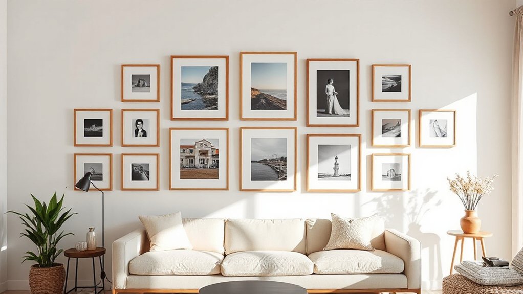
You can save time and reduce stress by using simple, repeatable hanging methods that align with your established grid. These techniques emphasize efficiency, accuracy, and clean results, so you stay on track without reworking spaces.
- Prep first, then measure: set up a dedicated workspace, verify wall conditions, and choose your hanging tools before you start.
- Use a consistent system: mark centerlines, apply level lines, and keep hardware aligned with the grid to avoid guesswork.
- Dry-fit and adjust: lay pieces, review spacing, and only drill once you’re confident.
Key concepts: hanging tools simplify mounting, and wall preparation ensures studs, anchors, and paint are ready for secure, neat displays.
DIY Hanger Hacks for a Sturdy Gallery Wall
When you’re building a sturdy gallery wall, practical hanger hacks save time and prevent sagging or misaligned frames. Start with a level layout using painter’s tape as a guide, then secure the key points with reliable fasteners.
Velcro strips offer a quick, low-profile hold for light frames, while adhesive hooks handle heavier pieces without drilling. Pair Velcro with a spacer to maintain even gaps and reduce edge sag.
For mixed weights, distribute load with two hooks per frame and use cord or picture wire for stability. Check weight ratings on every product and avoid overloading.
Space frames at 1 to 2 inches apart, and test each piece before finalizing. Reassess after decorating to guarantee continued balance and alignment.
Elevate Your Gallery Wall With Lighting and Accents
Lighting and thoughtful accents instantly elevate a gallery wall by tying pieces together and guiding the eye. You can harness lighting accessories and accent decor to create depth, emphasis, and flow without clutter.
- Choose adjustable lighting to spotlight focal pieces and cast flattering shadows across textures.
- Layer accents—matte frames, metallic trims, and cohesive color cues—to unify diverse works.
- Map lighting and decor to a deliberate rhythm, aligning heights and spacing for a balanced narrative.
This approach keeps the display cohesive, not chaotic, and guarantees each artwork earns its place. Use a simple, consistent palette for both lighting and accents, so the eye moves smoothly from piece to piece.
You’ll achieve a polished look that feels intentional and gallery-ready.
Displaying Mixed Media on Your Gallery Wall
Mixed media demands thoughtful planning: pair textures, materials, and surfaces in a way that reads as one cohesive story rather than a hodgepodge. You’ll want to deliberate on weight, scale, and rhythm so each piece supports the next.
Begin with a strong anchor—perhaps a bold, flat element—and build with contrasting textures to create depth without clutter. Prioritize art layering: stack light, airy pieces above heavier, tactile ones, and use nonmade-up gaps to establish breathing room.
Use mats, frames, or spacers to preserve separation where needed, ensuring no surface competes for attention. Consistency in color or tonal range helps unify disparate media.
Test placement on the wall before committing; adjust until the arrangement feels intentional, balanced, and easy to navigate for viewers.
Rotating and Updating Your Gallery Wall Without Drama
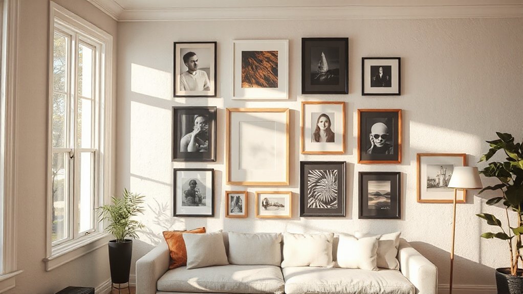
1) Schedule regular checks for balance, spacing, and frame condition to guide artwork rotation tips.
2) Use a consistent display method—same matting, same hanger height, same frame style—to ease maintenance and maintain flow.
3) Catalogue each piece digitally, noting title, date, and rotation date to support ongoing gallery wall maintenance.
You’ll maintain cohesion while invigorating your space. When you rotate, swap out one or two focal works first, then fill gaps with smaller pieces. This method minimizes disruption and preserves the gallery’s energy and rhythm.
Common Mistakes to Avoid on a Gallery Wall (And Quick Fixes)
Avoid common gallery-wall missteps by prioritizing balance, proportion, and consistency. Small mistakes can disrupt flow, but quick fixes keep the display cohesive.
You’ll avoid clutter by choosing a simple grid or salon-style layout that respects the wall’s scale. If art feels off, reassess spacing first—aim for even gaps between pieces and from edges.
Beware mismatched frames; unify with a cohesive frame selection or unify mats to anchor the collection. When mounting, confirm level alignment and wall anchors appropriate to weight.
For art placement, place the most dominant piece at eye level, then build around it. Quick fixes include swapping a frame for a near-match, adjusting spacing, and using temporary templates to test layout before committing.
Keep proportions consistent for a polished, intentional gallery.
Quick Start Guide: From Blank Wall to Gallery-Worthy
Start with a clear plan: measure the wall, choose a layout, and gather a cohesive set of pieces. You’ll map spacing, then pick art styles that balance contrast and harmony with your room’s wall textures. Keep the goal in sight: a gallery-worthy display that feels intentional, not random.
- Determine core piece first, then build around it for rhythm.
- Group by theme or color to create cohesion, not repetition.
- Recheck height and alignment at eye level, adjusting for fixture differences.
With measurements in hand, you’ll transfer your plan to the wall, using mock templates to test spacing. This approach minimizes holes and preserves texture.
Art styles converge, wall textures invite depth, and your wall becomes a confident, curated statement rather than a collection.
Frequently Asked Questions
How Do I Hang Art Without Nails on Rental Walls?
You can hang art without nails by using temporary adhesive and wall hooks, ensuring weight limits are respected. Clean surfaces first, apply hooks firmly, and use staggered placement for balance—adjust as needed without damaging rental walls.
What Spacing Looks Best for Small Galleries?
Spacing for small galleries: aim for 2–3 inches between pieces and vary heights for a dynamic grid. Use gallery spacing that feels cohesive, and plan art arrangement before hanging to keep visuals balanced and unobtrusive.
Can I Mix Frame Materials Without Clash?
Yes, you can mix frame materials without clash. Aim for Frame coordination by choosing a unifying element (color, profile width) and use deliberate Material contrast (metal with wood accents) to create intentional variety, not visual noise.
How Many Pieces Should I Start With?
Start with 3–5 pieces, then adjust as you assess balance. Use gallery lighting to highlight focal art, and plan art arrangement so spacing feels cohesive, eye-level, and intentional before finalizing.
What Safety Steps Protect Fragile Pieces?
Did you know 70% of damage happens during handling? You protect fragile pieces by using protective padding and maintaining climate control; handle gently, support corners, avoid quick temperature shifts, and pack securely for transport and installation.
Conclusion
You’ve got the framework to transform any blank wall into a curated moment. Start by sizing, then choose a cohesive frame mix and a unifying color rhythm. Plan your layout—grid, salon, or freeform—and mix media with confidence. Update with intention, swapping pieces as your taste evolves, not your mood. Remember: “practice makes progress.” With deliberate placement and steady rotation, your gallery wall stays fresh, grounded, and effortlessly stylish.