
In 2025, you’ll avoid outdated wall paint trends by embracing softer palettes, layered textures, and durable, matte or satin finishes that age gracefully in natural light. Skip oversaturated hues and harsh high contrasts, which clutter spaces and fatigue the eye. Move away from glossy coatings and flat monochromes; opt for depth with layered neutrals and gentle gradations. Focus on longevity, performance metrics, and cohesive color stories. If you keep exploring, you’ll uncover practical, lasting approaches for polished walls.
Key Takeaways
- Avoid oversaturated palettes and clutter; limit dominant hues to one or two and use lighter trims to maintain flow.
- Ditch glossy, high-sheen finishes in favor of satin or matte for durability and timelessness.
- Move away from flat monochrome neutrals; add depth with layered hues and varied textures.
- Minimize harsh high-contrast or sharp color transitions; opt for soft, related tones and gentle gradients.
- Beware static, single-color rooms; incorporate subtle contrasts and layered colors to adapt to changing light.
Adopt Softer Palettes in 2025: Key Principles to Try
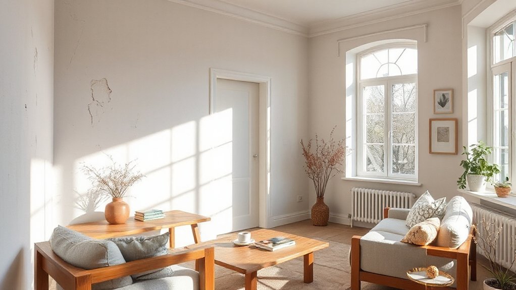
Soft palettes are back, and 2025 is the year to lean into them with intention. You’ll optimize spaces by choosing soft palettes that calm rooms while supporting activity zones. Begin with a restrained base—warm neutrals or cool grays—and layer with subtle accent notes to preserve flow.
Prioritize color psychology: softer tones reduce cognitive load, enhance focus, and invite slower, more intentional use of each area. Test hue relationships at scale, not on swatches alone, and monitor daylight to ensure stability across hours. Limit saturation to preserve perceived spaciousness and avoid visual fatigue.
Pair gentle hues with natural textures to amplify tactility without shouting. In practice, document rationale, measure impact, and iterate for coherence across architecture, furniture, and lighting.
Common Pitfalls: Oversaturated Hues That Clutter Rooms
Oversaturated hues pull focus and create visual noise, undermining the calm, cohesive spaces soft palettes aim to sustain. When you lean into too many bold colors at once, color psychology shifts from soothing to chaotic, making rooms feel smaller and more fragmented.
The pitfall isn’t coverage—it’s intent; you’re signaling distraction instead of flow. To avoid clutter, limit dominant tones to one or two hues and test how they breathe with neutrals.
Consider how paint application affects depth: matte walls recede, while satin or gloss amplify, drawing attention to surfaces rather than layout. Use restraint in accents, not saturation, pairing saturated walls with lighter trims and textures.
Prioritize coherence over novelty to preserve perceived space and functional calm.
Durable Finishes That Age Gracefully (Avoid Gloss Pitfalls)
Durable finishes that age gracefully matter as much as what you paint as how you finish it. You’ll prioritize low-sheen, wear-resistant options that keep color intact without chalky shine or reflective glare.
In practice, this means choosing formulas engineered for durability and cleanability, not just bold color. Avoid gloss pitfalls by leaning into satin or matte sheens that mask micro-damage while still delivering depth.
Eco-friendly pigments contribute to lower environmental impact and better indoor air quality, without sacrificing performance. Pair these finishes with maintenance-friendly coatings that resist scuffs and UV fade.
Track historical color trends to guide pigment choices, ensuring longevity beyond fashion. Your aim is timeless sophistication that ages with minimal retouching, aligning craft, health, and restraint.
Why Neutrals Need Depth: Layered Tones for Warmth
You’ll see neutrals come alive when you layer warm tones, creating subtle color shifts that read as depth rather than flatness.
By weaving depth through hues, you can prevent monotony and add dimension to a neutral palette.
Expect subtle shadow play to emphasize texture and guide the eye across surfaces, keeping the room inviting and visually dynamic.
Layered Warm Tones
Layered tones respond to natural light, shifting mood from crisp to cozy as daylight changes. This approach leverages historical palettes while staying contemporary, anchoring spaces in time without nostalgia overload.
Cultural influences appear as nuanced undertones—earthy clay, aged timber, and woven textures—subtly echoed in paint pairs and finishes. You’ll avoid flat monochromes by pairing tonal ranges with varied sheens, ensuring cohesion.
The result reads balanced, refined, and adaptable, supporting furniture, art, and architectural details. In 2025, layered warmth remains a practical shortcut to complexity.
Depth Through Hues
Depth in neutrals isn’t about adding more color; it’s about enriching the light you already have. You’ll achieve this by layering hues that share undertones yet diverge in value, creating subtle contrast without loud shifts. Think warm taupe with a hint of olive, or bone with a whisper of champagne — the goal is depth without dominance.
Pair these neutrals with deliberate tones across surfaces rather than relying on a single shade; a slightly darker trim or a mid-tone wall can push light deeper into a room. Bold accents punctuate the palette, preventing flatness, while metallic finishes catch ambient glow and reinforce perceived warmth.
This approach supports longevity, reduces abrupt changes, and keeps rooms feeling refined, cohesive, and contemporarily intentional.
Subtle Shadow Play
The approach hinges on precise undertones and deliberate shadow layering, preventing flat results even in rooms with high natural light. You’re encouraged to pair mid-tones with barely darker accents to sculpt dimensionality, rather than relying on saturated contrasts.
Textural contrast becomes the signal trait, guiding furniture placement and materials to echo the hue shifts. This technique respects simplicity while adding nuance, letting shadows reveal subtle shifts as daylight evolves.
For designers, it’s a disciplined, modern method to achieve warmth through measured variation rather than bold color blocks.
Avoid Harsh High Contrast: Gentle Transitions for Placemaking
Gentle progressions beat harsh contrasts for placemaking because people move through spaces more intuitively when color shifts are gradual. You’ll favor soft, related tones over binary splits, creating a choreography of zones rather than loud delineations.
Avoid Harsh contrasts that shout from wall to wall; instead, lean into midpoints, nuanced undertones, and repeated accents to guide flow. This approach reduces visual fatigue while preserving depth, texture, and identity across rooms.
Bold saturations aren’t abandoned, but deployed sparingly as anchors—doors, ceilings, or architectural features—so you maintain calm overarching harmony.
In practice, test gradient tapes, layered sheens, and cohesive palettes across adjacent spaces to sustain legibility without jarring shifts.
The result: a more purposeful, legible placemaking strategy that feels deliberate, modern, and human.
Light-Responsive Color: Why One-Color Rooms Fall Short
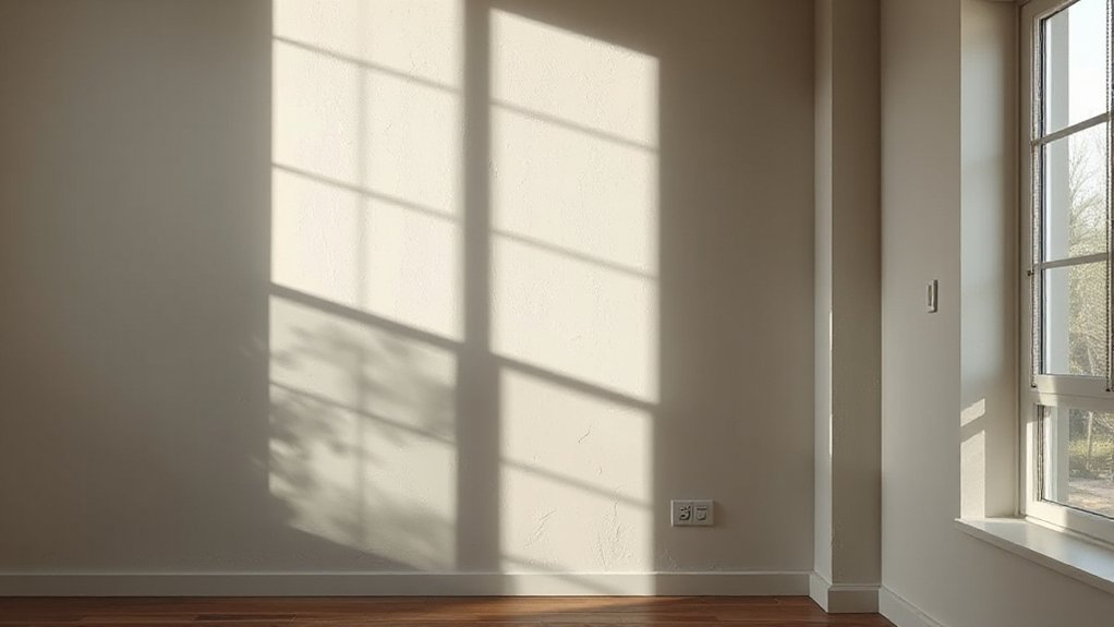
One-color rooms fail to stay consistent under varying light. You’ll notice shifts as daylight, lamps, and even crowdsourced skylight change how that single hue reads. Light-responsive color challenges you to pair tone with environment, not isolation.
In practice, color psychology shows colors evolve with time of day, mood, and occupancy, altering perceived warmth or coolness and impacting perceived space size. You should plan paint application around these dynamics: swatches outdoors, synthetic daylight, and real-room testing at multiple hours.
Favor nuanced primers and glaze accents that preserve tonal integrity, rather than flat coats that amplify glare. Use subtle contrasts—edges, architectural details, or secondary hues—to maintain depth.
The result: coherent mood across scenarios, instead of a static, single-note room.
Debunking Durability Myths: How to Choose Paint That Lasts
Durability myths often mislead buyers, so you’ll want a clear framework for evaluating finishes and substrates. Start with long-lasting finish guides and practical durability metrics to separate hype from real performance.
Durability Demystified
Durability isn’t a mystery once you separate myths from measurable traits like stain resistance, washability, and fade tolerance. You’ll evaluate paints by real-world performance data, not slogans.
Start with your room’s use: high-traffic halls demand tougher formulations, while kitchens benefit from moisture resistance and cleanability.
Don’t confuse pigment depth with longevity; color staying power matters, but even the strongest color can appear uneven if you overlook primer and surface prep.
Look for proven formulas that resist chemical exposure from cleaners, oils, and coffee—without yellowing.
Consider color fading under natural light, then prioritize products offering durable stable finishes rather than flashy claims.
In practice, compare warranty terms, application guidance, and recoat intervals to select a coating that remains consistent across years, not trends.
Long-Lasting Finish Guides
Glossy finishes often mislead about resilience; look past the sheen to real-world performance data. In this section, you’ll decode durability beyond hype, focusing on how finishes hold up under wear, cleaning, and sunlight. You’ll assess performance metrics, not myths, and translate results into practical choices for projects.
Expect concise guidance on film hardness, stain resistance, and recoating intervals, rather than vague promises. You’ll balance aesthetics with longevity by considering substrates, primers, and topcoats. Embrace innovations without sacrificing reliability, and connect trends to everyday use.
This is where innovative color palettes meet proven durability, guiding you toward finishes that endure.
- Prioritize wear resistance over appearance alone
- Match topcoat performance to room conditions
- Consider eco-friendly paint options without compromising longevity
Layered Color Stories: Textures and Softening Finishes
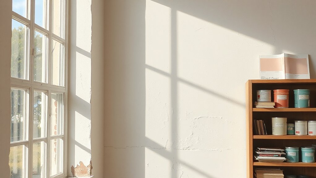
Layered color stories blend multiple hues and textures to create depth without heavy contrast, using soft, overlapping finishes to soften edges and shifts. You’ll turn to textured finishes to add tactility without shouting color, letting subtle variations do the talking.
In practice, layer multiple color schemes that share a common undertone, then introduce gentle glazes and matte sheens to blur progressions. This approach avoids harsh delineation, producing rooms that feel cohesive yet dynamic.
The trend favors restrained palettes—dusty pastels, warm neutrals, and muted earthy tones—applied in graduated steps rather than single, bold slabs. You should prioritize consistency of finish across surfaces to maintain flow.
Lean into daylight-driven shifts; textures should appear soft, not muddy, ensuring legibility of the underlying color narrative.
2025-Ready Combinations: Timeless Tones by Light
While light alone defines spaces, five ready-made color pairings make timeless tone workstations out of any room, guiding you toward cohesive schemes that feel polished yet effortless. Each pairing leverages light as a primary cue, then anchors with a complementary tone to create balance.
You’ll notice how Vibrant accents pop against subdued bases, while bold patterns appear sparingly to maintain restraint. The approach favors clarity over complexity, delivering walls that read as intentional rather than decorative afterthoughts.
Focus on temperature, contrast, and scale to keep rooms breathable and adaptable across seasons. These combinations stay versatile, proving that light-driven palettes can age well without gimmicks, elevating interiors with precision.
- Calm neutrals with a warm highlight
- Cool foundations paired with soft, luminous accents
- Light-based contrasts that emphasize architectural features
Quick Evaluation Checklist: Is Your Wall Plan 2025-Ready?
You’ll want to spot Wall Color Longevity Signs early, so you’re not surprised by shifting trends or fading hues.
Consider Material Durability Considerations alongside finish choices to guarantee long-term resilience and compatibility across spaces.
Finally, assess Finish and Sheen Compatibility with current furnishings and lighting to keep your plan 2025-ready and adaptable.
Wall Color Longevity Signs
If your wall color plan still feels fresh after several seasons, you’re likely spotting signs that its longevity is on track. You’ll notice cohesive palettes, minimal repaint cycles, and alignment with current décor trajectories.
Track whether wallpaper patterns and decorative accents maintain harmony rather than clash, signaling durable choices. A durable plan often relies on adaptable neutrals and controlled saturation that withstands trends.
- Consistent color relationships across rooms
- Timely updates via accents rather than full repaint
- Compatibility with evolving wallpaper patterns and decorative accents
Material Durability Considerations
Material durability matters because a 2025-ready wall plan should withstand wear, cleaning, and evolving spaces without frequent refreshes. You’ll evaluate substrate resilience, coating resilience, and long-term performance across environments.
Prioritize high-adhesion primers, trowel-ready textures, and durable topcoats with scrubability ratings suitable for kitchens, hallways, and high-traffic zones. Consider moisture tolerance, UV resistance, and fading resistance to maintain color integrity over time.
Texture patterns influence maintenance needs; complex textures may trap contaminants, so balance aesthetic intent with cleanability.
For paint application, select formulations that resist cracking and chalking while enabling even coverage on varied surfaces. Document maintenance routines and touch-up protocols to extend life.
Your 2025 plan should align durability with workflow and evolving spatial uses, avoiding premature repaint cycles.
Finish and Sheen Compatibility
Finish and sheen choices directly influence long-term maintenance and perceived space quality, so start with a quick compatibility check across substrate, lighting, and cleaning needs.
You’ll weigh how finish interacts with texture, sheen level, and durability, aiming for cohesive mood and practical upkeep. In 2025, matte sheen can soften glare and reveal textural contrast, but it risks staining if high-traffic areas aren’t protected. Balance with a compatible base coat and appropriate sealer to maintain washability.
Consider lighting temperature and room function to prevent color drift. When in doubt, test on small patches before full application.
- Align texture and sheen to room function for durable, stylish results
- Prefer matte sheen in low-traffic zones; reserve higher sheens for washable surfaces
- Pre-test for textural contrast and cleaning response before committing
Frequently Asked Questions
How Do Softer Palettes Impact Small Spaces in 2025?
Soft palettes visually expand small spaces and calm busy walls; you’ll notice textural contrasts, which add depth without crowding. Rely on color psychology, using muted hues strategically to enhance perceived room height, mood, and cohesive focal points.
Can Muted Tones Still Feel Vibrant Without Clutter?
Muted tones can still feel vibrant when you balance color psychology with bold accents, creating visual harmony that pops without clutter. You’ll notice contrast, texture, and light interplay driving energy while maintaining calm, purposeful spaces.
What Finishes Best Resist Wear Without Gloss?
Matte finishes resist wear better than gloss for you, especially in high-traffic areas; pair with satin textures to soften reflections. You’ll maintain a durable, modern look, balancing subtle sheen with practical cleaning ease and long-term upkeep.
Do Neutrals Need Bold Accents for Depth?
A simple answer: no, neutrals don’t need bold accents for depth. In a case study, you’d use neutral contrast and subtle textures—think layered shades and tactile plaster—to add dimension without overpowering the space.
Are Dynamic Lighting and Paints Linked for Depth?
Yes, dynamic lighting and paints are linked for depth; color psychology informs you how ambient illumination shapes perceived hue and contrast, guiding your choices to create nuanced, layered spaces that feel richer without overpowering the design.
Conclusion
You’re steering your space toward 2025 with measured restraint, avoiding flashy pitfalls and embracing depth. Think softer palettes, layered neutrals, and durable, nuanced finishes that age gracefully. If you doubt the trend, trust the data: oversized contrasts clutter rooms; understated shifts elevate placemaking. Your wall plan should feel earned, not flashy. Stay curious, test swatches, and let light reveal texture. Like a quiet drumbeat, the right tones keep your design confidently timeless.