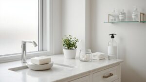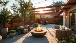
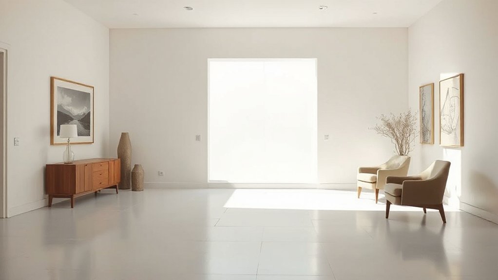

You might think a larger space requires a major remodel, but smart layout tweaks often do the trick. You’ll position big pieces against walls, keep traffic clear, and choose slim furniture to reduce bulk. Mirrors opposite windows amplify light, and light neutrals brighten every room. Group into cozy zones with soft boundaries, add low-profile pieces, and use rugs or lighting to define flow. Curious how small shifts can create instant openness? Let’s explore the practical steps next.
Key Takeaways
- Use low-profile, streamlined furniture and anchored seating layouts to keep sightlines open and create an airy feel.
- Implement reflective surfaces like long mirrors opposite windows to deepen natural light and perceived space.
- Choose light-colored floors and near-white walls to expand depth and brighten the room.
- Maintain clear traffic paths and avoid clutter with smart storage and staged decluttering routines.
- Create defined zones with rugs and wall anchors while keeping furnishings against walls to maximize flow.
Create Instant Space Illusion With Simple Layout Tweaks
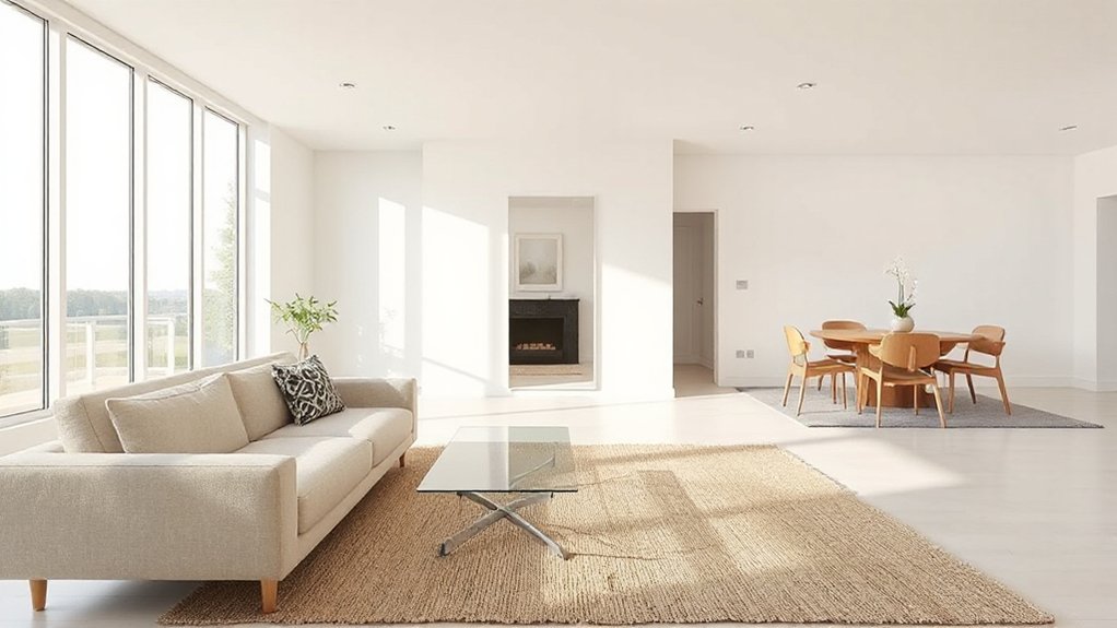
You can instantly make a space feel bigger by tweaking the layout instead of expanding it. Start by highlighting focal points: a single, clear visual anchor makes the room read as orderly rather than crowded.
Use color psychology to empower perception—cool tones recede, warm accents create coziness without bulk.
Position seating to form a natural flow, keeping traffic clear and sightlines uninterrupted.
Choose furniture ergonomics that maximize on-site comfort without overpowering the floor plan; low-profile sofas and streamlined tables preserve openness while supporting daily use.
Clip clutter with smart storage, so surfaces stay airy.
Align rugs with room geometry to extend floor space, and mirror placement can subtly multiply light and depth.
In short, intentional arrangement yields instant clarity and calm.
Improve Traffic Flow for Open-Ceiling Circulation
Open-floor sightlines and tall ceilings invite movement, so prioritize clear pathways that guide traffic without interrupting sightlines or hugs of furniture. You’ll balance ceiling height with open routes, letting air and light travel freely between zones.
Use linear furniture placement and threshold-less *passages* to keep 흐르듯 흐름. Focus on structural beams as architectural accents, not obstructions, to emphasize vertical space while maintaining flow.
Align entrances with primary sightlines to minimize detours, and vary rug textures to cue paths without crowding sightlines. Choose compact storage along walls to reduce clutter in transit, preserving feelings of openness.
- Optimize route alignment with main entry points
- Emphasize ceiling height through uninterrupted views
- Treat structural beams as sculptural guides
- Place low-profile furniture along walkways
- Use rugs to subtly delineate zones without blocking sightlines
Clear Pathways by Reducing Clutter and Visual Blocks
Clear pathways start with tidy sightlines and minimal visual clutter. You reclaim space by sorting every surface, drawer, and corner, so only essential items stay in view.
Focus on space organization: group similar objects, store frequently used things at arm’s reach, and conceal rest behind doors or within cabinetry. Remove oversized decor that blocks movement and interrupts rhythm, replacing with streamlined accents that read as intentional negative space.
Prioritize clear floor lines; relocate shoes, bags, and cords to designated bins or baskets. Use consistent finishes and colors to reduce visual noise, making passages feel expansive.
Practice clutter reduction daily: six-item quick clears, weekly audits, and a one-in-one-out rule. Your home gains calm, cohesiveness, and perceived square footage without sacrificing function.
Prioritize Negative Space in Each Room
Let untouched spaces set the rhythm, giving each room a calm focal point.
Let the perimeters breathe by keeping edges clean and deliberate, so negative space frames what you see.
Declutter visual clutter quickly to reveal purpose and polish without overthinking it.
Embrace Untouched Spaces
Even in a busy room, you can make space feel intentional by carving out untouched areas that breathe. You’ll guide the eye with clean planes, letting Untouched corners and Hidden nooks anchor calm, not clutter. Embrace negative space as a design asset: your furniture becomes focal, not filler, and movement stays deliberate.
- Define empty swaths between pieces to ground the layout
- Use low-profile furniture to preserve line and air
- Leave wall space unadorned to expand perception
- Highlight a single, quiet centerpiece instead of multiples
- Reset regularly to keep areas feeling pristine and new
Let Perimeters Breathe
Why not let the room breathe like it’s designed, not stuffed? You’ll create space by giving perimeters room to glide. Treat walls, corners, and thresholds as breathable boundaries, not shelves for every knickknack.
Choose furniture with negative space between pieces, so sightlines stay open and the room feels calmer. Emphasize an open perimeter: avoid crowding edges with heavy frames, tall bookcases, or layered textiles that trap energy.
Opt low, slender profiles and wall-mounted accents to keep floors visible. Let light travel freely; minimize visual clutter on mantels and tables.
A restrained palette helps the eye move, not stall. With intent, you’ll craft a layout that reads larger, cleaner, and more intentional, where every element earns its place.
Declutter Visual Clutter Quickly
Decluttering visual clutter starts with a quick audit: identify what you rarely touch, then remove or store it. You’ll create deliberate negative space that guides the eye and makes rooms feel larger. Focus on essentials, and choose storage solutions that tuck away items neatly without creating bulk.
Keep wall art minimal but impactful, swapping in a few standout pieces rather than cluttering walls. Let surfaces breathe; clear coffee tables and countertops first. Establish zones for belongings, so every item has a home.
Then reassess weekly to prevent buildup and preserve scale.
- Audit shelves and surface items, then store or donate what’s unused
- Select two-three storage solutions that blend with décor
- Swap busy prints for a single, bold wall art statement
- Prioritize vertical space with mounted organizers
- Rotate pieces seasonally to maintain visual calm
Zone Your Space Without Walls
You can zone your space without walls by guiding visual flow and defining areas with subtle cues. Create cozy boundaries that respect openness, using furniture placement and color shifts to imply separate zones.
This approach preserves an open feel while delivering clear, intentional, and aesthetically cohesive spaces.
Visual Flow Without Walls
When you want the feel of an open layout without removing walls, use visual flow to connect spaces. You guide sightlines and traffic with color, lighting, and furniture alignment, creating a cohesive journey through rooms. Subtly repeating materials and textures makes progression feel intentional, not separate.
Architectural illusions heighten spaciousness by lining up focal points and echoing ceiling heights. Color psychology frames mood and perception; cool tones recede, warm tones advance, and a restrained palette prevents clutter. Maintain consistent trim and proportion to preserve unity as you move from zone to zone.
- Align furniture lines to draw the eye forward
- Use a dominant color thread across spaces
- Soften edges with continuous lighting
- Mirror or reflect through strategic placement
- Maintain balanced openness with scale in mind
Cozy Boundaries, Open Feel
Zones create cozy boundaries while preserving an open feel by using sightlines, soft separations, and intentional scale. You define zones with low furniture, rugs, and color shifts, not walls, so flow stays uninterrupted.
Align seating to face common vistas, guiding the eye and creating cozy boundaries that feel deliberate, not divided. Lightweight shelving, curtains, or screens suggest edges while maintaining transparency; choose materials that reflect light and don’t visually clutter.
Mirror placement expands depth, while consistent flooring reinforces unity across zones. Keep clutter minimal in sightlines to preserve the open feel; every piece should earn its place.
Use scale-appropriate accents to emphasize intimate corners without shrinking the room. When you implement this, space reads larger, smarter, and more livable, with comfort baked into every passage.
cozy boundaries, open feel.
Place Furniture to Expand Perception of Size
To make a room feel more expansive, place furniture with intention: keep traffic lanes clear and group pieces to create open sightlines. You’ll shape the flow by anchoring large items against walls, then floating lighter pairs to define zones without crowding.
Use Furnishing symmetry to balance focal points, like a sofa facing a console or artwork, so the eye travels calmly. Color blocking helps recession; pair warm neutrals with cool accents across the room to echo depth.
Choose low-profile seating for airy ceilings and place a slim coffee table to maintain legroom. Be deliberate with rug placement to unify groups while protecting pathways.
- Begin with a main seating anchor against a wall
- Mirror shapes across the room for balance
- Align furniture to maximize sightlines
- Use color blocking to imply distance
- Opt for compact, elongated tables rather than bulky blocks
Choose Furniture Scale for Small Rooms
When you size furniture for small rooms, start with scale rules that keep visual harmony and avoid crowding. Use lighter pieces and proportional dimensions to boost visual lightness.
Smart furniture placement tricks expand perceived space. Keep the mix intentional: measure, test, and align form with function through disciplined proportion and placement.
Scale Proportion Rules
Choosing furniture scale for small rooms is about proportion, not size. When you plan, aim for scale harmony by pairing larger pieces with lighter surroundings and avoiding overly heavy silhouettes. Prioritize proportion balance so every item feels intentional, not crowded.
Use multi-functional furniture to preserve floor space without sacrificing presence. Consider leg height, arm thickness, and depth to keep lines clean and aligned. Keep color and texture simple to enhance perceived airiness.
- Match sofa length to room width for balanced horizontal scale
- Choose chairs with open legs or slim profiles to reduce bulk
- Elevate furniture with narrow legs to create vertical lightness
- Incorporate mirrors and glass accents to extend perception of space
- Limit heavy fabrics; favor streamlined, tactile textures for cohesion
Visual Lightness Tactics
Visual lightness starts with choosing furniture scale that breathes roomier air. In small rooms, select slender profiles and sofas with exposed legs to lift the visual floor.
Opt for low, compact coffee tables and console pieces that don’t crowd sightlines, allowing air to circulate.
Favor colors that read light—soft neutrals, airy whites, and pale pastels—so walls and furniture blend. Incorporate color contrast sparingly to define zones without heaviness; a dark accent against light upholstery sharpens structure without lowering ceiling perception.
Introduce texture variety through varied materials—linen, rattan, glass, or matte wood—so surfaces read as layered, not dense.
Prioritize scale that stays proportional to each wall, ensuring coherence, rhythm, and an open, breathable feel throughout.
Furniture Placement Tricks
Careful furniture placement makes the scaled pieces from Visual Lightness feel intentional rather than accidental. You’ll optimize a small room by choosing furniture that fits proportionally, not overpowering the space. Focus on leggy legs, low profiles, and clear sightlines to boost spatial perception without crowding.
Arrange pieces to create distinct zones while maintaining flow and balance, so every item earns its footprint.
- Use compact sofas with slim arms to preserve openness
- Place a narrow coffee table that stays within sightlines
- Elevate seating with wall-mounted shelves to free floor space
- Group chairs in conversational clusters, not single-file lines
- Anchor layouts with rugs that define zones without shrinking them
This approach reinforces furniture arrangement and sharpens spatial perception for a larger feel.
Use Multi-Functional Furniture in Tight Areas
When space is tight, opt for furniture that serves more than one purpose. In tight areas, prioritize pieces that combine storage, seating, and surface space without bulk. Look for convertible furniture that folds flat or morphs into dining, desk, or bed configurations, so you reclaim floor area without sacrificing function.
Choose compact design options with clean lines, hidden casters, and modular components you can rearrange as needs shift. Multi-tasking furniture reduces clutter by integrating drawers, shelves, or hidden compartments into a single silhouette.
Align pieces with walls to maximize travel space and avoid visual congestion. Select neutral finishes and matte textures to reflect light. With intention and restraint, you’ll gain versatility, flow, and a calmer, more expansive feel.
Layer Lighting to Make Rooms Feel Bigger
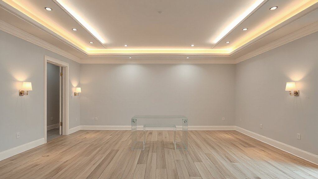
Layer your lighting to visually expand space by layering brightness across layers and focal points. You’ll combine ambient, task, and accent lights, using dimmers to modulate mood without overpowering the room.
This approach highlights the room’s architecture and creates the perception of a larger, more cohesive space.
Layer Lighting Basics
Layering lighting is the fastest way to make a room feel bigger, because each light source creates depth and minimizes shadows that flatten space. You’ll balance layers to boost perceived size, not overpower mood. Focus on clean, intentional placement, and let scale guide each decision.
Layer lighting, ambient glow, and task cues work together to reveal architecture without clutter.
- Use ceiling, wall, and floor sources at varying heights for dimensional contrast.
- Fold in ambient glow from concealed fixtures to soften edges.
- Highlight focal features with strategic task lights.
- Choose warm tones that feel expansive rather than clinical.
- Keep cords slim and unobtrusive, and hide switches for a seamless look.
Brightness Layering Techniques
Brightness is earned in layers, not by blasting the room with light. You optimize depth by balancing sources and shadows, layering ambient, task, and accent luminance so spaces read bigger.
Start with natural light as the base, using sheer drapes and positioned mirrors to extend daylight without glare. Then add controlled ambient lighting to sculpt architectural lines, avoiding hotspots that flatten corners.
Introduce task lamps for focused zones, keeping wattage in harmony with overall brightness. Use color contrast to enhance perceived size: cool whites recede, warm tones advance; pair with soft, high-CRI LEDs to preserve true color.
Dim with intention, not habit, so every fixture reinforces openness. Avoid cluttered overheads; choose slim profiles and wall washers to maintain clean sightlines.
Hidden Lighting Effects
- Concealed LED strips along recesses
- Under-cabinet glow for kitchens
- Backlit artwork without glare
- Floor-level sconces for guidance
- Hidden cove lighting for ceilings
Use Mirrors and Reflective Surfaces to Multiply Light
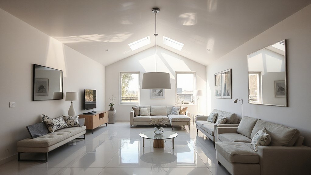
Mirrors and reflective surfaces don’t just brighten a space; they amplify it. You’ll compose a visual loop that tricks the eye into perceiving depth and airiness.
Start with purposeful mirror placement: align high, horizontal lines opposite windows to rebound daylight without creating harsh glare. Place a tall mirror beside a narrow wall to visually widen a corridor, or lean a full-length piece to reflect seating areas and extend sightlines.
Reflective decor—metallic frames, glass-top tables, glossy surfaces—adds brightness without bulk, so choose finishes that echo natural light tones. Avoid overloading walls; strategic placements create breathing room.
Consider multiples only in pairs or a single statement piece that anchors a seating vignette. By refining reflections, you multiply light and the sense of space.
Smart Mirror Placement for Depth
Strategically place mirrors to carve depth, not clutter. You’ll maximize perception by thoughtful placement that adds space without crowding rooms. Focus on alignment with architectural lines and sightlines to amplify open areas, not overpower them.
Use mirrors as depth cues, not decorations, and prioritize smart placement over sheer size.
- Place a long mirror opposite a window to bounce natural light deeper into the room
- Angle a wall mirror to extend a hallway without interrupting traffic flow
- Install a shallow cabinet mirror to reflect ceiling height and widen perceived space
- Position mirrors at eye level to mimic a taller, airier room
- Group smaller mirrors to create a gallery of depth instead of a single dominant piece
Smart placement and mirror positioning transform ambiance with precision.
Color Schemes That Read as Larger Than They Are
Color can read larger when you play with lightness and a pale taint, making walls recede while accents pop. Use light, cohesive tones for a monochrome room to boost perceived space and maintain visual expansion.
Let strategic contrast and subtle cohesion guide the palette, so the room feels bigger without shouting color.
Lightness Perception Tricks
Lightness tricks hinge on how your eye reads contrast and space. You’ll boost perceived area by choosing luminance-accurate schemes that push walls and ceilings outward in your mind.
- Use high-contrast edges sparingly: soft transitions feel airier than stark lines.
- Favor near-white walls with soft, cool undertones for a limitless backdrop.
- Elevate color contrast at focal points (art, furniture) instead of every surface.
- Tweak ceiling height perception with slightly lighter ceilings than walls.
- Keep fixtures and textiles cohesive to maintain a continuous, expansive flow.
Together, these approaches amplify depth without added clutter. You’ll notice rooms feel larger, calmer, and more intentional, as color contrast and ceiling height interplay to reveal space rather than erode it.
Pale Taint, Visual Expansion
Pale taint can make a room feel unexpectedly expansive: subtle, desaturated hues bounce light and soften edges, so walls recede and space breathes. You choose pale taint tactically, pairing cool and warm neutrals to maintain balance without dulling contrast.
Visual expansion happens when you favor large, uninterrupted surfaces over busy patterns; aim for matte finishes that minimize glare while preserving depth. Use a restrained palette, then introduce intentional accents to guide the eye upward and across the room.
Keep furniture low-proportioned and leggy, letting floor and ceiling lines arrive cleanly. Lighting plays a critical role: diffuse ambient mixed with targeted task light preserves the airy feel.
In practice, curate a cohesive, breathable scheme that amplifies space while preserving warmth and character.
Monochrome Room Cohesion
- Maintain a restrained palette across all surfaces
- Vary textures rather than hues to create depth
- Use soft-to-muted tones for an expansive feel
- Align furniture lines with architectural panels
- Introduce glossy accents to catch light without breaking harmony
Window Treatments That Maximize Natural Light
Want to flood a room with daylight without sacrificing privacy or style? Choose window treatments that maximize light while keeping it manageable. Start with sheer fabrics that soften glare and widen perceived space, then layer with light, opaque panels only where needed for privacy.
Favor curtain styles that stack neatly and won’t crowd the frame, such as floor-to-ceiling drapes on slender rods. Opt for translucent materials in pale neutrals to reflect rather than absorb light.
Install tracking or recessed systems so panels glide smoothly and stay aligned, avoiding bulky hardware. Consider venting blinds or high-placed shades that lift completely for daylight at will.
Keep windows clear of clutter, minimize valance use, and embrace long vertical lines to draw the eye upward, expanding the feel of each room.
Decluttering Habits That Create Visual Space
Decluttering isn’t about tidying once; it’s about setting a rhythm that visually expands every room. You’ll create space by adopting routines that reduce clutter before it accumulates, letting light and architecture breathe.
- Embrace Minimalist decor as a baseline: keep essentials, remove duplicates, and let each item earn its place.
- Triage daily: 60-second resets at day’s end prevent buildup and maintain calm.
- Use Color contrast strategically: light walls with dark accents to push boundaries outward.
- Limit surfaces: clear tops weekly, mirroring a gallery approach to display only what matters.
- Schedule seasonal purges: rotate or retire pieces that no longer serve you, preserving scale and flow.
Zone-Driven Layouts for Living, Dining, and Work
Zone-driven layouts slice each room into purposeful zones—living, dining, and work—so flow stays clear and tasks stay distinct. You chart where conversations happen, meals occur, and focus time begins, then layer furniture to reinforce those lines without crowding.
Zone zoning guides you to place seating away from entrances, define dining with a compact, tactile footprint, and carve a productive nook with proper lighting and acoustics.
Aesthetic cohesion comes from a shared material palette, subtle alignments, and intentional sightlines that minimize visual clutter. Layout layering lets you overlap functions without overlap in performance—soft rugs anchor zones, storage hides in plain sight, and verticals add rhythm.
You maintain flexibility, too, so rooms adapt as needs shift. Your home reads calm, organized, spacious.
Clever Storage That Keeps Surfaces Clear
Clever storage keeps surfaces clear by tucking essentials away where you actually use them. You optimize every inch with intent, so counters stay clean and rooms feel open. Move clutter into discreet systems that blend with your decor, not compete with it. Think strategically: every container earns its place, and every placement boosts flow.
- Hidden compartments beneath consoles and ottomans hide everyday items without sacrificing style
- Decorative baskets on shelves or doors corral remotes, chargers, and crafting supplies
- Wall-mounted cubbies for keys, sunglasses, and mail, keeping surfaces free
- Lidded bins under sinks or benches to stash cleaners and gadgets
- Slide-out organizers in cabinets to maximize depth and accessibility
Focus on cohesion, texture, and symmetry; a tidy surface reads as intentional space.
Flooring Continuity for Edge-to-Edge Flow
Flooring continuity ties rooms together, creating a seamless edge-to-edge flow that makes spaces feel bigger. You choose flooring with a consistent tone and grain across zones to avoid visual breaks that slice a room into pieces. A single, uninterrupted surface lengthens sightlines, expanding what you see at once.
To optimize, run the same planks or tiles through living areas, dining spaces, and kitchens where possible, aligning boards with doorways to guide movement. Consider color contrast carefully: a light floor against darker furniture can brighten and ground the space without creating harsh delineations.
Balance this with furniture height, keeping low-profile pieces in sight lines to preserve openness. Avoid shifts that interrupt flow; subtle changes can interrupt the perceived expanse.
15-Minute Layout Tweaks You Can Do Today
Try these quick moves that don’t require a full remodel. You’ll gain perceived space by smartly adjusting what you already have. Focus on color psychology to unify areas; light, cool tones open rooms, while accent hues draw attention without clutter. Add acoustic treatments to keep sound calm and space feeling larger. Small swaps and placements create order, which visually expands.
- Minimize contrast between adjacent rooms with cohesive palettes
- Elevate storage with floating shelves to free floor space
- Mirror strategically to bounce light and extend depth
- Layer lighting: ambient, task, and under-chelf accents
- Tidy cords and swap bulky furniture for slim profiles
Frequently Asked Questions
How Can Color Affect Perceived Room Size?
Color psychology shows lighter walls visually expand space, while contrasting shades add depth. You’ll feel airy rooms when you use pale neutrals with darker accents, leveraging contrasting shades to subtly shape perception and heighten architectural details.
Is Ceiling Height the Main Illusion Factor?
No, ceiling height isn’t the main illusion factor. You can maximize space by installing ceiling panels and crown molding, which draw the eye upward and create refined vertical lines that feel more expansive and cohesive.
Do Rugs Influence Space Perception More Than Paint?
Rugs influence space perception as much as paint, you know. Choose decorative accents and window treatments strategically to expand perceived room size, using light colors and low-contrast patterns that maintain cohesion while guiding the eye toward openness.
Can Furniture Arrangement Impact Light Distribution?
Yes, your furniture arrangement can influence light distribution by guiding reflections and shadows. Opt for open layouts, strategic storage solutions, and window treatments to maximize daylight, creating brighter spaces and cohesive, aesthetically balanced rooms.
Do Doors and Entryways Alter Room Spaciousness?
Door placement subtly shapes room spaciousness, you’ll notice, and thoughtful entryway design can keep traffic flowing smoothly. You feel more open spaces as you navigate, so you naturally arrange doors to optimize sightlines and graceful shifts. Affordable, effective tweaks.
Conclusion About Layout Changes That Will Instantly Make a Home Feel Larger
In tight spaces, think bigger by binding balance with bauful, breezy basics. Clear clutter, curb corners, and couch calmly against walls. Create conversational clusters, cue calm lighting, and mirror-magic margins to multiply light. Favor slim, low-profile furnishings for focal finesse, and forge flawless flow with floor-to-ceiling continuity. A pinch of positive negative space plus purposeful pathways powers perception—space expands, serenity settles, and your home hums with instantly inviting, airy allure. Start small, sightly, strategically today. These are the things potential buyers will be looking for too.