


For the best paint colours in UK homes this year, you’ll pair core neutrals with soft pastels to soften daylight and add depth. Use warm earthy tones in living areas for inviting cohesion, then calm blues and greens in bedrooms for serenity. Choose durable finishes—matte, satin, or washable eggshell—matched to room use, and factor lighting to avoid washout. Test swatches under natural light across the day, and you’ll craft a cohesive, timeless palette that adapts with you as conditions shift. If you want more, you’ll discover how to apply these tips step by step.
Key Takeaways
- Opt for warm neutrals as versatile bases, pairing with soft pastels for depth and cohesive walls, trim, and cabinetry.
- Use calm cool blues and greens in bedrooms for serene, layered backdrops that remain fresh year-round.
- Incorporate warm earth tones in living spaces (terracotta, ochre, browns) to create inviting, timeless warmth.
- Layer finishes with matte for softness and satin for high-traffic areas to balance mood and durability.
- Test swatches under natural daylight at different times to ensure true colour accuracy and lasting cohesion.
What Makes a Paint Color Work in UK Homes
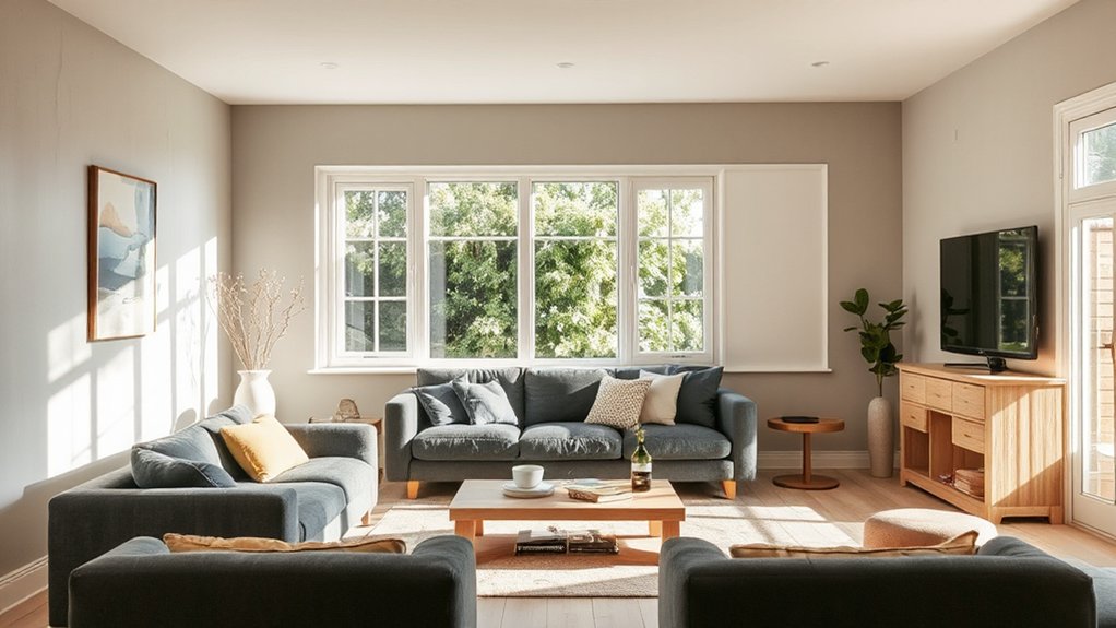
Choosing a paint color that works in UK homes hinges on three core factors: light, room purpose, and architecture. You assess natural and artificial light, noting how morning sun shifts tone and evening shadows mute contrast.
Room purpose guides saturation and finish: you’ll favor calm, adaptable tones for living spaces and more resilient, washable options for kitchens and hallways.
Architecture matters too; consider period details, ceiling height, and proportion to avoid overpowering or shrinking effects.
You harness color psychology to influence mood, choosing hues that enhance focus, calm, or warmth without shouting.
Durability also matters: you select high-quality, scrubbable finishes that resist wear and reflectivity changes over time.
In short, the right color respects light, function, and structure while delivering lasting visual balance.
Core Neutrals for UK Interiors
Core neutrals form the backbone of UK interiors, offering reliable flexibility as lighting shifts through the day. You’ll notice these shades grounding schemes, balancing warmth and cool undertones to suit any room. Choose neutrals with subtle variance in undertone, ensuring harmony across walls, trim, and cabinetry.
Color psychology tells us neutrals influence mood and perceived space; opt for hues that reinforce calm in living zones and focus in work areas. Prioritize paint durability—long-lasting hides, minimal fading, and resistance to humidity in kitchens and baths.
Texture matters too: matte finishes soften light, while satin can enhance durability where traffic is high. Pair neutrals with restrained accent colors to maintain cohesion, depth, and timeless appeal without sacrificing modern edge.
Soft Pastels to Brighten the British Light
Soft pastels lift the quiet glow of British light, offering a gentle counterpoint to the deep neutrals you’ve already embraced. You’ll find that pastel palettes refresh rooms without overpowering them, preserving architectural details while adding subtle personality.
Use pale blues, soft pinks, and powder yellows to create layered depth that reads as calm, not clinical. Balance is key: pair light brightness with crisp whites or cool grays to prevent washout, and reserve stronger hues for accents and art.
In kitchens and bedrooms, choose matte finishes to maintain sophistication while keeping surfaces soft to touch. Consider lighting strategies that amplify the tint without skewing color accuracy.
These choices deliver modern serenity, support daylight, and forecast enduring appeal in your evolving palette. Pastel palettes meet contemporary living with restraint and clarity.
Warm Earth Tones for Cozy Living Rooms
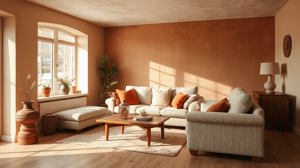
Warm earth tones create inviting living rooms with natural warmth, so consider how warmth levels influence the mood you aim for.
Pair these hues with neutral textures to add depth without overpowering the space.
Your next step is to balance tonal warmth and tactile variation to sharpen the room’s coziness and timeless appeal.
Warmth Levels For Rooms
Consider how warm earth tones can transform a living room into a welcoming retreat: richer browns, terracotta, and muted ochres create instant coziness without overwhelming the space. You’ll achieve effective warmth by balancing saturation with lighting and furniture scale, ensuring the room feels inviting rather than heavy.
Color psychology supports this approach: strategic hues can influence mood, encouraging relaxation and sociability during evenings and gatherings. To maintain harmony, pair warm tones with cooler neutrals at key focal points, preventing tonal fatigue.
When selecting paint, assess durability alongside color depth; paint durability matters for high-traffic areas, resisting scuffs and fading over years of daily use. Subtle undertones matter, so test swatches in multiple lighting conditions to confirm lasting warmth and cohesive, enduring appeal.
Texture With Neutral Hues
Texture in neutral hues can deepen the warmth of a living room without sacrificing clarity or light. You’ll achieve this by pairing warm earth tones with restrained textures, creating a cocooned yet breathable ambience.
Opt for soft, matte neutrals on walls and introduce tactile depth through Textured walls—think plaster, linen, or subtle rattan panels—so the space reads sophisticated, not flat.
Neutral palettes keep furniture silhouettes legible while guiding natural light to glow, not compete. Introduce warmth with ochre, terracotta, or sand accents in cushions or throws, staying mindful of balance against cooler whites or greys.
Use underlit shelves or a single statement rug to anchor the scheme. Keep the palette cohesive; avoid jarring contrasts that disrupt calm, cohesive flow.
Cool Blues and Greens for Calm UK Bedrooms

Cool blues and greens create a serene backdrop for UK bedrooms, helping you unwind after a long day. You’ll notice these hues foster calm and focus, supporting better sleep and restorative downtime.
Choose mid-tones with subtle warmth to avoid clinical chill, ensuring the room feels inviting. In practice, pair slate‑blue walls with soft sage accents to balance coolness with nature-inspired depth.
Color psychology suggests cooler palettes ease tension, while tiny pops of pale ochre or white trim sharpen contrast without disrupting flow.
Prioritize paint durability in walls facing morning light; opt for a high‑quality, fade-resistant finish to retain mood and saturation.
Use layered textures—linen, wool, and matte surfaces—for dimension that stays refined as trends shift.
Bright Kitchen Accents That Suit UK Light
Bright kitchen accents thrive in UK light, guiding you toward finishes that stay lively without overpowering. In this setting, you’ll leverage brightness with purpose, choosing palettes and textures that reflect daylight while remaining practical for daily use.
Vibrant wallpapers and bold accent walls can punch up a seaside or urban kitchen, yet they must harmonize with cabinetry, worktops, and fixtures. Aim for contrasts that read polished rather than loud, and deploy color in controlled swaths to avoid fatigue over time.
1) Vibrant wallpapers as a feature behind open shelving or a nook, keeping surrounding cabinetry neutral.
2) Bold accent walls behind the dining area, tempered with warm undertones to prevent glare.
3) Colored accessories and lighting that echo the wall or wallpaper for cohesive coherence.
Shades That Complement Traditional British Architecture
Traditional brick calls for warm neutrals that highlight its texture.
While heritage stone reads best with cooler, muted tones that respect its provenance.
You’ll want colors that harmonize with the brick’s depth and the stone’s cool undertones without competing.
Consider how traditional brick complements, and how heritage stone contrasts, to set a timeless, refined palette.
Traditional Brick Complements
Classic brick architecture calls for complementary tones that enhance its warmth without competing with the texture. You’ll want hues that respect the mortar, letting red, brown, and amber undertones breathe. Choose subtle contrasts that sharpen silhouette while remaining respectful of tradition.
The goal is cohesion, not competition, so lean into muted, timeless shades with modern polish. For period homes, opt for colours that mute brick’s boldness, then let accessories do the talking. Vintage florals and rustic accents can be introduced through textiles and furniture without overpowering the brick’s character.
- Stonewash taupe
- Warm ivory with soft olive undertones
- Dusty sage paired with charcoal details
Heritage Stone Contrasts
Think warm limestone, soft slate, and dusty sandstone as the backbone, then introduce cool undertones to create nuanced shadow lines on a historic facade. Use contrast sparingly: a lighter field stone against a darker mortar accentuates proportions, while a mid-tone surround adds definition without shouting.
Avoid harsh, modern grays that jar with heritage stone contrasts. For doors and accents, lean toward timber-inspired stains that echo centuries-old craft. This approach keeps the historic facade honest yet contemporary, ensuring your palette reads as timeless rather than trendy.
Finishes and Sheens That Pair With UK Lighting
When selecting paint finishes for UK lighting, choose sheens that complement both natural daylight and common interior fixtures, rather than fighting them. You’ll want finishes that reflect warmth in mornings and soften glare at dusk, guiding perception of colour without distortion.
Focus on subtle shifts in tone as light changes, not bold contrasts that feel harsh indoors. Faux finishes and metallic sheens offer texture and nuance, elevating walls while remaining versatile across spaces. Plan to pair with trim and cabinetry for cohesive ambience.
- Faux finishes add tactile depth, mimicking plaster, linen, or silk under varying illumination.
- Metallic sheens catch and soften daylight, creating dynamic highlights without overpowering colour.
- Sheens shift with the time of day, ensuring consistent mood from breakfast to twilight.
How to Test Palettes in British Daylight

With UK daylight shifting across the day, testing palettes in real conditions is non-negotiable. You should observe color at different times, under varied light temperatures, and across walls that receive direct sun versus shaded areas.
Begin with a swatch board placed where you’ll actually paint, then track changes from morning through dusk. Use consistent, neutral viewing conditions—avoid window glare and artificial color casts during measurements.
Document perceived hue, saturation, and brightness using a simple scale, then compare to your reference chips in the same light. Incorporate daylight simulation where needed to model overcast and warm golden-hour scenes.
Rely on objective notes rather than memory, and prioritize palettes that maintain balance across conditions, not just in peak daylight.
Room-by-Room Color Picks for This Year
As you map out this year’s plan, you’ll want to lock in room-by-room color picks that reflect the Room Color Trends and the Year’s Top Hues.
Think through how each space speaks to mood, light, and function, then align palettes accordingly.
This guide starts by outlining practical, trend-aware choices you can apply room to room.
Room Color Trends
Room-by-room color picks this year lean into warmth, versatility, and calm without sacrificing personality. You’ll notice trends that blend comfort with composure, guided by color psychology to influence mood.
Expect grounded neutrals layered with soft accents that adapt to light, plus tactile finishes that enhance coziness. Eco-friendly paints remain a priority, proving you don’t have to compromise performance for planet-friendly choices.
- Warm neutral foundations that pair with muted terracotta or sage accents to create inviting, adaptable spaces.
- Saturated, but nuanced blues and greens that deliver calm focus in work zones and relaxing vibes in living areas.
- Subtle contrast walls with lighter ceilings to elevate ceilings’ perceived height and add architectural polish.
Choose palettes that echo nature, ensuring longevity and effortless refreshment.
Year’s Top Hues
This year’s top hues tailor color to each room, offering warmth, focus, and serenity you can rely on.
In living spaces, choose restrained neutrals paired with a Vibrant accent to anchor furniture and art without shouting.
Bedrooms benefit from mood enhancing hues that promote calm, with soft undertones and minimal contrast for restful sleep.
Kitchens deserve clean, resilient shades that echo natural light, then a bold splash of color on cabinetry or islands for depth.
Bathrooms gain depth through cool, reflective tones that feel spa-like.
While hallways profit from subtle progressions—soothing palettes that move the eye.
Home offices should balance concentration with warmth, using grounding tones and a single vibrant detail for energy.
Consistency across rooms creates a cohesive, modern home.
Budget-Smart Swaps and Durable Finishes for UK Homes
Smart budgeting and long-lasting finishes go hand in hand for UK homes, so choose durable coatings that resist scuffs and stains while keeping costs predictable. You’ll maximize impact with eco conscious choices that won’t break the bank, balancing performance and style across rooms.
Prioritize minimal maintenance and washable surfaces to extend intervals between repaints, and select finishes that hide fingerprints and wear. Eco friendly paints and budget friendly finishes are your allies in this approach, delivering resilience without sacrificing aesthetic.
- Durable matte sheens on living spaces that still look refined after daily traffic
- Scrubbable satin for kitchens and baths that handle moisture and messes
- Washable eggshell on hallways and children’s rooms for easy cleanup and longevity
Tools and Techniques to Apply Color Like a Pro
To apply color like a pro, start with the right tools and a disciplined prep routine that minimizes mistakes and waste. You’ll need quality brushes, rollers, an edging tool, a suspended filter, and painter’s tape. Use a dedicated tray, a mini roller for trim, and a microfiber cloth for dust.
Prep meticulously: clean surfaces, seal gaps, and prime when necessary.
Paint application techniques matter: back-roll to blend edges, cut in with steady strokes, and maintain a wet-edge workflow to avoid lap marks.
Control temperature and ventilation to reduce drying flaws.
Consider color psychology to predict mood shifts and contrast effects before you begin.
Work in logical zones, keep a consistent pace, and discard used materials promptly to sustain accuracy and finish quality.
Creating Cohesive Palettes Across a UK Home
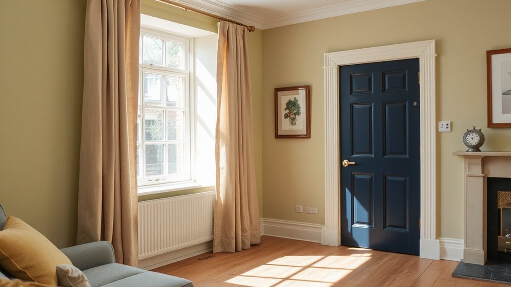
1) A warm, light base in living spaces paired with cooler accents in bedrooms creates visual harmony and depth.
2) Repeats of the same undertone across fabrics, furniture, and walls unify textures.
3) Durable enamel or satin finishes on kitchens and baths sustain color integrity under daily use.
Frequently Asked Questions
How Do Lighting Conditions Affect Perceived Color in UK Homes?
Natural light shifts color warmth and clarity, while artificial lighting can mute or exaggerate tones; you’ll perceive hues differently at dawn, dusk, or under LEDs and warm bulbs, so calibrate paints under both lighting conditions for accuracy.
What Are Common Color Mistakes in British Hallways?
Common color mistakes in British hallways include overusing dark tones, neglecting lighting, and ignoring color psychology; instead, balance neutrals with accent hues. Align with historical color trends, ensuring contrasts support flow and perceptual depth.
Which Finishes Resist UK Humidity and Temperature Changes?
“Time and tide wait for no one.” You should choose satin or polyurethane enamel for durability; matte finishes won’t cut it in humidity. Paint durability matters, so pick high-gloss or alkyd enamel with proven finish types.
How Often Should You Refresh Paint in Rental UK Properties?
You should refresh paint every 5–7 years in rental UK properties. This guarantees paint durability and color maintenance, reduces wear, and keeps spaces appealing for tenants, landlords, and inspections, while aligning with current durability trends and regulations.
Can Color Choices Impact Home Value in the UK Market?
Yes, color choices can influence value in the UK market. You should apply color psychology strategically, and prioritize color schemes with broad appeal; pair with durable finishes, emphasizing paint durability to sustain resale attractiveness and perceived quality.
Conclusion
You’ll finish this year with a palette that feels tailor-made for UK homes. Choose core neutrals to anchor rooms, temper with soft pastels, and warm earth tones for inviting living spaces, while cool blues and greens calm bedrooms. Follow room-by-room picks, lean on budget-smart finishes, and use durable coatings for longevity. Like a well-cut suit, this color plan fits every corner of your home—cohesive, confident, and effortlessly on-trend. Your walls, your mood, perfectly coordinated.