
A mood board is your visual roadmap for turning vibes into concrete design choices. You define the core mood with a few guiding questions, gather authentic inspiration, and build a cohesive color and texture system that supports your vibe. Use imagery, typography, and tactile cues to anchor decisions, then layout for quick scanning and clear hierarchy. Iterate fast, trim discordant pieces, and turn the board into a living brief that drives action. Stay tuned to discover practical steps you can apply today.
Key Takeaways
- A mood board is a tangible collage of visuals, textures, and ideas that conveys a project’s vibe and guides decisions, not perfection.
- Define the core mood, audience reaction, and exclusions to keep the board cohesive and measurable.
- Gather authentic inspirations from diverse sources and capture tangible samples like textures and typography.
- Create visual cohesion with a core style, consistent lighting, color palette, and standardized citations.
- Transition from mood board to action by assigning owners, deadlines, and success metrics based on the visuals.
What a Mood Board Is and Why It Works
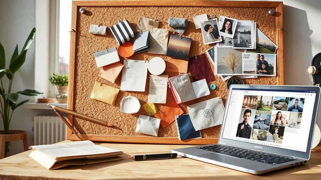
A mood board is a tangible compilation of visuals, textures, and ideas that conveys the vibe a project should feel like. You assemble images, colors, fonts, and samples to map intent, not to imitate perfection. The board anchors decisions, guiding choices through a shared reference point.
It works because it makes abstract goals concrete, enabling quick checks against your target mood. Emotional expression comes through selections that evoke feeling rather than logic alone, helping you spot gaps before you invest time and money.
Creative collaboration thrives here: you and teammates riff, critique, and refine in real time, aligning perspectives and priorities. This process speeds consensus, reduces backtracking, and clarifies roles.
In short, a mood board translates inspiration into actionable direction, ensuring consistent tone across the project.
How Mood Boards Help Your Projects: A Quick Overview
Mood boards streamline decisions by translating abstract goals into concrete, shareable visual references. When you assemble colors, textures, typography, and imagery, you create a single language your team can read quickly. This accelerates approvals, cuts back-and-forth, and keeps everyone aligned on intent.
You’ll spot gaps early, avoiding costly revisions later in the project. By capturing Emotional expression in visuals, you translate mood into tangible criteria that guides design choices, content tone, and user experience.
Mood boards also support Brand storytelling, ensuring every element reinforces your narrative arc—from audience needs to brand voice. They function as a references library you can reuse across phases, reducing ambiguity and keeping momentum.
In short, mood boards stabilize direction while preserving creative flexibility.
Define Your Vibe: Nail Your Core Mood in 3 Questions
You’ve got the visuals and the language in place, now it’s time to lock in the core vibe. Ask three questions to define it: What feeling should your project evoke—excited, serene, bold? Which audience reaction matters most—inspiration, action, contemplation? What’ll you refuse to include—clutter, vague tones, inconsistent cues?
Answering these clarifies direction, guiding choices fast. Use emotional expression as your compass; your core mood should radiate from every element, not just a few highlights.
In practice, map each decision to that mood so visuals and copy reinforce it, creating a cohesive experience. This reduces overthinking and protects your visual storytelling from drift.
Nail these questions, and your mood becomes measurable, repeatable, and easily communicated to teammates.
Gather Inspiration: The Best Places to Look

Curate your mood board by gathering sources that match your core vibe, then test each idea quickly against your three defining questions. You’ll thumb through sources with intent, filtering for authenticity, relevance, and emotion.
Historical references ground you, while cultural influences keep it alive and contemporary. Look beyond glossy magazines: archives, museums, and documentary photography can reveal enduring motifs.
Social feeds offer trends, but verify again against your vibe so you don’t chase fads. Capture samples that feel tangible—textures, tones, typography—then decide what belongs.
- Museums, archives, and libraries for historical references and context
- Cultural centers, travel photography, and local art scenes for cultural influences
- Design blogs and curated curations that align with your vibe and avoid noise
Build a Harmonious Color Palette for Your Board
Color relationships guide how your board reads, so start with a core color and map nearby hues to build a cohesive flow.
Establish a harmonious palette by grounding with one or two neutral anchors, then layer harmonious hues and subtle contrasts to keep it readable.
Use balance and contrast tips to test the rhythm across sections, ensuring the board remains focused and intentional.
Color Relationships On Board
Color relationships on a mood board matter because the right palette ties elements together and sets the mood. You’ll use color relationships to create coherence, hierarchy, and energy, without overloading the design. Focus on how colors interact, not just which hues you like.
- Learn color theory basics—identify dominant, supporting, and accent colors to guide decisions.
- Apply complementary schemes to create contrast that feels intentional, not random.
- Test balance by adjusting saturation and value so your board reads clearly from a distance.
Harmonious Palette Foundations
To build a harmonious palette for your board, start with a unifying base and then add supportive tones that enhance it. Choose base colors that share a common undertone (warm or cool) and align with your mood board’s intent.
Add 2–3 accent shades that echo the base yet provide contrast, keeping saturation moderate for cohesion. Integrate a neutral anchor—cream, taupe, or charcoal—to ground the composition and improve legibility.
Apply color harmony principles, like analogous or complementary schemes, to guide relationships between hues and maintain balance. Test contrast against text and images to preserve readability.
Use repeats of key colors to reinforce visual storytelling without clutter. Remember, intentional restraint beats overloading your board with too many hues.
Balance And Contrast Tips
Now that you’ve chosen a harmonious base, it’s time to balance it with contrast that guides the eye and supports readability. You’ll create contrast without breaking color harmony, using value, saturation, and temperature to establish visual balance across your board.
Prioritize legibility for text and focal elements, ensuring the main message stands out. Subtle shifts can elevate depth while keeping cohesion intact.
- Use light-to-dark value changes for emphasis, not loud color clashes.
- Pair warm and cool tones to enhance visual balance and keep color harmony intact.
- Apply accent pops sparingly to direct attention without overwhelming the palette.
Texture and Material: Touch the Mood
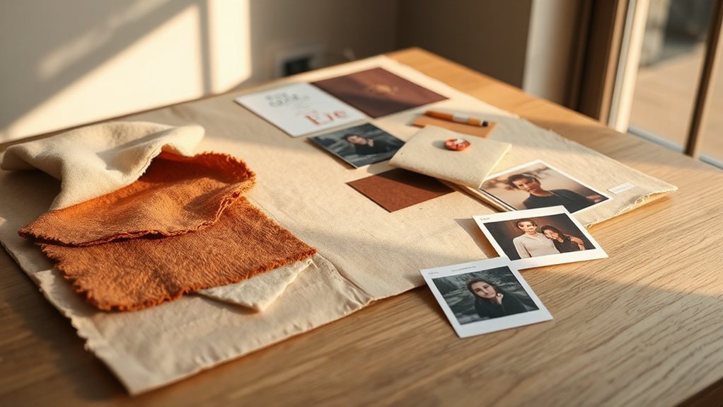
Texture signals mood before sight, so feel how fabrics, surfaces, and finishes communicate your board’s vibe. Use a Material Palettes Guide to assemble tactile options that align with your color and theme, then test how they read in person.
Explore Tactile Cues by pairing different textures with core elements to spark concrete, actionable ideas for your Mood Board.
Texture in Mood Boards
- Pair tactile references with adjacent visuals to test harmony.
- Map texture scale to the space’s proportion, ensuring legible detail.
- Document firsthand observations, noting how each material reads under light and distance.
Material Palettes Guide
A well-rounded material palette blends texture with tactile material choices to ground the mood board’s mood. You’ll select material textures that reinforce the desired atmosphere, balancing warm and cool finishes to avoid clash.
Begin with a core trio—fibrous, smooth, and rugged—then layer subtle variations to add depth without noise. Prioritize durability and consistency across application surfaces, from anchors to accents, ensuring Design consistency throughout the board.
Document each material’s tactile properties, weight, and scale so collaborators feel the mood through touch, not just sight. Use swatches or samples to test alignment under lighting, considering how textures interact with color.
Curate a concise materials list, noting substitutions for changes in budget or availability, and maintain a readable, actionable palette that supports your concept.
Tactile Cues Exploration
But to truly read a mood, you must touch it; start by cataloging tactile cues that align with your concept—think weight, grain, and temperature. You’ll translate texture into decisions, guiding materials, finishes, and how viewers respond through sensory engagement.
Focus on how surfaces feel, not just look, to align with your mood board goals. Use tactile cues to verify coherence between idea and object, ensuring every element reinforces the narrative.
- List weights and densities that match your concept to create physical rhythm.
- Compare grain, pattern, and finish to reinforce tonal direction and mood consistency.
- Note temperature and friction cues to shape perceived atmosphere and user interaction.
Imagery and Citations: Create a Consistent Visual Theme
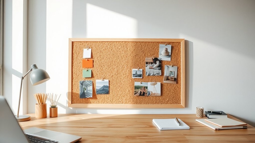
How can you keep your mood board cohesive when it comes to imagery and citations? You’ll align imagery selection with your theme, color palette, and mood words you’ve set earlier. Choose a core style (photo realism, illustration, collage) and apply it across all visuals. Maintain consistent lighting, tone, and composition so every image feels like part of one story.
For citations, use a single sourcing method: digital, print, or mixed—but standardize formatting and placement. Create a simple citation grid: source, author, date, and medium, included on a caption or pinned note.
Limit variety in subject matter to avoid visual noise. Tag images with keywords to speed future sourcing, then prune duplicates. This disciplined approach preserves a clear, professional, cohesive aesthetic throughout your board.
Imagery selection, Citation sourcing.
Create a Readable Layout: A Simple, At-a-Glance Board
To keep your mood board legible at a glance, start with a clear grid and predictable spacing that lets each image breathe. A simple, at-a-glance board relies on consistent margins, alignment, and a restrained color rhythm to support Visual storytelling and Brand identity without clutter.
Prioritize a focal zone for the strongest concept and keep supporting pieces smaller, but readable.
- Set a fixed grid (columns and rows) and tuck white space between blocks to guide the eye.
- Limit type and color variations to maintain cohesion and readability across scenes.
- Use visual hierarchy—size, contrast, and alignment—to highlight core ideas quickly.
This approach yields a practical, scannable layout you can defend in meetings and iterations.
Organize Scraps Into Cohesion: a Tiny System That Scales
You start by turning scraps into signals you can act on, so each piece clearly points to a goal or mood.
Use a tiny, repeatable system that labels, sorts, and stacks scraps by signal, not size or color alone.
This scalable approach keeps your board cohesive as it grows.
Scrap To Signal
Even small scraps can become a signal of a cohesive mood board, if you organize them with a tiny, scalable system. Scrap-to-signal is about quick decisions that preserve potential. You’ll streamline inputs, label by vibe, then lock in a center theme for creative journaling and visual storytelling.
1) Gather, tag, and separate scraps by emotion rather than object type, so patterns emerge faster.
2) Create a single reference card per mood, updating it as you collect, not after you’re done.
3) Flip the process: test variations on a small scale, then apply the winning approach across the board.
Stay deliberate, iterate with intention, and let each piece push the board toward a clearer narrative. This keeps your process practical, repeatable, and focused on signal over noise.
Tiny System Scaling
Map each scrap to one cue—tone, season, or emotion—so you quickly see purpose, not pieces. Use color psychology to guide decisions: assign warm hues to energy, cool tones to calm, neutrals to balance.
Build consistency by limiting palettes to three primary hues and two accents per project. For visual storytelling, draft a tiny storyboard that aligns scraps with narrative beats, then prune redundancies.
Reassess weekly, archive outdated items, and keep the system lean enough to scale across campaigns without friction.
Quick Color Schemes You Can Try Right Now
1) Monochrome with a pop: choose black, white, and gray, then add one bright accent to create focus.
2) Soft neutrals with a bold accent: beige, taupe, ivory, plus a single saturated color for energy.
3) Analog harmony: adjacent hues on the color wheel (blues and teals, or greens and yellows) for cohesive, natural vibes.
Keep notes on why each choice works, and adjust as you refine your mood board.
Mood Board Formats: Physical, Digital, or Hybrid
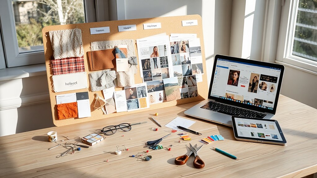
Mood boards can live on paper, on screen, or in a flexible mix, so choosing a format that fits your workflow matters.
You can start physical with a corkboard, fabric swatches, and printouts to capture tactile cues. This helps you feel material textures and weight, guiding decisions before you commit to digital steps.
If you lean digital, use streamlined templates and digital tools to assemble images, color swatches, and typography references quickly. Digital formats are easy to update and share with teammates, which keeps feedback loop tight.
A hybrid approach often works best: sketch ideas physically, then photograph or scan them into a digital board for collaboration.
Match your format to project tempo, team needs, and available tools to maximize clarity and speed.
How to Use Your Board to Decide Details
Your board should guide concrete decisions, not debates. Use it to lock down details by comparing options against your color harmony and your core inspiration sources. Let visuals push you toward consistency, not trend-chasing.
Start with the big choices (palette, materials, mood) and test each against one or two non-negotiables you’ve set. If an item isn’t aligning, remove it or replace it, immediately. When you reach consensus, document exact specs so vendors and collaborators can follow them precisely.
Your board becomes a decision brief, not a mood sketch. Maintain strict relevance: every element should reinforce the mood and color harmony you committed to. Revisit choices only if they threaten core goals, not whimsy.
- Aligns with color harmony
- Reflects clear inspiration sources
- Documents concrete specs
Iterate Fast: Evolve Your Mood Board Over Time
Keeping momentum means letting your mood board breathe and evolve. You should schedule regular, quick reviews—weekly or biweekly—so only fresh elements stay. Compare current visuals against your evolving concept and remove anything that no longer fits.
Add new images, textures, or colors that sharpen the narrative you’re pursuing, not just what’s trendy. Tie each addition to visual storytelling by asking how it communicates mood, setting, or character. Track emotional resonance: if a piece feels flat, swap it for something with nuance or contrast.
Use versioning to capture shifts without losing context. Remember, iteration isn’t chaos; it’s disciplined refinement. Lay out your criteria, test ideas, and let your board reflect your growing vision.
Common Mood-Board Mistakes (and How to Fix Them)

Mistakes creep in when a mood board lacks purpose, structure, or discipline. You’ll spot issues fast if you’re specific about goals, constraints, and audience. Without this, color clash and clutter chaos creep in, and the board stops guiding decisions.
- Define a clear brief and success metrics to avoid aimless selections.
- Limit elements, fonts, and swatches to maintain cohesion and focus.
- Regularly prune irrelevant items to keep momentum and relevance.
Fixes you can apply: set a unifying theme, batch-logo/colors, and test with a quick room or layout scenario. Use this board to validate choices before sourcing.
If you notice discord, remove or replace the offending piece, not the entire concept. Stay disciplined, iterate, and your board will translate into confident, actionable design.
Next Steps: Turn Your Mood Board Into Real Wins
Now that you’ve pinpointed common pitfalls and fixed cohesion issues, it’s time to convert your mood board into tangible outcomes. Start by translating visuals into concrete actions: assign clear owners, deadlines, and success metrics for each element. Prioritize decisions that advance your core goal, and document rationale to avoid backtracking.
Use your mood board as a living brief, not scenery—update it as feedback lands. Foster Emotional expression by inviting stakeholders to share reactions and interpretive notes, then fuse these voices into a unified plan.
Enable Creative collaboration through structured review sessions, rapid prototyping, and visible progress tracks. Cap outcomes with small, testable wins; celebrate them to sustain momentum and refine the board into real, repeatable results.
Frequently Asked Questions
How Long Should a Mood Board Take to Complete?
A mood board takes about 1–3 days, depending on scope. You’ll pinpoint ideas quickly, then refine. Focus on color schemes and material textures, arranging samples efficiently. Keep decisions practical, iterate, and lock your board once cohesive.
Can a Mood Board Influence Budget Decisions?
Yes, a mood board can influence budget decisions. You align goals with visual cohesion, guiding budget planning so expenditures match chosen aesthetics, avoiding misfires. Coincidence sparks rhythm: you see trends, then allocate funds, preserving coherence and cost control.
What’s the Best Size for a Digital Board?
For a digital board, 1920×1080 pixels works well, giving clarity and flexibility. You should tailor to your project, keeping Color schemes and Image sourcing balanced. You’ll adjust size as needed, but start with a crisp, scalable canvas.
How Often Should I Update a Mood Board?
Update your mood board every 2–4 weeks, or whenever your project pivots. Keep Color schemes and Material textures current, reflecting new inspirations and palettes to stay practical, cohesive, and ready for quick design decisions.
Do Mood Boards Require Citations for Every Image?
Yes, mood boards benefit from citations for every image you source, especially to track attribution. By ensuring visual consistency and careful image sourcing, you’ll sustain credibility and show professional rigor, even in quick, practical design decisions. Fun fact: citations boost perceived quality.
Conclusion
You’ve got a simple, repeatable path: collect, refine, and test until your board reflects what you actually want. Use it to make faster, smarter decisions and keep scope tight. For example, a hypothetical startup styled a mood board to align brand visuals in one week, slashing back-and-forth and landing a cohesive logo, palette, and photography brief. Iterate fast, trust the process, and let the board guide details as they evolve—without losing your original vibe.