
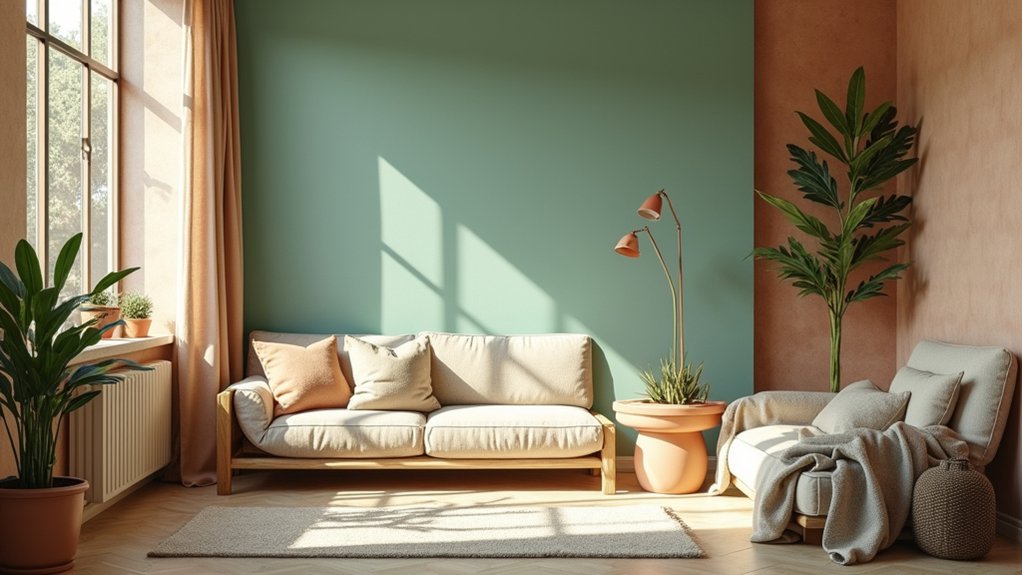

Nature-inspired palettes calm spaces and connect you to the outdoors. Start with earthy neutrals as soft backdrops, layered with mossy greens for grounding and sky blues or sea tones for expansion. For warmth, use sunset reds and peach oranges in limited areas to energize without overwhelm. Apply practical ratios (dominant 60–70%, secondary 20–30%, accents 10% or less) and choose durable, easy-care materials. Consistent lighting and finishes finish the look—and you’ll uncover more practical cues as you continue.
Key Takeaways
- Align palettes with natural cycles and environments to create calming, restorative spaces that feel grounded and cohesive.
- Use earthy neutrals as a base, layered with foliage and sky-inspired accents for harmony and balance.
- Incorporate nature-inspired textures, prints, and durable, easy-care fabrics to sustain longevity and visual interest.
- Apply color psychology with dominant, secondary, and accent ratios (60–70%, 20–30%, ~10%) for balanced rooms.
- Enhance spaces with sustainable finishes and appropriate lighting to reveal subtle color shifts and mood shifts throughout the day.
Foundations: Why Nature-Inspired Palettes Calm Spaces
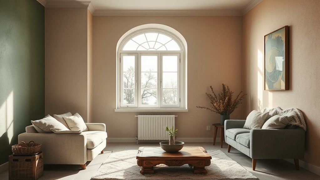
Nature-inspired palettes calm spaces by aligning our sensory environment with the patterns and rhythms found in the natural world. You’ll experience steadier mood, reduced stress, and clearer focus when color choices reflect ecological symbolism.
These palettes leverage Biophilic design principles to reconnect you with living systems, even in urban rooms. Start by prioritizing neutrals grounded in earth tones, then layer subtle accents drawn from foliage and sky.
Use low-saturation greens and browns to promote calm, with cool blues providing balance for concentration. Consider texture alongside hue to enhance perceptual stability.
In practice, map color decisions to natural cycles—dawn, noon, dusk—to guide contrasts and progressions. This approach yields cohesive spaces that feel authentic, purposeful, and restorative, without extraneous elements.
Mossy Greens for Grounded Living Rooms
Have you considered mossy greens as an anchor for grounded living rooms? Mossy greens anchor spaces with earthy calm, pairing well with indoor plants and benefiting from natural lighting. You’ll create tactful depth using muted greens, olive, and sage accents that feel organic rather than loud.
Tune contrast with warm woods and matte textures to keep the room cohesive and breathable. The palette supports serene focus, letting furniture and art breathe.
- Use low-profile greenery near windows to maximize natural lighting without glare.
- Layer textures—linen, jute, and clay—to reinforce the mossy feel while keeping surfaces tactile.
- Choose lighting with a soft, green-leaning hue to maintain cohesion after sundown.
Sky Blues and Sea Tones for Expansive Feel
Sky blues and sea tones open up interiors with a crisp, expansive feel. You’ll use cool neutrals as anchors, then layer brighter blues to mirror the sky’s mid-morning brightness.
Pick a base of pale azure or navy as a grounding backbone, and introduce seafoam, slate, or teal accents for depth. Balance glossy surfaces with matte textiles to mimic cloud formations—soft, drifting shapes that soften architectural lines.
Consider horizon gradients in a single wall or integrated through flooring and cushions, creating a seamless progression from light to darker hues. Use natural textures—linen, cotton, sisal—to enhance airiness without dulling contrast.
This palette boosts perceived space while maintaining calm, nautical clarity.
Sunset Reds and Peach Oranges for Warmth
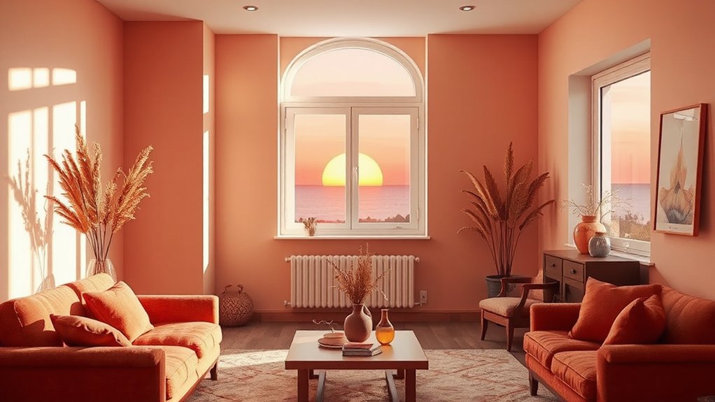
As you explore Sunset Reds Palette and Peach Orange Accents, you’ll see how warm hues can anchor a design with a confident, inviting glow.
Use the Sunset Reds as the core to create structure, then pair Peach Oranges as precise accents to soften and energize the composition.
This approach builds warmth through deliberate hue choices, maintaining clarity and visual balance across the palette.
Sunset Reds Palette
In practice, apply deep reds to focal walls or furniture and balance with peach hues in textiles and art, preserving harmony through contrast. Color psychology supports this approach: crimson evokes vitality, while peach soothes and invites conversation.
Cultural symbolism varies, but many traditions honor red as emotion and life force, making it ideal for social spaces.
Use the following guidelines to implement confidently:
- Choose one dominant crimson as the room’s anchor.
- Introduce peach accents in moderation to avoid glare.
- Balance with neutrals for longevity and versatility.
Peach Orange Accents
| Element | Placement | Density |
|---|---|---|
| Sofa/Throw | Living area | Medium |
| Lamp Shade | Side tables | Low |
| Artwork | Accent wall | High |
Warmth Through Hues
To add warmth to a space, weave sunset reds and peach oranges into key surfaces and accents so the room hums with inviting liveliness. You’ll leverage color psychology to evoke energy without overwhelming the senses, balancing intensity with soft neutrals. These hues carry cultural symbolism across traditions, enriching the atmosphere with familiar warmth.
Apply restraint: feature walls or upholstery in a single saturated shade, then use peach accents for contrast and calm.
- Choose a primary sunset red for focal areas, pairing it with warm neutrals to anchor the room.
- Layer peach orange textiles and decor to diffuse brightness and invite relaxation.
- Use controlled lighting to modulate perceived warmth, aligning with cultural expectations and personal taste.
Earthy Neutrals as Soft Backdrops
Earthy neutrals serve as soft, unobtrusive backdrops that ground color palettes without overpowering them. You’ll use these hues to create calm rooms that feel grounded, not bland. Think warm beiges, dusty taupes, and muted greys as your base, then layer with richer accents for contrast.
In practice, these tones support color psychology by reducing visual fatigue and advancing a sense of stability, which helps occupants focus and relax. They also align with historical color trends, echoing timeless palettes that have endured through decades of design shifts.
Apply them on walls, floors, and large furniture to anchor your scheme, then introduce small pops of color through textiles and art. Keep textures varied to add interest without disrupting the serenity of the backdrop.
Leafy Textures: Wood, Linen, Stone Pairings
Leafy textures come alive when you pair wood, linen, and stone with intention. You’ll create tactile depth by mixing warm wood grains with cool linen and rugged stone, keeping lines clean to let textures speak.
Use contrast to emphasize natural elements: matte stone against satin wood, breathable linen with crisp edges. Wildflower motifs and botanical wallpapers reinforce the theme without overwhelming the space, guiding your eye through layers.
Maintain a balanced palette that respects the texture hierarchy, then let textiles and surfaces lead the room’s rhythm.
- Align wood tone with stone undertone, then soften with linen’s texture and color.
- Layer botanical wallpapers behind furniture to create depth without clutter.
- Choose finishes that mirror nature’s subtle contrasts, avoiding high-gloss reflections.
Balancing With Light White and Gray Neutrals
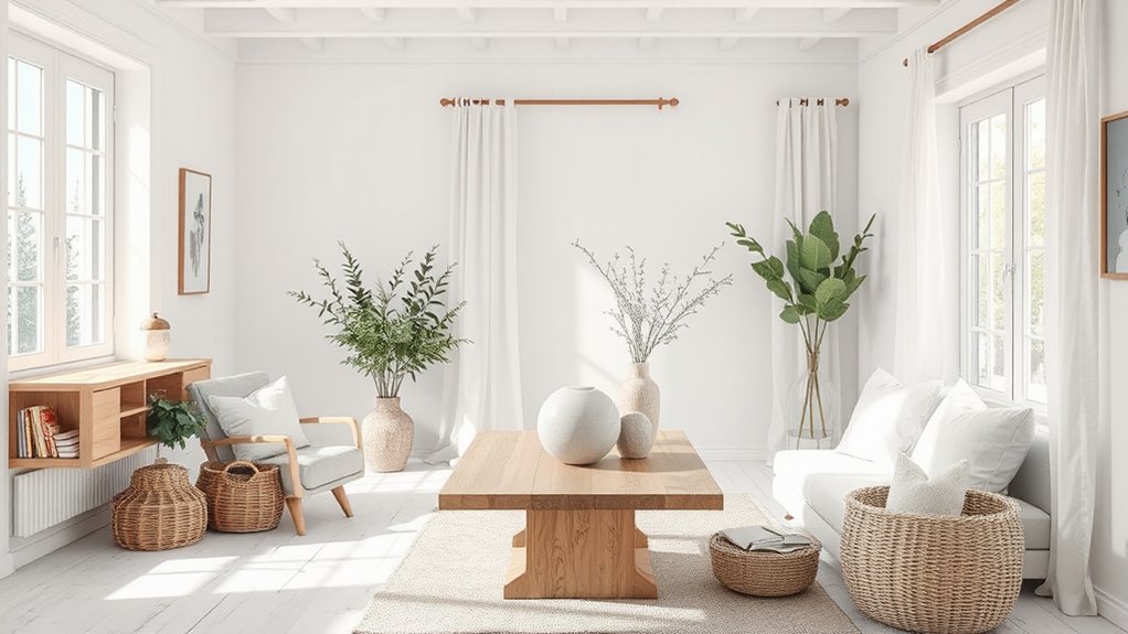
White and gray neutrals create a quiet backbone for any palette, so you can balance lighter tones without dulling contrast. You’ll use white neutrals to reflect light in rooms with limited windows, while gray tones ground the space and prevent glare. Pair warm whites with cool grays to avoid a sterile feel, then introduce texture to keep depth. Incorporate subtle shifts in value to guide the eye without shouting color.
| Column A | Column B |
|---|---|
| Use white neutrals for ceilings and walls | Add gray tones through furniture and textiles |
| Introduce texture (linen, wool) | Use accent pieces sparingly |
This approach yields calm, cohesive rooms that feel airy yet modern, leveraging white neutrals and gray tones to balance brightness and shade.
Proportions: How Much Nature Color Is Right
You’ll set proportions by balancing Natural Balance Ratios with Subtle Hue Volume, so your palette feels cohesive without overpowering a scene.
Start with a dominant nature color and let accents obey a measured ratio to keep visual weight in check. This approach keeps your work practical, precise, and ready for real-world use.
Natural Balance Ratios
- Determine a dominant nature color (60–70%), complemented by a secondary hue (20–30%), then an accent (10% or less) to punctuate.
- Align tones to a shared temperature (warm or cool) for seamless flow across walls, textiles, and furnishings.
- Use texture and natural materials to reinforce balance, letting daylight reveal subtle shifts without competing elements.
Subtle Hue Volume
Color psychology informs choices: soft greens evoke renewal, muted blues promote calm, and warm terracotta adds comfort without dominance. Balance matters: pair bold hues with muted surroundings to avoid visual fatigue, and repeat a single accent color across textiles, artwork, and hardware for cohesion.
Cultural symbolism can guide tone—forests imply growth, waters imply clarity. Maintain restraint, aim for harmony, and the space remains inviting.
Room-by-Room: Living Room Palette Playbook
A living room palette should anchor your space with a core color while supporting accent hues that reflect nature’s mood. You’ll balance calm neutrals with textures and prints that energize without overwhelming, using practical guidelines you can apply today.
In this room-by-room playbook, focus on cohesion, contrast, and function to create a welcoming, durable environment.
1) Choose a grounding core color, then layer with two to three nature-inspired accents—think wildflower patterns for soft flair and forest-inspired textiles for depth.
2) Select durable fabrics and finishes, prioritizing easy-care options in upholstery, rugs, and cushions that echo the core hue.
3) Test mood shifts with swatches in both daylight and artificial light, adjusting contrast and saturation to maintain harmony.
Room-by-Room: Bedroom Palette Techniques
To craft a bedroom palette that promotes rest and mood perfection, start with a grounding core color and layer in two to three nature-inspired accents that set the room’s vibe. Choose a calm base—soft gray, sage, or misty blue—and anchor with durable, low-reflection finishes.
Introduce accents drawn from nature: a fern-green textile, stone-gray bedding, and wood-toned furniture highlights. Balance contrast with complementary neutrals to preserve serenity.
Apply nature-inspired color psychology by pairing cool and warm notes to modulate energy through the day, while preserving nighttime calm.
Opt for sustainable material choices: hemp sheets, wool throws, solid-wood nightstands, and low-VOC paints.
Limit glossy surfaces to reduce glare, and assure consistent lighting to support restorative sleep.
Maintain cohesion through repeat color cues and textures.
Room-by-Room: Kitchen and Dining Color Strategies
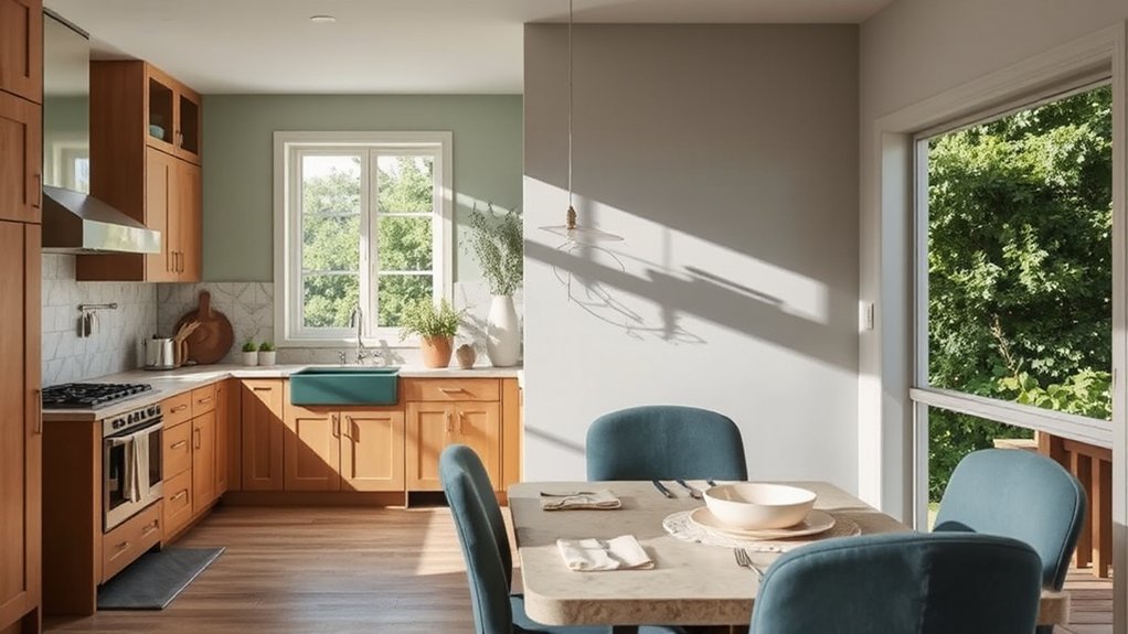
When planning a kitchen and dining color strategy, start with a durable, reflective-safe base and layer two to three nature-inspired accents that define the space’s energy. You’ll create contrast, cohesion, and a sense of calm that supports daily meals and hosting.
Use outdoor inspired art as focal points and let botanical wallpaper anchor accent walls for depth without overwhelming. Balance warm cabinets with cool counters to keep the room feeling open and practical.
- Choose a muted base with a hint of sheen, then introduce botanical wallpaper on a feature wall.
- Pair garden-inspired art with durable, easy-clean surfaces for longevity.
- Apply color pops through textiles and small décor that echo outdoor palettes.
Finishes and Light: Elevating Nature Hues With Sheen and Lighting
Finish surfaces and lighting with intent: choose sheens that enhance nature hues while supporting practicality. You’ll pair finishes with room function, using matte or eggshell on walls for diffused light and washable semigloss in high-traffic zones.
In kitchens and baths, select sustainable finishes that resist moisture and staining, preserving color integrity over time. Light plays a critical role: warmer bulbs soften greens and browns; cooler tones sharpen blues and grays.
Consider color psychology to cue mood—soft greens feel calming, earthy browns ground a space, and muted blues invite focus.
Balance sheen with texture: matte ceilings, satin trim, and a subtle gloss on cabinetry create depth without glare. Prioritize sustainable finishes to reduce environmental impact while sustaining beauty and longevity.
Frequently Asked Questions
How Many Nature-Inspired Colors Should I Use per Room?
You should use 3–4 nature-inspired colors per room. Favor earth tone combinations and complementary color schemes, balancing neutrals with a couple of accent hues to keep depth without crowding the space. Keep it practical, cohesive, and easy to live with.
Which Tones Pair Best With Bold Nature Hues?
Bold nature hues pair best with neutral foundations. To overcome hesitation, start with a calm backdrop, then add Wildflower accents and Sunset hues for contrast and depth that feel balanced, timeless, and practical for daily living.
Do Natural Palettes Affect Room Acoustics or Air Quality?
Natural palettes can enhance sound absorption and air purification modestly, but don’t rely on them alone; pair with proper materials, ventilation, and acoustical treatments to meaningfully improve room acoustics and air quality.
How to Balance Light in North-Facing Spaces With Greens?
You can balance light in north-facing spaces with greens by embracing natural lighting techniques and sustainable material choices; use light-reflecting paints, strategic mirrors, and layered greenery to brighten, while keeping textures and fabrics environmentally mindful.
Can I Use Nature Colors in Small Apartments Effectively?
Did you know 60% of small apartments feel cozier with nature-inspired palettes? You can use indoor plant integration and natural lighting strategies to make the space appear larger, calmer, and more vibrant without overwhelming your walls.
Conclusion
Nature isn’t just a backdrop—it’s your design compass. When you embrace mossy greens, sky blues, and earthy neutrals, spaces feel grounded, expansive, and calm. A single swatch can shift mood; research shows color impacts perceived temperature and comfort. Imagine your living room as a forest floor: with layered greens and natural textures, you’ll move through it with ease. Start small: test a mossy accent wall, then expand as you sense the room breathe. Your home, refreshed by nature.