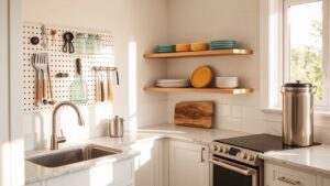
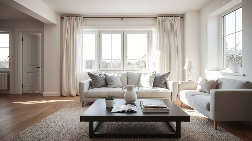

Imagine this: a room that feels curated, not chaotic, where every detail earns its place. You can achieve that designer look on your own by defining a clear style, building a cohesive color palette, and layering textures with intention. You’ll balance bold patterns with subtle finishes and master space with thoughtful lighting. Ready to tighten your choices and test them in real conditions to avoid costly missteps? Let’s start shaping a polished, high-end result.
Key Takeaways
- Define a cohesive style and goals, audit current spaces, and create mood boards to guide all decisions.
- Build a limited, adaptable color palette (dominant base, 1–2 accents) and test under different lighting.
- Establish a consistent design system: fonts, image treatments, spacing, and standardized hardware across spaces.
- Elevate surfaces with layered textures, balanced patterns, and controlled materials for depth and richness.
- Plan layout and flow with focal points, traffic paths, negative space, and color psychology to convey mood.
Define Your Designer Look: Identify Your Style Gaps and Goals
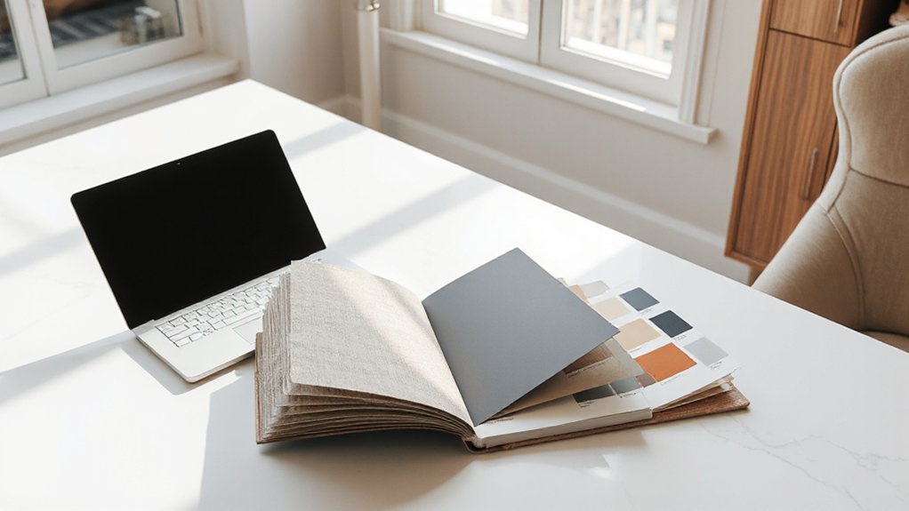
To define your designer look, start by pinpointing what you like and what you don’t. You’ll identify gaps between your current spaces and your goals, then map a practical path forward.
Begin with a quick audit: note elements you consistently admire, plus those that feel off. Create mood boards to visualize themes, textures, and silhouettes you’re drawn to, and compile a style inventory that lists finishes, furniture lines, and color accents you favor.
Compare these to your existing room, then prioritize changes that deliver the biggest impact with the least effort. Use your inventories to guide purchases and DIY tweaks, ensuring every choice aligns with your target aesthetic.
This disciplined approach keeps you focused, measurable, and steadily closer to a cohesive, designer-inspired result.
Build a Cohesive Color Palette on Any Budget
Color is the backbone of your designer look, so you’ll want a cohesive palette you can rely on across every room and project. Build this by anchoring with a neutral base and 1–2 accent hues that repeat throughout spaces.
Prioritize color harmony: choose complementary or analogous relationships rather than random pairings. Start with a limited palette, then layer in textures and lighting to enrich the scheme without expanding the core colors.
Use swatches, not guesses, and test under different light throughout the day. Document your palette creation in a simple rule: one dominant, one secondary, and one accent.
Apply consistently in walls, furnishings, and accessories for unity, flexibility for future updates, and a cohesive designer look on any budget.
Choose Textures That Elevate Surfaces and Fabrics
Textures are the quickest way to elevate surfaces and fabrics without changing their core materials. You’ll gain instant depth by layering tactile elements with deliberate contrast. Choose textiles and finishes that create textural contrast, such as a soft velvet against a smooth leather or a rough linen against polished metal.
Pair matte wallpapers with glossy surfaces to heighten surface enhancement without overhauling structure. Vary scale thoughtfully: oversized textures command attention, while finer weaves add subtle richness. Use natural materials where possible—cotton, wool, wood, stone—then introduce a single, controlled accent texture to avoid clutter.
Consider lighting and shadows, letting texture read differently at day and night. To put it briefly, texture strategy should amplify, not distract, guiding the eye across the room.
Master Layout: Balance Scale, Space, and Flow
After elevating surfaces with textures, the room’s real impact comes from how you arrange it all. Master layout means balancing scale, space, and flow so nothing fights for attention. Start with a focal point and let others support it without competing.
Use proportion: pair large pieces with smaller accents to keep a calm rhythm. Map routes so traffic moves naturally, avoiding tight clusters that trap movement.
Establish balance by distributing visual weight—color, texture, and form—across the room to create harmony. Plan negative space deliberately; it boosts breathing room and highlights key elements.
Prioritize spatial flow by staggering furniture, guiding sightlines, and aligning edges. When in doubt, edit relentlessly for balance, harmony, and smooth spatial flow.
Typography That Lifts Your Brand or Style
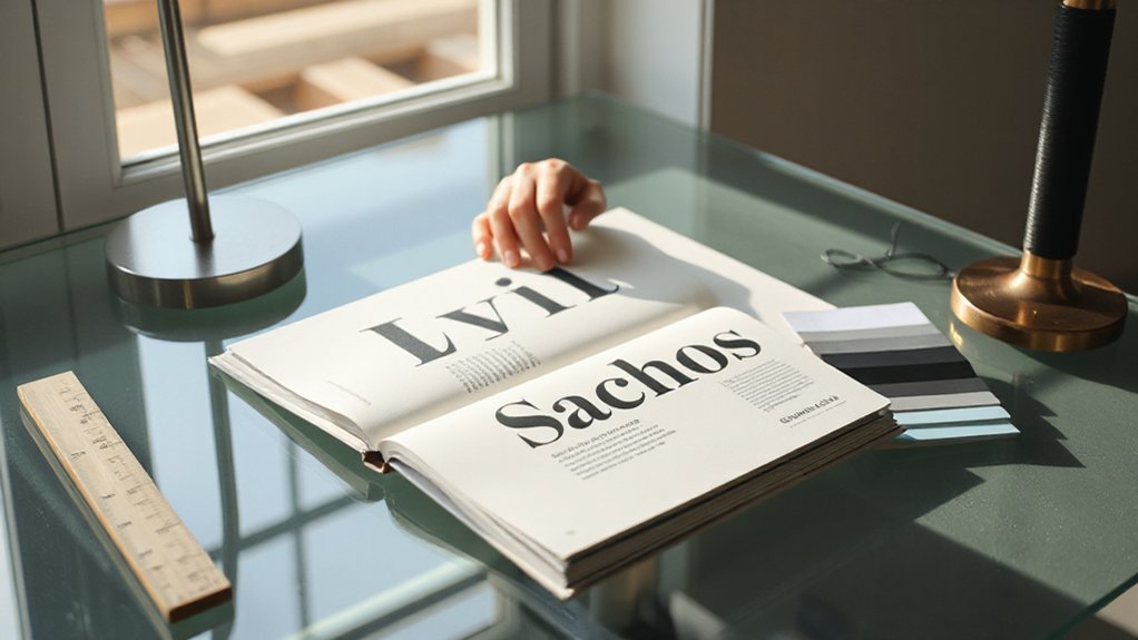
Typography isn’t just about fonts; it’s the backbone of your brand’s voice. You modernize your look by choosing type with purpose, not just personality. Start with a primary typeface that reflects your character—then pair it with a legible secondary for hierarchy.
Prioritize readability across screens and print, using 1–2 weights per family to maintain consistency. Consider typography trends thoughtfully; adopt elements that support your message rather than chase novelty.
Use font psychology to cue emotions: sturdy serifs for trust, clean sans for clarity, a distinctive display for emphasis. Maintain ample line length, spacing, and contrast to guide readers effortlessly.
Test across devices, print, and branding materials, adjusting kerning and rhythm until your words feel cohesive, confident, and unmistakably yours.
Select Timeless Statement Pieces That Still Feel Current
Choose timeless pieces that pop today, like a standout chair or coat, so your space feels anchored yet fresh.
Mix current touches with classic investments—think clean lines, quality materials, and understated hardware.
Prioritize investment-worthy staples now to keep your look cohesive long-term.
Timeless Pieces That Pop
Timeless pieces act as the backbone of a polished look, yet they should still feel fresh. You choose foundational items that nod to past eras without shouting vintage. Start with clean, tailored silhouettes and quality fabrics that adapt to trends without aging.
Add vintage accents thoughtfully—think a sculpted chair, a midcentury-inspired coffee table, or a sturdy wooden dresser—so room energy remains cohesive rather than cluttered. Let statement lighting do the heavy lifting: a bold chandelier or architectural sconces instantly elevates ambiance without overhauling decor.
Keep color palettes restrained; monochrome or earth tones let these pieces shine. Balance texture and form to avoid flatness, and guarantee maintenance is minimal. When you mix timeless with a modern vibe, your space feels deliberate, not dated.
Current Yet Classic Choices
To keep your space current without losing its classic backbone, start with timeless statement pieces that pair clean lines with modern sensibility. Choose items that blend simplicity with rare character, so your rooms feel intentional rather than trend-driven.
Prioritize pieces that carry Vintage charm yet remain versatile enough to swap accessories around. Opt for a sofa with a timeless silhouette, a coffee table that pairs metal and wood, or lighting with subtle sculptural quality.
Introduce Artistic flair through a standout rug, a bold-but-refined piece of art, or a single, unexpected accent color carried across textures.
Limit clutter by allowing each piece to serve a clear purpose. Balance finishes, embrace negative space, and let enduring shapes anchor your evolving palette.
Investment-Worthy Design Staples
Investing in a few key staples pays off in flexibility and longevity. You’ll build a foundation that resists trend fatigue while adapting to evolving spaces. Choose a handful of timeless elements: a clean sofa, a balanced coffee table, quality lighting, and a neutral palette with one accent splash.
Prioritize proportion, craft, and finish over flashy novelty, so you can refresh accents without replacing core pieces. For practicality, select versatile fabrics, easy-clean surfaces, and modular layouts that scale with life events.
Integrate thoughtful details—soft textures, smart storage, and quiet hardware—that read as intentional design. You’ll notice why gardening tips and tech gadgets win here: both emphasize utility, durability, and subtle refinement that stays current season after season.
Pair Bold Pieces With Timeless Basics
Accessories pairing should be deliberate: pick one metallic, one texture, and one color accent that ties the palette together. Fabric selection matters—avoid two glossy fabrics together; mix matte with subtle sheen for depth.
Fit is nonnegotiable: trim at the shoulders, correct sleeve length, and seams that skim, not cling. Build capsules around neutral foundations—black, navy, gray, or taupe—and remix with bold accents.
Maintain cohesion by repeating a guiding silhouette and keeping accessories refined, functional, and proportionate to your frame.
DIY Tweaks That Look Professionally Made
Small tweaks can yield a polished, designer-like finish without the price tag. Start with deliberate layering: mix textures, vary heights, and balance negative space to echo professional setups.
Replace generic hardware with matte black or brass details on cabinets and drawers to elevate perceived quality instantly.
Tighten seams, trim uneven edges, and finish surfaces with a simple, durable sealant to preserve color and texture.
Choose a cohesive color story across rooms and stick to it for visual harmony.
Embrace creative collaboration by pooling ideas with a friend or designer for fresh perspectives, but execute yourself to stay authentic.
Prioritize sustainable sourcing: upcycle where possible, opt for certified materials, and favor long-lasting pieces over ultra-trendy buys.
Precision and restraint trump impulse for a refined result.
Lighting Tips to Transform Mood, Depth, and Perception
Layered lighting creates depth and mood by combining ambient, task, and accent sources you control.
Start with a warm, color-accurate ambient wash, then add focused task lights and subtle accents to sculpt space.
You’ll boost perception and adaptability by adjusting color temperature to suit the moment.
Layered Lighting Effects
Layered lighting creates depth and mood by combining ambient, task, and accent layers so your space feels intentional rather than flat. With a strategic mix, you control atmosphere and focus, not just brightness.
Start by setting ambient lighting to a soft baseline, then add task lights for practical areas, and finish with accent pieces to sculpt shadows and highlight features. Use dimmers to fine-tune intensity, and vary color temperatures to preserve depth.
Layered lighting and ambient accents work together to shape perception, making rooms feel coordinated, not cluttered. Plan layouts that minimize glare and ensure easy reachability to switches.
- Balance ambient accents with dedicated task zones
- Install dimmable layers for flexibility
- Choose varying color temperatures within a cohesive range
- Highlight architectural features with targeted accents
Mood-Boosting Color Temperature
Use a deliberate mix: ambient glow for depth, task light for clarity, and accent light to punctuate color. Align color temperature with intent to achieve color harmony across fixtures and walls, preventing jarring shifts.
If you want mood enhancement, bias toward warmer temps in social zones and cooler temps in work zones. Dim-to-warm controls amplify mood shifts without changing fixtures.
Standardize bulbs and maintain consistent CRI for true, accurate tones, ensuring a cohesive designer look without hiring a pro.
Finishing Touches: Hardware, Accessories, and Details That Sing
Hardware, accessories, and small details often make or break a designer look, so choose thoughtfully and strike a balance between cohesion and personality. You can elevate spaces by focusing on intentional hardware accents and restrained accessory layering that echo your core vibe without shouting.
- Choose hardware accents in finishes that mirror other metals for a cohesive gleam.
- Layer accessories with purpose: pair a statement piece with quiet, repeating elements.
- Opt for tactile details: textures, knurling, and subtle engravings for depth.
- Edit relentlessly; one well-placed item beats several generic pieces.
How to Source Affordable, Design-Forward Materials
You can start by identifying affordable material sources that still read design-forward, focusing on durable, statement-making options.
Look for curated picks that balance trendiness with timeless appeal, and compare finishes, textures, and samples before committing.
Keep budget-conscious procurement in mind by prioritizing versatile pieces and scalable quantities that maximize impact without overspending.
Affordable Material Sources
To get a designer-ready look without breaking the bank, start by knowing where to source affordable, design-forward materials. You’ll optimize style by targeting value-driven channels, balancing cost with durability, and prioritizing timeless finishes.
Sustainable sourcing and Vintage finds should guide choices, ensuring materials last and age gracefully.
- Local salvage yards and architectural outlets for unique, budget-friendly options
- Community marketplaces and maker spaces offering repurposed timber and metals
- Overstock, closeouts, and factory seconds from reputable suppliers
- Refined secondhand shops and vintage dealers with in-demand textures
Design-Forward Material Picks
Ever wonder how to pick design-forward materials without blowing the budget? You can. Focus on materials with lasting impact and versatile textures, then balance them with restrained color. Start with a simple palette and repeat key tones across surfaces to create cohesion—this is color coordination in action.
Prioritize material textures that read as premium in real life, such as matte laminates, subtle terrazzo, or textured ceramics, rather than high-gloss finishes that scream trend. Seek durable, affordable options: engineered woods, solid-surface substitutes, and textile-backed laminates pair well with metal accents.
When you mix patterns, limit contrast and repeat motifs to avoid visual overload. Sample before committing; compare weight, warmth, and tactile appeal.
Finally, document your selections in a mood sheet to guarantee consistency across furniture, walls, and textiles.
Budget-Conscious Procurement Tips
Here’s how to source affordable, design-forward materials without compromising quality: start with a clear material hierarchy—prioritize durable surfaces like engineered wood, solid-surface substitutes, and textile-backed laminates. Then layer in texture with matte finishes and subtle terrazzo.
You’ll optimize value by pairing cost-effective bases with high-impact accents, vetting vendors for warranties, and choosing stock colors that align with your palette.
- Budget shopping strategies: compare bulk pricing, sample before committing, and track long-term wearability
- DIY hacks: refinish instead of replace, upcycle existing pieces, and upcharge with removable veneers
- Source smartly: rotate suppliers seasonally to catch promotions and closeouts
- Quality checks: test joinery, edge detail, and finish durability before purchase
Space Planning for Rooms, Outfits, and Brand Visuals
Good space planning ties rooms, outfits, and brand visuals into a cohesive whole; start by defining function, flow, and focal points for each area.
For rooms, map use, traffic paths, and light sources, then assign a primary feature to anchor the space.
For outfits, translate function into silhouette, fabric, and layering that move with your day, ensuring a clear visual thread.
For brand visuals, establish a consistent grid, typography, and image style that carry across touchpoints.
Prioritize progressions between zones, ensuring rhythm and balance in scale and color.
Consider Artistic expression and Cultural influences as guiding cues, but keep execution practical: measurements, budgets, and timelines drive decisions.
End with a simple checklist to verify cohesion before implementation.
Color Psychology: Evoke the Right Mood With Color
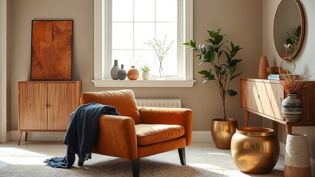
Color mood shifts show how color choices quietly steer perception, energy, and emotion in any space. You’ll use color psychology to select hues that reinforce your brand visuals and room vibe, from calming neutrals to energizing accents.
Start with a core mood, then layer supporting tones to reinforce it without overwhelming the design.
Color Mood Shifts
- Choose a dominant base, then add a contrasting accent to sharpen focus.
- Alternate cool and warm notes at logical intervals for clear mood shifts.
- Limit your palette to 2–3 hues for sharp, confident shifts.
- Test lighting alongside color changes to preserve intended vibes.
Psychology of Hues
What mood do hues create, and how can you leverage that knowledge to design with intent? When you pick colors, you’re not guessing—you’re guiding perception. Hue psychology shows that different tones evoke distinct responses: calm blues for focus, energetic oranges for calls to action, and balanced greens for trust.
Use color harmony to keep your palette cohesive: choose a primary hue and supporting accents that share undertones, then add a neutral anchor to ground the design. Limit contrasts to avoid cognitive overload; high contrast attracts attention, but too much can feel jarring.
Test with real-world light to confirm mood holds in your environment. In practice, map each hue to a goal, then align typography, imagery, and layout accordingly to reinforce the intended effect.
Consistency Cues: Build a Recognizable Style System
Consistency cues create an unmistakable identity by aligning fonts, imagery, and layout across every touchpoint. You’ll craft a repeatable system that signals professionalism, helps recognition, and strengthens personal branding across channels like social media.
- Define a core type family and hierarchy for headlines, body, and captions
- Choose a restrained color palette and apply it consistently
- Standardize image treatments, aspect ratios, and cropping rules
- Document usage rules for logos, icons, and spacing
Apply the system everywhere you communicate, from your website to posts and emails. When you update visuals, do so in small, centralized edits to maintain continuity.
This approach makes your presence cohesive, efficient, and memorable, reinforcing authority without needing a designer. Consistency cues enable you to scale your personal branding confidently on social media.
Texture and Pattern Pairing That Stays Harmonious
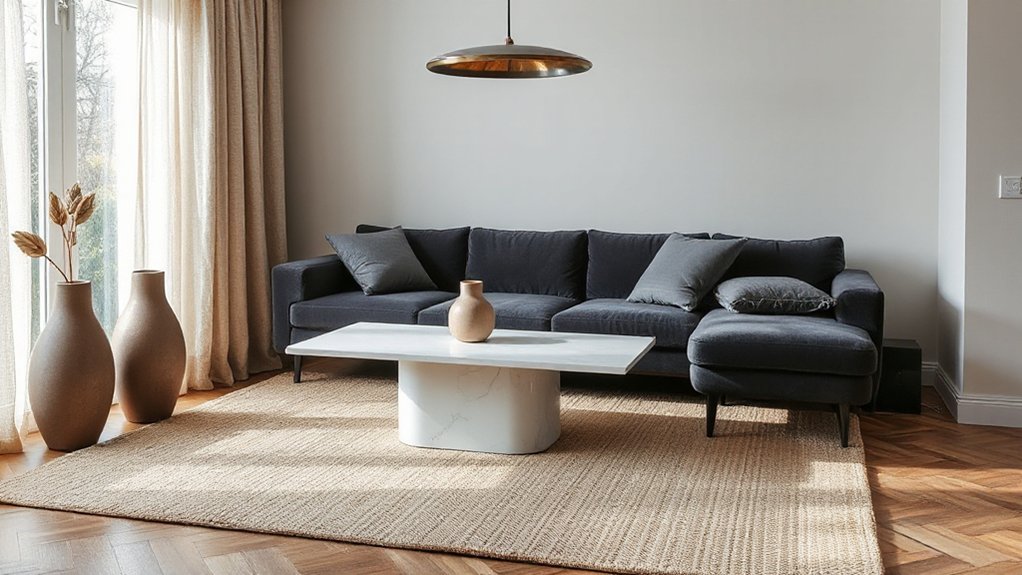
Texture and pattern pairing can elevate your visuals without clutter; when done right, complementary textures guide the eye and create a cohesive feel across channels. You’ll achieve harmony by prioritizing texture contrast and deliberate pattern mixing.
Start with a dominant texture as your base and add a secondary pattern in a restrained scale. Keep color palettes cohesive—three max—so contrast remains intentional, not chaotic.
Use repetition to stitch looks together: repeat a motif, a weaving, or a grain across layouts, surfaces, and digital panels. Balance bold patterns with subtle textures to avoid visual fatigue.
Test at typical viewing sizes, then refine spacing, margins, and alignment to preserve rhythm. When in doubt, simplify: texture contrast plus measured pattern mixing yields a polished, designer-like finish.
Budget-Friendly Toolkits to Simulate Pro Polish
You can stretch your budget with toolkits that deliver pro polish without the price tag. Look for bundles labeled for design power-ups—think fonts, palettes, mockups, and workflow templates that pair well together.
These kits help you move from casual to polished quickly, so you can focus on impact over expense.
Toolkits For Pro Polish
If you’re aiming for pro polish on a budget, start with the right toolkit that replicates the look and feel of design software without the price tag. You’ll blend affordable software, plug-ins, and templates to mimic high-end workflows, then tailor outputs with tight alignment, clean typography, and consistent spacing.
Focus on sustainable materials and cultural influences when sourcing assets and textures to keep projects cohesive and meaningful.
- Free or low-cost vector and raster editors with pro-grade export options
- Template libraries that enforce grid systems and typography scales
- Style kits and palettes inspired by diverse cultural influences
- Lightweight, non-destructive editing workflows that preserve originality
Budget Design Power-Ups
Prioritize typography scales, consistent margins, and automated alignment to remove guesswork. Leverage stock assets and adjustable cameras or mockups to present a polished finish fast.
Track color with a simple rule: two neutrals, one accent, and one highlight for emphasis. Use reusable components so updates stay cohesive across pages or posts.
Infuse your work with artistic expression by tweaking texture, spacing, and rhythm. Let cultural influences guide motif choices, ensuring authenticity without overcomplication.
These budget tools deliver credible, professional results you can own.
What to Avoid: Common Designer-Look Mistakes and Quick Fixes
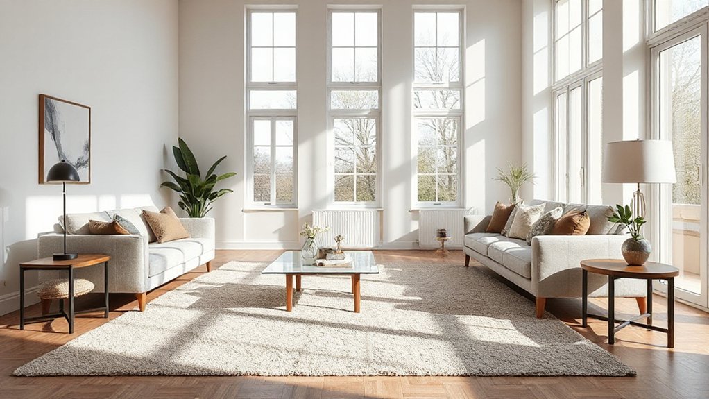
Common designer-look mistakes derail projects fast, but you can spot and fix them quickly. You’ll avoid over-contrast palettes, cluttered surfaces, and mismatched materials by sticking to a cohesive plan. Keep scale and proportion in check, so items read intentionally rather than randomly placed.
- Use a restrained color palette and repeat key tones
- Pair statement pieces with simple foundations to prevent overwhelm
- Align finishes and textures across furniture, textiles, and accessories
- Integrate fashion accessories and art installations thoughtfully to reinforce a curated feel
Quick fixes: declutter surfaces, remove one competing focal point, and test lighting at multiple times of day. Then verify that every element serves function and mood, not just novelty.
This keeps the look polished, practical, and on-brand.
Test a Look Before You Commit: Quick Validation Steps
To test a look before you commit, run fast, low-risk validation steps that reveal what works and what doesn’t. Start with one signature element, like a color story or a single accessory, and evaluate it in isolation. Check under different lighting and in motion to gauge consistency. Use mirrors, photos, and quick feedback from a trusted friend to spot overreliance on fashion trends or dated styling.
Limit changes to small, reversible tweaks so you don’t derail the whole look. Track outcomes: do you feel confident, or self-conscious? Consider social media influence by comparing your test shot to relatable, authentic posts, not glamour shots. If the result feels true to you, advance; if not, iterate promptly.
Real-World Before-and-After Case Studies
- Consistent framing and lighting elevate display
- Muted palettes unify disparate pieces
- Capsule wardrobe simplifies styling decisions
- Strategic accessories complete ensembles without overload
Next Steps: Refining Your Look Over Time and on Future Projects
As you refine your look over time and onto future projects, set a clear, repeatable process: assess what works, capture lessons, and apply tweaks in small, measurable steps. You’ll formalize a routine: review outcomes, track metrics, and identify patterns that signal success or failure.
Use those signals to prune clutter, reinforce proven elements, and introduce minimal, purposeful changes with each new project. Build a living style playbook that documents decisions, fabrics, finishes, and proportions.
Prioritize trend forecasting to anticipate shifts without chasing every fad. Emphasize sustainable sourcing to maintain quality and responsibility across projects.
Regularly test assumptions in low-stakes contexts, then scale what proves durable. Maintain discipline, iterate relentlessly, and your designer-look confidence will compound over time.
Frequently Asked Questions
How Do I Start Defining My Designer Look Quickly?
Start by defining your vibe in a sentence, then pick a color palette and key furniture pieces. Use cohesive color palettes, test lighting, and arrange furniture to balance flow. Keep it practical: note scale, distance, and focal points.
Whatbudget Tips Help Achieve High-End Feels Affordably?
You can stretch your budget by prioritizing timeless color palettes and smart furniture arrangements. Start with a few high-impact pieces, mix budget finds with quality staples, and curate decor thoughtfully to mimic a designer’s cohesive, refined look.
Which Quick Tweaks Elevate Surfaces and Fabrics?
Color coordination and texture layering elevate surfaces fast: you mix complementary hues, swap bold fabrics for subtle weaves, and pair matte with sheens. You add a statement throw, calibrate scale, and keep lines clean for cohesive, polished results.
How Can I Test a Look Before Committing?
Test your look by a timed room mock-up and swap elements in real life. Try a cohesive color palette, and adjust furniture arrangement to confirm flow, scale, and comfort before committing; iterate until everything feels right.
What Are Simple Consistency Cues for a Unified Style?
Like a well-tuned engine, you adjust a color palette and pattern mixing for simple consistency cues. You keep the color palette cohesive, repeat key motifs, and guarantee proportional patterns, so every element feels unified and deliberate.
Conclusion
Ready to own the look you crave? Think of your space as a canvas, each choice a deliberate brushstroke. Define your goal, curate a color story, layer textures, and test early—then prune ruthlessly. When the layout flows, and lighting casts the right mood, your room speaks with quiet confidence. You don’t hire a designer—you harness your choices. Refine, repeat, and watch the space evolve with you, becoming more polished and distinctly yours, from first glance to lasting impression.