


Turn awkward spaces into coherent zones with practical steps you can act on now. Start by identifying blockers—odd alcoves, wasted corners, and traffic pinch points—and map the room from entry to exit. Measure carefully, establish a single focal point, and define zones with appropriately sized rugs. Use color blocks to anchor furniture, lean into modular, lightweight solutions for tight angles, and refresh seasonally with small updates. If you keep applying these moves, you’ll discover even more efficient, stylish layouts.
Key Takeaways
- Identify awkward spaces by mapping flow, tension points, and misread movement to guide redesign decisions.
- Establish a clear focal point and rotate furniture to emphasize natural silhouettes and visibility.
- Zone irregular areas with appropriately sized rugs, mats, and consistent edges to improve function and safety.
- Use color blocking and textures to distract from imperfections while maintaining cohesive undertones.
- Plan gallery-style layouts with measured plans, flexible lighting, and temporary anchors before finalizing.
Identify Your Awkward Space: Common Causes and How They Limit Design

Awkward spaces usually show up when a room’s flow is blocked, its functions clash, or you misread how people move through it. You’ll spot tension where furniture blocks paths, doors open into furniture, or traffic feels forced.
Common culprits include odd alcoves, wasted corners, or dual-purpose areas that fight for attention. The layout limits how you use the space and whether you feel comfortable there.
Evaluate how you enter, navigate, and exit, then map how each zone should function. This clarity helps you decide where to adjust.
Think about furniture placement first, ensuring clear walkways and logical sightlines. Then consider color schemes that unify disparate areas and visually expand the room, reducing the sense of fragmentation.
Identify constraints, then plan targeted improvements.
Measure and Map Your Room in 5 Simple Steps
To map your space quickly and accurately, start with 5 straightforward steps: measure walls and doorways, record window locations, note built-ins, sketch the floor plan, and verify scale.
You’ll then translate measurements into a usable plan: note wall lengths, door swings, and any alcoves. Capture ceiling height to anticipate vertical clearance and furniture proportions, ensuring tall pieces don’t crowd low ceilings. Mark electrical outlets and light switches for practical placement. Use a simple, to-scale sketch—no embellishment—so furniture fits as planned.
Record window sizes and their distances from corners to estimate natural light. Double-check door openings to avoid clashes with sofas or consoles. Finally, verify scale with a ruler, translating real dimensions into your layout to guide placement confidently.
Establish a Focal Point When Plans Don’t Align
When plans clash, pick a single focal point to anchor the room and guide every other decision. You establish hierarchy by identifying one element you love and centering the layout around it. Use that focal point to orient furniture, lighting, and décor so space division becomes clear, even in irregular footprints.
Sketch sightlines and place the main seating or display where it’s most visible from key entry points. Minimalism helps: let the focal point breathe and avoid clutter that competes with it.
If you’re unsure, rotate items until the strongest silhouette appears dominant from most angles. Maintain balance by pairing supporting pieces to echo the focal point’s scale and color.
Clear focal point, decisive arrangement, confident space.
Color Schemes for Irregular Corners

Irregular corners demand a deliberate color strategy that unifies oddly shaped spaces. You choose color schemes that create a cohesive flow, guiding the eye around misaligned walls and alcoves.
Begin with color harmony: pick a dominant shade and two supporting tones that share undertones, so contrasts feel intentional rather than accidental. Palette selection should consider light sources, room function, and furniture finishes to prevent clashing reflections.
Use lighter tones to visually expand tight corners, and reserve deeper hues for accent zones to anchor the layout. Consider a unifying midtone across walls, trim, and built-ins, then introduce a contrasting chair or artwork for focal relief.
Test swatches on multiple walls at different times of day, ensuring the palette remains balanced and practical.
Choose Built-In and Modular Solutions for Tight Angles
Ever considered how built-ins and modular systems can tame tight angles? You should prioritize compact, purpose-built units that maximize every inch. Choose built-in shelves and cabinets that align with walls, avoiding gaps that steal space.
Modular components let you reconfigure as angles shift, reducing wasted footprint and simplifying maintenance. Opt for shallow depth where possible to keep walkways clear, and employ adjustable shelves to adapt for varying items.
Custom shelving adds a tailored fit, eliminating dead zones while preserving visual flow. For texture and focal interest, pair these solutions with wall murals that enhance depth without overwhelming corners.
This approach delivers clean lines, practical storage, and a cohesive look, so tight angles feel intentional, not compromised.
Furniture Placement for Wonky Walls
Start by zoning wall space to balance wonky walls, assigning each area a clear function and path flow.
Use cornered composition rules to anchor furniture where lines meet, creating visual triangles that guide the eye and stabilize the room.
Keep arrangements deliberate: prioritize movement, scale, and symmetry to tame irregular walls without clutter.
Wall-Space Zoning
Use a modular approach: pair slim consoles with mid-size chairs to balance irregular edges, or anchor a sofa with a low bookshelf that follows the wall’s rhythm.
Treat windows as sacred anchors, avoiding heavy blocks directly in their line of sight. Create visual anchors with wall art at eye level, and use decorative accents to reinforce each zone’s purpose without clutter.
For traffic, keep pathways clear; rotate pieces to test flow before committing. Measure angles, not just lengths, and prefer furniture with soft edges that hug the contour of the wall.
Cornered Composition Rules
Cornered corners demand a simple rule: place furniture to hug the wall’s axis while creating clear, intentional nooks. You’ll maximize usable space by aligning major pieces along the line of the wall, then offsetting with small, soft accents that invite flow rather than crowding.
Avoid crowding the center; instead, anchor seating and consoles to the longest wall to preserve circulation. In wonky rooms, use verticals—tall shelves or mirrors—to draw the eye upward and stabilize proportions.
Plan your furniture arrangement around focal points, like a fireplace or window, so traffic routes stay uncluttered. Coordinate color tones across furniture and textiles to unify odd angles.
Maintain crisp edges, layer textures, and test sightlines from multiple entrances to guarantee balance and purpose.
Lighting Tricks to Brighten Dark Nooks
To brighten dark corners, start with layered lighting that blends ambient, task, and accent effects.
Use accent light strategies to highlight architectural quirks while keeping glare in check, and place fixtures to avoid harsh shadows.
Brighten Dark Corners
If a room feels cramped or dim, you can instantly lift its mood by brightening the dark corners with smart lighting. To start, choose adjustable fixtures that layer light without glare, so you see clearly without hotspots. Use wall textures to reflect light subtly, adding depth rather than dulling shadows.
Position sconces and floor lamps at eye level to distribute illumination evenly, avoiding harsh contrasts. Opt for high-CRI bulbs in warm to neutral tones, so colors stay true and inviting.
Complement artificial light with natural lighting whenever possible: sheer curtains, strategically placed mirrors, and windows that welcome daylight. Keep cords tidy and outlets accessible, enabling quick tweaks.
Finally, test lighting at different times of day, adjusting brightness to maintain a lively, comfortable atmosphere.
Layered Lighting Tips
Layered lighting is the most practical way to brighten dark nooks, because it tackles every plane of a room with purpose. You’ll create depth by combining ambient layering with targeted tasks.
Start with a discreet ceiling or wall wash to even out shadows, then add fixtures at eye level to illuminate work zones without glare. Place fixtures to avoid hot spots and guarantee even coverage, paying attention to contrast between bright and dim areas.
Use dimmers to flex the mood without swapping bulbs. Choose warm tones for a cozy feel and cool tones for clarity in small dens.
Mind fixture placement so light sources illuminate shelves, seating, and entry points, not your own silhouette. This approach yields brighter, more usable spaces.
Accent Light Strategies
Accent lighting isn’t about flooding a room with brightness; it’s about pinpointing small, strategic bursts that lift dark corners. You’ll boost nooks with focused fixtures positioned to skim textures, artwork, or shelves without glare.
Start with a dimmable lamp on a side table to cast soft pedestal shadows, then add a wall washer or picture light to reveal color and detail. Use one additional accent beam to carve depth, not flood space.
Aim for layered illumination: a primary ambient base, plus these targeted accents, then a subtle backlight to soften edges. Keep scale in check—thin, unobtrusive fixtures feel less heavy in tight areas.
Choose warm tones to maintain cohesion, and prefer switches that let you vary intensity. This approach delivers practical, confident accent lighting. Layered illumination, achieved.
Texture and Pattern to Minimize Imperfections

Texture and pattern can disguise uneven surfaces by drawing the eye and creating rhythm that reads as intentional detail. You can use this to your advantage by pairing textures with deliberate scale and spacing, preventing attention from lingering on flaws.
Start with textural contrast: mix matte and shiny surfaces to break up irregularities without highlighting them. Then apply pattern blending: layer subtle motifs that flow without clashing, so imperfect edges disappear into cohesive movement.
Choose fabrics, wallpapers, or finishes that share a unifying color palette, reinforcing consistency. Use larger, calmer patterns to mask deviations; reserve fine, busy prints for accents that won’t emphasize flaws.
Maintain proportion: balance bold textures with simpler elements to keep rooms visually stable and purposeful. This approach delivers a polished, intentional vibe.
Storage That Fits Unusual Shapes
Dealing with irregular spaces means your storage should follow the shape, not force it. You design around walls, corners, and nooks, so every inch serves a purpose. Choose Custom shelving that flexes with curves, alcoves, and odd angles, avoiding wasted gaps.
Build units that stack, hinge, or rotate, letting you reconfigure as needs shift. Use floating panels to maximize deep corners and under-sill space, keeping sight lines clear and access easy.
Select Unusual materials that resist bending and look intentional in tight spots, like lightweight composite laminates or powder-coated metals. Don’t overcomplicate; prioritize modularity, accessibility, and clean lines.
Label zones for quick retrieval, and integrate cable management where electronics sit. Your goal: practical storage that respects form without compromising function.
Zone Your Nooks With Purposeful Rugs and Mats
Define clear zone boundaries to guide movement and function.
Choose functional rugs that anchor each nook and resist wear. Then layer textured mats for grip and comfort.
This practical trio—define, select, layer—sets the foundation for purposeful, stylish spacing.
Define Zone Boundaries
To define distinct zones in a shared space, place rugs and mats that anchor each area with clear boundaries. You’ll create visual separation without walls, guiding flow and function. Start by selecting rugs that contrast with adjacent textiles so edges read as intentional boundaries.
Center seating, dining, or work zones on their own rug sizes, ensuring at least a 24-inch buffer for legroom or comfort. Use color cues that echo the room’s palette to reinforce cohesion while marking transitions.
Maintain consistent rug thickness to avoid tripping or slippage, and consider subtleties like pile height to influence acoustics. Zone boundaries become practical cues: they tell you where one zone ends and another begins, helping you organize layouts efficiently.
Define boundaries, and watch clutter recede.
Choose Functional Rugs
- Size matters: oversized where possible, so furniture sits atop edges.
- Material balance: low-pile for dining, plush for living areas.
- Color strategy: harmonize with dominant hues, highlight accents.
- Placement: center primary furniture group, extend edges to anchor flow.
Layer Textured Mats
Use varying pile heights and materials to add depth: a sisal or jute front mat, then a plush runner in the seating area. Keep colors cohesive but contrast textures to sharpen boundaries.
Guarantee pile heights don’t trip you up and edges lie flat for safety. Rotate patterns seasonally to refresh the scene without clutter. Maintain clean lines around mats, and vacuum regularly to preserve texture.
Textured mats and Layered rugs deliver practical zoning with subtle, intentional style.
Gallery Walls That Flow Across Uneven Surfaces
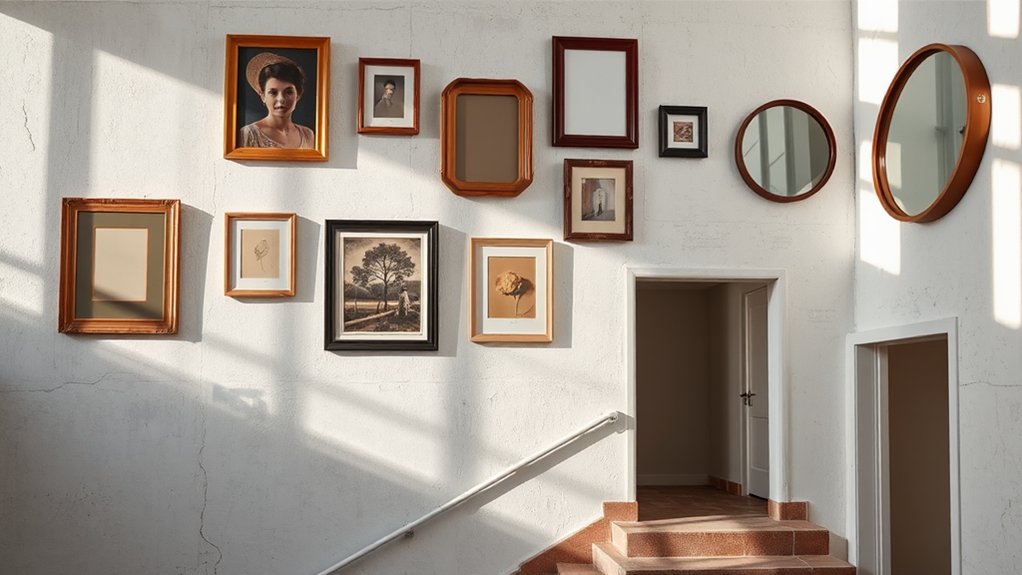
If you’re aiming for a gallery wall that travels across uneven surfaces, start by planning a cohesive layout that minimizes gaps and preserves balance. You’ll create a flow that guides the eye without crowding edges. Use practical anchors and offset rules to keep rhythm steady.
- Map a core spine first, then branch outward in small steps.
- Align frames with key architectural lines to tame irregularities.
- Vary sizes strategically, maintaining a consistent margin throughout.
- Test illumination and color psychology by adjusting artificial lighting to control mood.
Keep the installation adaptable; secure lightweight pieces temporarily, then finalize.
Prioritize crisp lines and even spacing where possible. This approach yields a unified look that feels intentional, not accidental, across your uneven surfaces.
Doors and Pathways: Navigating Odd Transitions
Master your progressions by leveraging doorway rhythm tricks and pathway alignment tips to create a coherent flow. You’ll set cadence with doorways that guide the eye.
And align paths to reduce abrupt shifts. Use these techniques to convert awkward corners into intentional, easy-to-navigate spaces.
Doorway Rhythm Tricks
Doorways aren’t just openings; they’re routes for rhythm. You shape passages with deliberate cadence, guiding flow as you pass through. Use these doorway rhythm tricks to curb awkward entry and keep spaces cohesive.
- Align lighting with the doorway to cue movement.
- Match wall color near the frame to soften the threshold.
- Space furniture to create a clear path without crowding.
- Introduce a repeating motif (rug, hardware) across rooms to unify.
Apply these steps before you reveal a new zone, not after. Your aim is practical precision: minimize hesitation, maximize intent, and preserve stance through the transition.
Doorway rhythm hinges on timing, placement, and polish. When you enter, you’ll feel confident, not cautious. Awkward entry becomes deliberate motion, and the space reads as one continuous environment.
Pathway Alignment Tips
Start by evaluating the doorway and corridor widths; guarantee clearance is comfortable for movement and furniture flow. Use color coordination to cue direction—warmer tones near the entrance, cooler hues along the main axis—to guide the eye forward.
Align furniture arrangement so every piece supports stride, not distraction; avoid protruding edges that interrupt rhythm. Maintain consistent lighting along the path, highlighting safety without glare.
Simplify transitions with logical pauses, like a small seating nook or a mirror nook that refocuses attention. Your goal: a calm, continuous journey from start to destination.
Budget-Friendly DIY Upgrades That Preserve Character
You can refresh awkward spaces on a budget by choosing simple, high-impact upgrades that preserve the room’s character. You’ll gain leverage by focusing on practical tweaks that read as intentional rather than flashy.
- Rearrange furniture to create flow and define zones without new pieces.
- Add window treatments that soften light and frame views without overpowering the room.
- Refinish or paint a single feature piece to lift the space with minimal effort.
- Swap hardware or switch out textiles to refresh texture and color cues.
These steps emphasize furniture arrangement and window treatments as core tools.
Embrace easy, reversible tweaks, measure before changes, and prioritize high-contrast accents to preserve character while maximizing function.
Color Blocking to Create Cohesion Without Renovation
Color blocking is a practical way to weave cohesion into a space without a full renovation. You’ll pair bold blocks with subtle ones to anchor furniture, walls, and textiles, guiding the eye and reducing visual chaos.
Use color contrast to emphasize focal points, like a sofa against a deep accent wall or a rug that bridges warm and cool tones. Choose two to three hues that share undertones, ensuring shade harmony across elements such as pillows, throws, and artwork.
Keep the palette cohesive by repeating a dominant color in trims or hardware, then introduce a complementary shade for contrast without overpowering the room. Test lighting, too, because natural and artificial light alter color perception and the block logic you’ve set.
Seasonal Styling to Keep Awkward Spaces Fresh

Seasonal styling keeps awkward spaces feeling intentional rather than shifting. You refresh with purpose, using seasonal decor that signals change without chaos and honors color progression. Keep the look cohesive by pairing updated accents with a stable base.
- Swap accent tones seasonally to mirror natural color shifts, anchoring with neutral furniture.
- Introduce small, repeatable elements (pillows, throws, art) to maintain rhythm across rooms.
- Update a single focal point per season to guide visual flow, not overwhelm.
- Use modular decor that packs away neatly, preserving space for everyday use.
This approach stays practical: you refresh thoughtfully, preserve function, and avoid clutter. The result is a space that feels vibrant, intentional, and adaptable to whatever the calendar brings.
Seasonal decor and color progression reinforce continuity rather than disruption.
Quick-Fire Micro-Projects You Can Do Today
Looking for quick wins? You can transform awkward spaces with a handful of micro-projects that deliver instant impact. Start by identifying Furnishing essentials you already own and swap them into focal zones—think a bold chair at a dead-end table or a slim console by an empty wall.
Add Vintage accents, like a distressed mirror or a retro lamp, to establish character without overhauling.
Next, declutter surfaces with tray organizers, then group three small items into cohesive vignettes to trap light and create depth. Use removable wall decals or a single framed print to redefine scale without commitment.
Refresh with a plant or two for texture and airiness. Finally, reconfigure seating to guide traffic flow, keeping pathways open and the space feeling intentional, not cramped.
A Practical Maintenance Checklist for Quirkily Cozy Spaces
A practical maintenance checklist keeps quirky spaces livable and inviting, so you can enjoy their character without hassle. You approach upkeep with focus, clarity, and predictable rhythms that preserve charm while protecting function. Follow these steps to support space ergonomics and maintenance scheduling.
- Inspect high-traffic zones monthly, noting wear on edges, cushions, and grips; address issues before they escalate.
- Schedule quarterly reset checks for lighting, outlets, and ventilation to maintain comfort and safety.
- Tidy wiring and cords weekly, minimizing trip hazards and keeping sightlines clear for a cozy, organized feel.
- Reassess furniture placement seasonally to maintain ergonomic balance and adapt to evolving use patterns.
Frequently Asked Questions
How Can I Measure Oddly Shaped Corners Quickly?
Yes—you can measure odd corners quickly by using a folding ruler or tape, tracing the irregular space, and noting two diagonal spans. Corner measurement: measure along walls, and then connect points for the irregular space outline.
What Tools Simplify Uneven Wall Assessments?
You’ll find 78% of pros say simple laser measures speed uneven-wall assessments. Use a laser distance meter, a contour gauge, and a stud finder. Focus on wall texture, lighting tricks to map irregularities quickly and accurately.
How Do I Hide Awkward Door Stops Stylishly?
You’ll hide awkward door stops stylishly with door stop covers that blend in, then add decorative door stoppers as accents. Choose low-profile covers, secure properly, and keep finishes cohesive for a clean, practical, and polished look.
Can Color Blocks Disguise Irregular Room Edges?
Yes—color blocks can disguise irregular room edges by creating bold lines that mislead the eye. Use color blocking strategically, pairing lighter hues with darker borders; this generates visual illusions that redefine space and smooth awkward shifts.
What Quick Fixes Restore Vintage Character Cheaply?
Yes, you can. Add vintage character quickly with vintage accessories and antique paint finishes; mix in worn wood, brass hardware, and aged mirrors. You’ll preserve charm affordably while boosting curb appeal and tactile, historical warmth.
Conclusion
You’ve mapped the quirks, chosen focal points, and layered color without overhauling. You stay practical: measure, plan, and tweak, not guess. You embrace built-ins, modulars, and color blocking to weave cohesion through awkward corners. Seasonal tweaks keep the room lively, while micro-projects deliver instant wins. Your maintenance checklist becomes second nature, so the space stays cozy year-round. In short: design with intention, adapt boldly, and let the quirks become your signature rather than your constraint.