
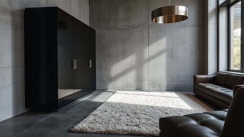

Did you know that 60% of a room’s perceived depth comes from texture and material contrast? To nail a modern look, you blend natural and sleek finishes—think matte walls with glossy accents—so they don’t feel cluttered. You’ll layer stone, wood, and metal within a cohesive neutral palette, amplify textures with thoughtful lighting, and choose durable, sustainable finishes. Ready to balance contrasts and elevate your space, without losing cohesion?
Key Takeaways
- Establish a unifying color base with neutrals to ground textures and maintain cohesive harmony.
- Pair matte and glossy finishes strategically, reserving gloss for accents to create visual contrast.
- Start with hard structural bases (concrete/steel) then layer soft textiles for warmth and depth.
- Vary textures across surfaces while controlling scale and sheen to avoid visual clutter.
- Use natural elements and greenery to add organic contrast and balance with tactile materials.
Define the Modern Texture-Mixing Brief

Defining the Modern Texture-Mixing Brief means outlining exactly how textures will work together to achieve a cohesive, contemporary look. You establish the core objective: a balanced, tactile palette where each surface reinforces the overall mood.
Start with the dominant material and set its scale, weight, and finish, then map complementary textures that enhance it without competing. Emphasize Textural contrast to create visual interest, while ensuring Material harmony across spaces, so transitions feel intentional, not accidental.
Specify practical constraints, such as durability, maintenance, and environmental conditions, to guide selections that perform well together. Include limits on sheen, pattern, and subtle color shifts to prevent distraction.
End with measurable criteria—how the texture mix will read from various angles and lighting conditions. This brief becomes your design compass.
Establish a Unifying Color Base
Start by selecting a neutral base palette that grounds your space and supports a mix of textures.
Use consistent hue anchors—repeat a single key color in varied intensities across materials to unify the look. This approach keeps contrast intentional and cohesive, letting each texture read clearly.
Neutral Base Palette
A neutral base palette unifies a modern design by grounding walls, floors, and larger surfaces in soft, cohesive tones. You establish a calm foundation that supports bold textures and intentional accents without competing colors.
- Choose neutral primitives (creams, taupes, grays) as your core, reserving deeper anchors for contrast.
- Consider color psychology to craft moods—cool neutrals feel expansive; warm tones cozy the space without overwhelming.
- Align furniture ergonomics with scale and placement so you can move naturally and enjoy long-term comfort.
- Use texture and material variation to keep depth alive while preserving visual harmony across rooms.
Consistent Hue Anchors
To harness Textural inspiration without chaos, align tones across wood, fabric, and metal so they share warmth or coolness, avoiding jarring contrasts.
Consider material durability as a guiding criterion for color placement; tougher surfaces can tolerate deeper or bolder hues, while delicate finishes stay near the base spectrum.
The result is a balanced, modern interior that reads unified at a glance.
Choose the Right Texture Palette for Your Space
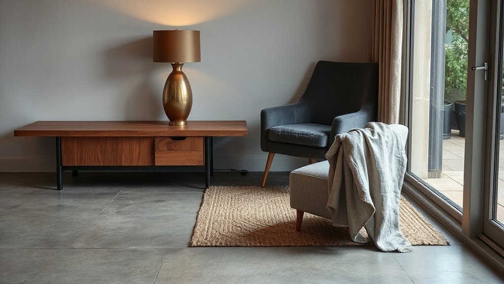
A balanced texture palette starts with natural materials that feel cohesive yet varied, guiding you toward a calm, modern aesthetic. Use contrast through texture to highlight key elements—think matte versus glossy surfaces or soft textiles against hard finishes—without overdoing it.
Let color-driven pairings anchor your choices, ensuring each texture supports the space’s overall base color and mood.
Natural Material Mix
Choosing the right texture palette starts with understanding your space’s light, scale, and purpose; a cohesive mix ties disparate materials into a single, modern whole.
In this Natural Material Mix, you balance tactile honesty with refined restraint, leaning on Natural stone and Organic fibers to ground the design.
Pair stone with soft textiles to create contrast, not competition, and let bare surfaces read as anchors.
Avoid overpatterning; keep a restrained palette to preserve cohesion.
- Select Natural stone as a durable, tactile anchor for floors or countertops.
- Introduce Organic fibers through upholstery and textiles for warmth.
- Use a restrained color base to unify disparate textures.
- Reserve tactile emphasis for key surfaces to maintain balance.
Contrast Through Texture
Texture contrasts are what elevate a modern look from flat to tactile. When you choose a texture palette, prioritize purposeful variety over random combos. Begin with a dominant, calm base—plaster, concrete, or satin paint—that keeps rooms cohesive.
Introduce a secondary texture with subtle contrast, such as a matte ceramic, a tactile woven fabric, or a soft leather, to create depth without clutter. Use pattern layering selectively: repeat a small motif across textiles and surfaces to hint coherence while avoiding busy competition.
Balance is key: lighter textures for air, heavier ones for grounding. Consider material durability in high-use zones, pairing resilient options with softer accents to maintain longevity. Finish with deliberate spacing so each texture has room to breathe.
Color-Driven Pairings
1) Identify mood and select a dominant hue.
2) Pair textures that echo color values.
3) Calibrate light with finishes and sheen.
4) Validate perception across soft and bright moments.
Pair Matte and Glossy Textures for Contrast
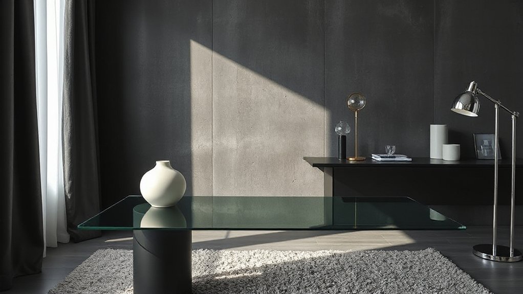
Pair matte and glossy textures to create immediate contrast that reads as modern and intentional. You balance surfaces so light reflects differently, guiding the eye and elevating focal points with minimal effort.
Choose one dominant finish—matte for walls or large furniture—and punctuate with glossy accents to catch attention without shouting. Textural harmony emerges when contrast supports the room’s scale, color, and light, not when it competes with them.
Use matte surfaces to soften glare and add warmth; reserve glossy elements for trim, hardware, or a single statement piece. This material contrast creates visual rhythm, guides movement, and communicates sophistication.
Keep transitions seamless, avoid overmixing finishes, and let form dictate where shine lands. Done well, you’ll achieve a cohesive, contemporary atmosphere.
Mix Hard and Soft Materials for Depth
Mix hard and soft materials to create depth that reads as deliberate, not decorative.
You blend architectural heft with tactile softness to establish material contrast that guides the eye and feel. Use texture layering to prevent flatness, pairing rigid surfaces with plush or pliable elements. In practice, let hard materials anchor the space, while soft ones soften edges and create inviting contrast. Keep edges crisp where needed, and allow surfaces to breathe with subtle variations in texture and sheen.
- Start with a hard base—concrete, stone, or steel—and introduce soft textiles or leather for warmth.
- Layer finishes across planes to emphasize depth without clutter.
- Vary scale within the same material family to enhance texture layering.
- Use lighting to accentuate contrast, casting shadows that reveal form and tactility.
This approach prioritizes material contrast, texture layering, and refined clarity.
Balance Tactile and Visual Weight With Scale Variety
Textural impact isn’t just about what you use, but how you scale it. You balance tactile and visual weight by varying scale across materials, avoiding a flat read. Start with a dominant material that reads large in room, then offset it with smaller, contrasting textures. This creates Tactile contrast while preserving Visual harmony.
Aim for a clear hierarchy: a bold wall treatment, mid-scale furniture, and fine accessories. Pair rough with smooth, matte with sheen, heavy with light. Consider proportional relationships: a statement sofa anchors the space, while cushions, rugs, and accents weave in complementary textures without competing.
Keep patterns and textures aligned to your palette, so weight shifts feel intentional. The result is cohesive depth that reads polished, not cluttered.
Layer Textiles Without Creating Clutter
Layering textiles adds depth without clutter by prioritizing purpose and balance. You layer deliberately, not abundantly, to keep spaces calm and cohesive. Focus on a restrained palette, varying textures rather than colors to achieve depth. Each textile should serve a function—comfort, acoustics, or visual impact—so clutter prevention becomes natural, not forced.
- Assess each piece’s role, then keep only those that contribute meaningfully.
- Pair textures with similar weight to maintain visual harmony.
- Limit the number of textiles in any one zone to avoid overwhelm.
- Use integrated storage or built-in surfaces to hide extras when not in use.
Select Metals That Age Gracefully Together
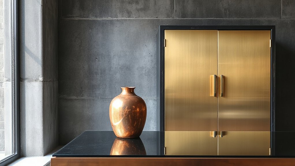
Aged metals create a cohesive, evolving aesthetic when you choose finishes that patina well together. You select metals whose aging profiles align, balancing warmth, contrast, and reflectivity. Prioritize consistency in undertone—cool, warm, or neutral—to prevent jarring shifts as patinas develop.
Pair subtle, matte textures with slightly brighter accents to preserve depth without clutter. Favor metal finishes that wear evenly: brushed brass with aged bronze, or antiqued nickel against freckled pewter. Consider patina timing; metals that patina at similar rates read as a curated family rather than a mismatched mix.
Avoid overpowering shine or excessive contrast, which fragments the look. The goal is unity through aging, so your choices emphasize fluidity, coordination, and a refined sense of artistic textures that deepen over time.
Concrete, Wood, and Fabric: A Triad Approach
Concrete, wood, and fabric form a triad that anchors a modern look with tactile variety. You’ll leverage textural contrast while preserving material harmony, so each element supports the others rather than competing.
Start by pairing a cool, smooth concrete surface with warm, tactile wood, then add fabric for softness and rhythm. Your goal is balance: let one texture take the lead while the others complement it.
- Establish a dominant texture to guide the space, using concrete for structure and depth.
- Introduce wood to counterbalance the hardness with warmth and grain.
- Integrate fabric in accents to soften edges and create cadence.
- Maintain material harmony through controlled color, finish, and scale across all three textures.
Bring Natural Textures in With Greenery and Plants
Greenery adds texture by introducing organic form and color that contrast with hard surfaces.
Balance these greens with natural materials so you don’t overwhelm the space, using pots, planters, and surfaces that echo the room’s materials.
Mind the plant scale and placement, placing larger specimens where they’ll anchor the room and smaller ones as accents to guide the eye.
Greenery Adds Texture
Plants aren’t just decor; they’re texture you can touch. Greenery adds depth by introducing living surface variation, color, and scale that layers with other materials. Use intentional plant pairing to echo your room’s tones while enhancing texture layering across furniture, fabrics, and finishes. Choose pots and planters that mirror your material palette for cohesive contrast, not competition.
- Pair tall plants with low, broad-leaf specimens to create vertical and horizontal texture contrasts.
- Mix matte ceramic pots with glossy metallic accents for tactile variety.
- Vary leaf shapes and sizes to add rhythm without clutter.
- Integrate seasonal greens to keep texture dynamic year-round.
Natural Materials Balance
Natural materials should anchor your space, balancing the softness of greenery with the tactile punch of wood, stone, and fabric. You create visual weight by pairing warm timber with cool stone and refined textiles, ensuring textural harmony across zones.
Choose natural materials that age gracefully and reveal character through use, not pretension. Layer textures deliberately: a wool rug under a linen sofa, a jute rug complemented by a ceramic planter, a raw-edge wood coffee table with smooth metals.
Keep color restrained to let materials speak, using neutrals as a unifying base. Integrate greenery to enhance contrast—plants emphasize grain, weave, and surface.
Plant Scale and Placement
Consider scale first: the right plant sizing grounds a room and reinforces the texture mix without overpowering it. Plant scale and placement work together to create rhythm, balance, and a natural counterpoint to hard surfaces. You’ll want to vary height and leaf form across zones, not crowd a single focal point. Aim for cohesion between texture and greenery so materials still read strong.
- Assess room proportions and choose plants that match ceiling height and furniture depth.
- Place tall specimens near walls or corners to elongate space while mid-height greens tie seating areas.
- Mix leaf shapes and textures for visual interest without visual competition.
- Rotate and replant seasonally to maintain balanced plant scale and placement over time.
Use Glass and Translucency to Soften the Room
Glass and translucency soften a room by inviting light to travel freely and by reducing visual weight. You shape this effect with intentional choices that don’t overwhelm your space. Begin with Glass accents that skim edges of shelves, coffee tables, and cabinetry to reflect light without creating busy patterns.
Pair them with Translucent layers, such as sheer drapes or frosted panels, to diffuse glare while preserving daylight. Limit solid surfaces to keep a sense of openness; airy partitions or glass doors help define zones without closing them off.
Maintain contrast through texture and color elsewhere, ensuring the glass reads as a calm, cohesive element. The result is a modern, serene environment that feels both spacious and inviting.
Place Textures Intentionally: Focal Points and Supporting Roles
You’ve set a calm, light-filled base—now assign textures with intent to create focal points and supporting roles. To guide the eye, treat tactile contrast as a design cue, not decoration. Each texture should push forward or recede, aligning with material layering to form a coherent narrative.
- Choose one statement texture as a focal anchor, then compliment with subtler textures.
- Pair high-contrast surfaces with softer elements to balance weight.
- Use scale variation to emphasize rhythm rather than clutter.
- Allocate textural moments by function—sofa, floors, and accents—to create purposeful progression.
Finishes That Read Modern: Matte, Satin, and Gloss Judiciously
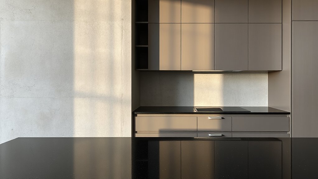
Matte surfaces create a quiet backbone, so you balance matte texture with controlled highlights to keep spaces feeling calm rather than flat.
Weigh satin and gloss by function—use satin for approachable surfaces and gloss for accents that catch the eye without overpowering.
Keep the mix intentional: let matte ground the look, and reserve satin and gloss for strategic, purposeful contrast.
Matte Texture Balance
To achieve a modern look, balance matte textures with just enough contrast. You’ll create depth without glare by pairing flat finishes with controlled sheen in a deliberate rhythm. Matte texture reads refined, while small accents keep the space legible and tactile.
Focus on proportion and material hierarchy to assure a cohesive, calm environment. Balance contrast with restraint: avoid competing patterns, and let one bold element anchor the room.
- Calibrate contrast through color and form, not gloss
- Use matte surfaces as backdrops for key focal pieces
- Introduce subtle texture via upholstery or stone
- Limit high-sheen accents to one or two strategic spots
Satin vs Gloss Roles
Satin finishes strike a balance between matte and gloss, offering subtle sheen that reads modern without shouting. In this role, you combine durability with substance, using satin to bridge textures across surfaces.
You’ll notice Satin finishes soften contrast, preserving detail while reducing glare, which makes spaces feel cohesive and refined. Pair satin with matte elements to maintain calm, then reserve gloss effects for focal points where you want emphasis or dynamism.
The key is restraint: avoid layering high-gloss finishes on every surface, which can read busy. Instead, let gloss highlights—on hardware, trim, or a single wall—read as intentional accents.
This approach yields a sophisticated rhythm, where Satin finishes anchor the scheme and Gloss effects punctuate the modern narrative.
Seating and Furnishings That Age Well
- Solid-wood frames with reinforced joints
- Leather or performance fabrics that resist wear
- Timeless silhouettes paired with subtle patterns
- Coordinated metal or wood accents for cohesion
Flooring and Wall Treatments to Anchor the Look
Flooring delineates space, guiding eye lines and defining zones with intention.
Wall treatments should offer cohesive texture and color so the room reads as a unified whole.
Balance texture contrast between floor and walls to anchor the look with clarity and polish.
Flooring Delineates Space
Likely one of the quickest ways to define a modern look is to let flooring delineate space, using contrast in material, texture, or tone to guide the eye and establish zones. You pair finishes to carve rooms without walls, creating intentional flow and function. Use a restrained palette to let texture speak, and respect cultural influences that shape material choices for authenticity. Artistic expression comes through the tactile language of floors, from concrete’s cool minimalism to timber’s warmth.
- Contrast light and dark planks to carve paths and zones.
- Combine matte and polished surfaces for subtle delineation.
- Use slab or large-format tiles to anchor seating areas.
- Introduce area rugs to soften transitions and add rhythm.
Wall Treatment Cohesion
Wall treatment should harmonize with flooring to anchor the look, using a cohesive material language that reinforces rhythm and purpose across the space. You pair surfaces that share undertone, texture, and scale so the room reads as a deliberate whole.
Start with a unified base—neutral paint, plaster, or paneling—that echoes the flooring’s warmth or coolness. Then layer complementary textures in controlled quantities.
Textural harmony emerges when you repeat material families across walls, ceiling, and accents, avoiding fragmented or competing finishes. Use material layering to build depth: a matte wall, a satin trim, and a subtle tactile panel can create interest without shouting.
Keep contrasts purposeful, smooth progressions, and seams deliberate, so the space feels cohesive, intentional, and grounded.
Texture Contrast Balance
Texture contrast should be deliberate and controlled, using flooring and wall treatments to anchor the look with purpose. You’ll create a grounded base by pairing a durable floor with a complementary wall finish, ensuring the textures don’t compete but rather reinforce each other.
Focus on textural harmony through deliberate contrasts that feel cohesive, not loud. Use material layering to add depth: a matte floor with a subtle sheen on walls, or a tactile wall treatment offset by smooth surfaces.
Maintain balance by limiting the number of textures in each zone and aligning colors. Keep proportions honest, letting one dominant texture anchor the space.
- Define a dominant floor texture and two supporting wall textures
- Align color warmth across surfaces
- Choose finishes with complementary sheen
- Test scale and proportion in lighting
Sculptural Accent Pieces With Texture Impact
Sculptural accent pieces bring texture into focus by combining form and surface in unexpected ways. You choose sculptural accents to punctuate rooms, not dominate them, so select pieces with tactile sculptures that invite touch and curiosity.
Favor contrasts—matte bases with glossy inlays, ribbed contours against smooth planes—to amplify depth without clutter. Lean toward materials that read differently from afar and up close, like ceramic, stone, or metal with patina.
Scale matters: a bold sculpture should balance seating, lighting, and architectural lines, while smaller pieces layer texture in groups. Maintain coherence by repeating a limited material family or finish across pieces.
Finally, consider placement in transit zones—entry walls, alcoves, and shelves—to guide sightlines and create deliberate texture moments throughout the space.
Lighting Textures: How Light Interacts With Surfaces
Lighting shapes texture as much as surface detail does, and how you illuminate a space can transform matte, ribbed, or glossy finishes into new visual textures. You’ll discover how lighting textures reveal subtle grain, depth, and contrast, shifting perception with angle, intensity, and warmth.
Focus on how lighting effects interact with materials, creating intentional surface reflections that heighten tactility without overcrowding the design. Use controlled luminance to differentiate textures and emphasize material character, not simply brighten the room.
- Position key light to sculpt texture with deliberate shadows and highlights
- Mix warm and cool tones to enhance surface reflections without glare
- Scale lighting to the texture’s rhythm for consistent depth
- Calibrate brightness to preserve detail across finishes and hues
Seasonal Texture Swaps to Refresh the Look
Seasonal texture swaps refresh the look by swapping tactile cues to match the moment—no full renovation required. You refresh your spaces by swapping fabrics, finishes, and accessories to reflect the season without overhauling core materials.
Start with textiles: lightweight weaves and breathable linens for warm months, heavier knits and boucles as temperatures dip. Introduce seasonal color updates through cushions, throws, and drapery, staying within a cohesive palette to maintain harmony.
Balance this with subtle material shifts, like swapping matte ceramics for glazed surfaces or swapping wicker for smooth stone accents to alter texture perception.
Leverage pattern mixing techniques to layer visuals without clutter, combining small-scale motifs with solid planes. The result feels intentional, refreshed, and modern while preserving your design’s backbone.
Common Mistakes to Avoid in Texture Mixing
Common texture mixing mistakes undermine a modern look, so spot and fix them early. If you ignore texture symbolism, you’ll create noise instead of harmony. Likewise, neglecting material provenance risks inconsistent tones and durability gaps. You want intentional contrasts, not random clutter.
- Mix without a unifying motif or story; let symbolism guide scale and finish.
- Overuse glossy or ultra-matte surfaces, dulling depth and cohesion.
- Ignore light and shadow; wrong textures look flat and disjointed.
- Fail to test provenance across seasons or wear; consistency matters.
Focus on provenance and subtle fidelity—sample finishes, note where they originate, and verify compatibility. When you align material provenance with texture symbolism, you preserve a polished, contemporary vibe rather than a disjointed collage.
Quick-Start Checklist to Implement Today
Here’s your quick-start checklist to implement today:
Start by auditing your current textures and materials. Note their finishes, provenance, and how they interact with light. Then pick one unifying motif to anchor the look.
Move deliberately: map where texture adds warmth, contrast, or visual weight, and identify any incongruities that pull focus.
Choose a single material or finish as the backbone, and align supporting textures to reinforce that choice.
Consider Textural symbolism to convey mood—earthy grains for grounded rooms, high-gloss for sophistication, matte for calm.
Prioritize Material sustainability by selecting durable, repairable options and low-impact sources.
Implement sample panels, test in differing light, and adjust before committing.
Finalize specifications in a short brief to guide procurement, detailing finishes, ratios, and maintenance expectations.
Frequently Asked Questions
How Do You Start a Modern Texture-Mixing Brief?
You start a modern texture-mixing brief by defining your color palette and identifying target furniture styles. You specify material contrasts, set project constraints, and outline success metrics, ensuring stakeholders align on textures, finishes, and fabric weight from the outset.
Which Textures Read as Modern Under Lighting?
You’ll notice contemporary patterns and minimalist finishes read as modern under lighting. You read the room, selecting tactile contrasts, balancing sheen and matte. You evoke confidence, mixing textures deliberately, ensuring each element complements the lighting and space.
How to Layer Textiles Without Visual Clutter?
Layer textiles strategically by varying scale and texture to avoid clutter, you’ll achieve calm depth. Pair colors deliberately, and use pattern contrast to keep the eye moving without overwhelming; color pairing anchors, while texture adds dimension and cohesion.
What Balance Between Matte and Glossy Matters Most?
You pursue surface contrast and material harmony, finding balance where matte and glossy echo like a quiet shoreline and sunlit glass. You prioritize this balance, letting texture depth guide tone, and you keep surfaces cohesive, uncluttered, deliberate.
How to Age Metals and Woods Cohesively?
You age metals and woods cohesively by embracing antique finishes and guiding patina development. You balance wear with protection, layer clear wax over steel, then allow bronze, oak, and brass to patinate together for a unified, timeless look.
Conclusion
You’ve set the framework—now it’s time to live in it. Keep your color base calm, layer textures thoughtfully, and let lighting reveal every detail. Balance matte and glossy surfaces, weave hard and soft materials, and rotate accents with the seasons to keep the look fresh. Avoid crowding; clarity wins texture. When in doubt, trust restraint over excess. This approach will transform spaces faster than a glow-up montage—seriously, it’ll feel like design magic.