
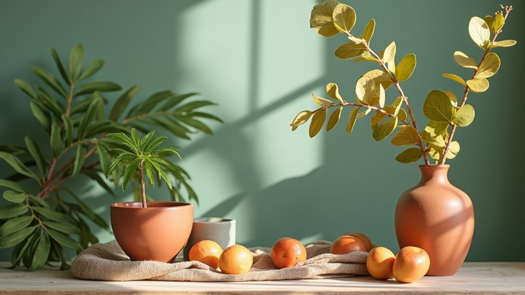

A nature-inspired palette refresh starts with a dominant hue drawn from natural scenes, paired with calm sun-washed neutrals like beige and off-white to maintain clarity. Layer mossy greens, ocean tones, and terracotta accents across finishes—mix matte and subtle gloss to control glare. Plan room-by-room with a cohesive texture story: linen, stone, wood, ceramics, and botanical patterns. Test swatches in varying light and adjust with textiles and decor for cohesion; continued exploration will reveal deeper harmony techniques.
Key Takeaways
- Identify a dominant natural hue and support with warm and cool tones to create calm, energized, and focused spaces.
- Use sun-washed neutrals with varied values and textures (linen, clay, stone) for a serene, cohesive palette.
- Integrate organic greens, terracotta, and earthy accents with matte finishes to anchor spaces and enhance mood.
- Layer materials and finishes with subtle grain variations to unify textures and reinforce architectural lines.
- Test swatches in different lighting and apply room-by-room logic (neutrals in living areas, accents in kitchens, moisture-resistant baths) for cohesive refreshes.
Identify Your Nature-Inspired Palette: How to Choose for Your Space
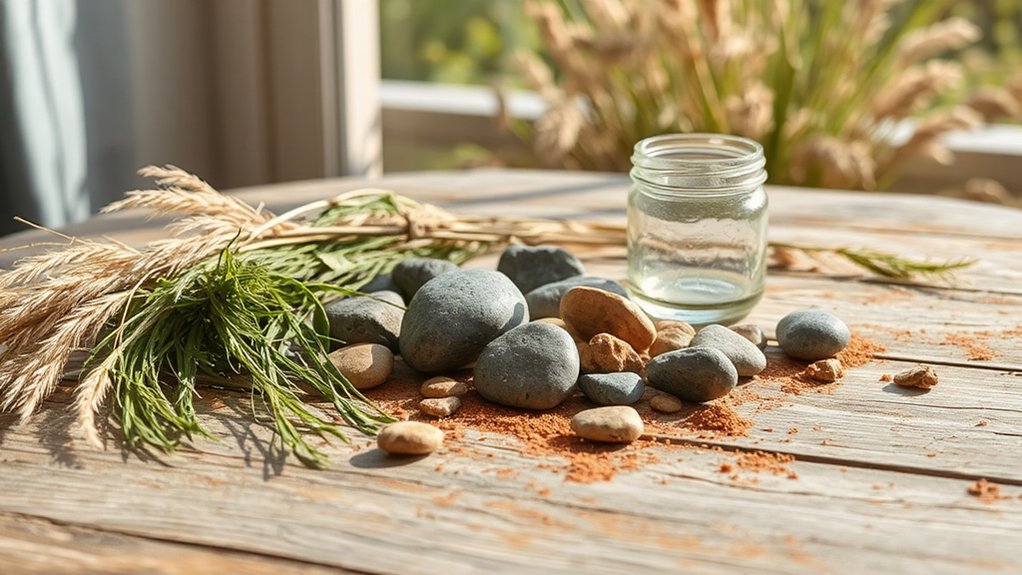
Choosing a nature-inspired palette starts with clarity about how you use the space. You map function before pigment, noting daily rhythms, focal points, and traffic flow to guide color decisions.
Start with a dominant hue drawn from a natural scene, then select supporting tones that reinforce color psychology—calm, energy, or focus—without overpowering the room.
Build visual harmony by balancing warm and cool values, ensuring contrast serves readability and function.
Record precise swatches and test in lighting at different times of day, because natural light shifts perception.
Consider material texture and finish, aligning sheen with use cases to preserve cohesion.
Finally, translate your findings into a concise palette brief, enabling consistent application across walls, textiles, and accents.
Sun-Washed Neutrals: Calm Beiges, Sands, and Off-Whites
Sun-washed neutrals offer a restrained palette that centers calm through beige, sand, and off-white tones. You’ll leverage subtle variations in value and temperature to ground spaces without visual clutter.
This approach ensures cohesive shifts across walls, textiles, and surfaces. This foundation supports layered textures and lighting strategies that enhance serenity while preserving architectural clarity.
Sun-Washed Neutral Palettes
The core principle is tonal simplicity: build depth through subtle shifts in undertone—warm honey, cool ivory, and muted taupe—rather than saturated color. In practice, pair these neutrals with textures and materials that add tactile interest, such as linen, clay, and polished stone.
When you introduce Nature inspired artwork or Organic textile patterns, do so as deliberate focal points that anchor the scheme without overpowering it. The result is a cohesive environment that feels expansive, breathable, and grounded in nature’s restrained palette.
Calming Beige Tones
This palette thrives on controlled contrast: lighter ceilings meet deeper furniture, while matte finishes reduce glare. Incorporate botanical patterns as subtle focal points—granular prints, leaf silhouettes, or woven motifs—to evoke nature without overwhelming the serenity.
Embrace natural lighting to modulate mood; sheer drapes, strategically placed windows, and light-reflective surfaces amplify luminance without shifting color balance. Pair with cool stone accents or warm wood tones to maintain balance.
The result is a timeless field of calm that supports everyday clarity and refined, durable interiors.
Sand and Off-White Hues
You’ll discover that sun-washed neutrals translate daylight into calm, breathable spaces, enhancing texture without competing with focal elements. The palette supports color symbolism by grounding accents in nature-inspired psychology—truth, calm, simplicity—while preserving warmth.
Historical influences reveal itself in traditional plaster, travertine, and aged timber textures, reinterpreted with modern finishes for longevity and ease of maintenance.
- Subtle contrast that highlights moldings and architectural joints
- Warmth without heaviness, adapting to cool or warm light
- Timeless backdrop for natural materials and art
- Harmonizes with muted greens, blues, and terracotta accents
In practice, these hues offer versatility, helping you craft coherent rooms that feel enduring and refined.
Mossy Greens: Bringing the Outdoors Into Living Areas
Mossy greens anchor spaces by pairing vibrant accent hues with lush indoor foliage. Consider how mossy greens interact with accent colors and plant textures to create focal points without overwhelming the room.
We’ll explore mossy green accent ideas and strategic indoor plant color pairings to guide practical, space-enhancing choices.
Mossy Green Accent Ideas
If you’re integrating mossy greens into your space, these accents harness the natural depth and texture of the outdoors to elevate everyday environments.
- Mossy green upholstery textures that absorb light without glare, creating a calm focal point
- Accent decor in matte finishes; think ceramic vessels and brass-edged accents with muted greens
- Subtle patterning via woven fabrics and rugs that mimic forest understory without overpowering
- Layered greenery displays and reclaimed wood shelves to reinforce tactile, organic contrast
These elements work together to deliver a cohesive mossy look, balancing color, texture, and form. Use restrained palettes and consistent undertones to maintain sophistication while capturing the essence of nature.
Indoor Plant Color Pairings
As you bring mossy greens into your living spaces, selecting plant pairings that harmonize color and form becomes a practical design tool. You’ll optimize contrast and cohesion by aligning leaf textures with container materials and room lighting, ensuring legibility of the palette.
Pair matte succulents with gloss-finish foliage to create focal points, then temper them with larger, softly textured plants to sustain rhythm.
Consider complementary hues—olive, sage, and forest—with cool neutrals like stone and muted terracotta to ground the scene.
Indoor plant symbolism enhances narrative, guiding placement to reflect mood and function.
Integrate botanical inspired art near greens to reinforce continuity, using calibrated scale to prevent visual competition.
The result is a curated, resilient display that communicates nature’s calm while supporting daily activities.
Ocean Blues and Stormy Grays: Creating a Tranquil Vibe
Ocean blues and stormy grays combine to craft a tranquil vibe by balancing cool, expansive hues with grounded neutrals. You’ll leverage these tones to evoke coastal clarity, reduce visual noise, and sustain focus in daily routines.
Implement contrast through crisp white trim and matte charcoal accents to heighten depth without overpowering serenity. Incorporate subtle texture—linen, concrete, or brushed steel—to add tactility that complements the color duo.
Include intentional accents like wildflower patterns and sunset hues in textiles or art to introduce organic warmth without breaking the calm.
- Use a restrained palette with 60% cool blues, 25% grays, 15% whites
- Introduce texture through natural materials
- Add wildflower patterns sparingly for focal interest
- Accent with sunset hues as subtle pops
Terracotta and Clay: Warm Earthy Accents That Ground a Room
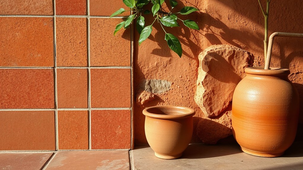
Terracotta and clay bring warm, earthy energy to a space, grounding furnishings and anchoring the palette with natural neutrality. You’ll leverage terracotta textures to introduce depth without overpowering light, using matte ceramic surfaces or slightly speckled glazes that read as organic rather than ornamental.
Pair these with clay color psychology insights: warm, muted tones influence perceived coziness and stability, guiding you toward balanced contrasts with cooler neutrals. Implement this by selecting low-sheen finishes for larger elements and reserving subtle sheen for accents to avoid visual fatigue.
In practice, combine terracotta hues with stone, sandstone, or charcoal to maintain legibility of architectural lines. The result is cohesive warmth that enhances form, texture, and daylight dynamics without sacrificing clarity or precision.
Build Cohesion: Finishes and Textures That Make Color Pairings Sing
You’ll coordinate finishes and textures to create a cohesive backdrop that lets color pairings sing.
By layering materials with complementary grains and tactile contrasts, you establish a unifying story across surfaces.
Subtle grain variation becomes the quiet driver of cohesion, guiding contrast without disruption.
Finishes That Harmonize Textures
Texture is the quiet conductor of color, guiding how finishes amplify or mute a palette by adding tangible depth and visual rhythm. You’ll balance sheen, matte, and tactile surfaces to guarantee color reads consistently across rooms.
Prioritize finishes that harmonize textures, so textured finishes feel cohesive rather than chaotic, and decorative accents don’t clash with wall or floor treatments. Choose sealants and lacquers that preserve the intended texture without overgloss; opt for gentle sheens to unify diverse materials.
- Align finishes across surfaces to enhance natural tonal shifts
- Pair textured finishes with understated decorative accents
- Use controlled sheen to maintain depth without glare
- Test in natural light to confirm color behavior
This approach yields refined, durable harmony throughout your space.
Layered Materials, Cohesive Feel
Layered materials create a cohesive feel by balancing finishes and textures that work in concert rather than in isolation. You select a foundational palette and pair it with layered textiles to modulate temperature, glare, and tactile interest, ensuring each element supports the whole.
Begin with durable, subtle neutrals as anchors, then introduce cohesive accents that echo micro-shades found in nature. The goal is visual harmony achieved through purposeful contrast: matte versus sheen, soft textiles against hard surfaces, and warm woods with cool stones.
Precision matters; avoid competing textures that fragment the scheme. Test combinations under varied lighting to confirm consistency across scenes.
When executed thoughtfully, this approach yields a refined, breathable interior where color loyalties remain stable, even as surfaces reveal nuanced, nature-inspired depth.
Contrast Through Subtle Grain Variations
Subtle grain variations become the quiet engine that keeps color pairings cohesive once finishes are layered with intention. When you select materials with distinct grain patterns, you create natural contrast textures that enhance, not clash, the color palette.
Subtle grain guides the eye, revealing depth and continuity across surfaces while maintaining clarity between light and dark values. You’ll want finishes that align grain direction with high-contrast moments to emphasize form without shouting.
Balance wooden, stone, and composite textures by prioritizing consistent sheen and microtexture. This approach preserves color integrity, reduces visual noise, and reinforces a unified narrative across rooms.
- Contrast textures that highlight grain without overpowering color
- Subtle grain as a unifying thread across surfaces
- Finishes with complementary sheen levels for cohesion
- Directional grain alignment to reinforce architectural lines
Room-by-Room Pairing: Living Room, Kitchen, and Bathrooms
Pairing color palettes across the living room, kitchen, and bathrooms demands a cohesive logic that respects function, lighting, and materials. You align hues to create a seamless narrative that travels room to room without abrupt shifts.
Begin with the living room’s base neutrals, layering depth through accent greens or blues drawn from nature. Then carry echoed tones into the kitchen with durable finishes and brighter, practical accents.
In bathrooms, enforce calmer, moisture-resilient palettes that reference the same botanicals or stone textures. Consider color psychology to modulate mood—soothing in water-centric spaces, energizing in social zones.
Account for seasonal variations by adjusting accessories and light reflectance rather than wholesale remodels. The result is a coherent, adaptable scheme that respects function and light.
Quick Refreshes: Walls, Textiles, and Decor on a Budget

A quick refresh keeps the cohesive palette intact while updating mood and function with minimal cost and disruption. You’ll optimize walls, textiles, and decor by applying nature-inspired contrasts, prioritizing durable finishes and low-emission materials. Focus on scalable changes that read as intentional upgrades rather than complete overhauls.
- Leverage seasonal color trends with a limited palette to refresh textiles and accent walls
- Use DIY color mixing to customize shades for textiles, trims, and small decor pieces
- Swap throw pillows, curtains, and rugs rather than wholesale redecorating
- Treat finishes (matte vs. satin) and hardware as budget-aware accents for cohesion
Mood, Light, and Space: The Psychology of Nature-Inspired Color
Nature-inspired colors shape mood by modulating light perception and emotional response, so you can tailor spaces to support focus, calm, or energy through hue brightness, saturation, and temperature.
In this framework, color symbolism guides design intent: cool blues and greens foster tranquility, while warm ochres and ambers invite engagement.
You’ll experience the emotional impact of saturation, where vivid accents sharpen attention and desaturated fields reduce distraction.
Light interactions matter: color appears lighter in bright daylight and deeper under artificial illumination, shifting perceived space and depth.
Spatial perception intertwines with psychology, influencing how you allocate attention and navigate rooms.
Use these cues to craft zones that align with function, mood, and performance, ensuring harmony between environmental cues and your daily routines.
Practical Swaps: Budget-Friendly Color Substitutions You Can Try Now
You can achieve a nature-inspired look on a budget by swapping color choices with practical substitutions that retain mood and depth. You’ll preserve harmony by prioritizing pigment depth, saturation balance, and undertone consistency, then pair affordable options with durable finishes. Focus on substitutions that maintain perceived richness without inflating cost, and choose materials that age well.
- Use Eco friendly paints with rich pigments to replicate natural greens and earth tones
- Opt for sustainable materials like reclaimed wood or composite accents instead of rare alignments
- Swap high-cost accent fabrics for durable, color-stable blends to keep texture
- Pair lighter neutrals with deeper core hues to sustain depth and contrast
These choices deliver credible nature-inspired results while supporting budget discipline and ecological responsibility.
Frequently Asked Questions
How Do I Start Selecting a Nature-Inspired Palette for a Small Room?
Start by measuring your space and choosing a dominant nature-inspired palette, then add nature inspired accessories strategically for balance. Consider color psychology effects to guide accents, ensuring contrast and light reflectivity; use textures to enhance depth in a small room.
Can Natural Colors Affect Room Perceived Size and Brightness?
Yes, natural colors can affect room perceived size and brightness. Color psychology and visual perception show light, cool tones visually expand spaces, while warm hues compress them; balance with reflective surfaces and strategic lighting to optimize openness. Also: futuristic smartwatch.
What Lighting Choices Best Showcase Nature-Inspired Colors?
You should choose layered, color-accurate lighting—prefer high-CRI fixtures and dimmable options—to showcase nature-inspired hues. Use botanical accents and organic textures near focal walls, while balancing warmth and coolness for depth and spatial clarity.
Which Finishes Enhance Earthy Tones Without Clashing?
Earthy tones shine with matte finishes for warmth and depth, while subtle gloss accents keep contrast alive. Use complementary accents to balance textures; matte vs. gloss pairing enhances durability and light reflection without clashing.
How Do I Test Paint Colors Before Committing Long-Term?
Yes, you should use color testing methods, like swatch panels and small patches, to preview before committing long-term. Place paint samples on multiple wall areas, ensuring lighting variations, and document results with photos for accurate comparisons.
Conclusion
You’ll discover that these nature-inspired choices aren’t about dramatic changes; they’re about gentle, confident shifts. By softly embracing sun-washed neutrals, mossy greens, and ocean blues, you nudge rooms toward calm without effort or upheaval. Consider the mood, light, and flow, then substitute textures and accents rather than wholesale revamps. Small, precise steps gradually harmonize space, like a well-tuned instrument. Embrace restraint, know when to pause, and let nature’s palette quietly—but effectively—take the lead.