
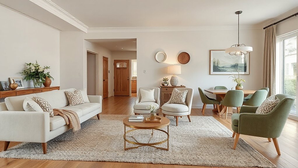

To create a cohesive look across your home, start with a single core palette and a clear vibe, then echo it through color, texture, and proportion. Choose a dominant hue without overpowering details, repeat textures for depth, and link materials across rooms for continuity. Establish a quiet furniture hierarchy that guides flow, edit room-by-room in stages, and plan shifts for everyday use versus special occasions. Ready to map your road ahead.
Key Takeaways
- Define a cohesive vibe and core palette, using neutral walls with controlled accent colors for harmony across all rooms.
- Establish a dominant color with variations and mood lighting to create depth and emotional consistency.
- Repeat textures, materials, and finishes across spaces to build a unifying tactile language.
- Plan furniture layout and visual hierarchy that preserve sightlines and flow, with proportional scale and aligned curtains.
- Maintain daily surface organization and deliberate updates to sustain calm, orderly aesthetics throughout the home.
Define Your Cohesive Vibe and Core Palette
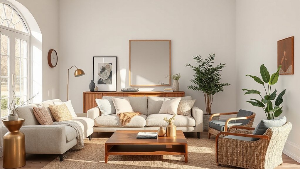
To establish a cohesive look, start by defining the vibe you want each room to convey and how they’ll connect. You’ll identify a central mood and translate it into a core palette that travels room to room.
Choose a minimal set of colors that support Color pairing, ensuring contrast and harmony without clutter. Establish a baseline—neutral walls, subtle accents, and a unifying material like wood or metal.
Decide on one or two accent hues and repeat them with purpose to reinforce Mood setting. Document your choices: name the vibe, list the colors, and note where each is used.
This clarity guides furniture, textiles, and art selections, keeping momentum steady as you furnish. You’ll create flow that feels intentional, not coincidental.
Pick a Dominant Color Without Monotony
Choose a dominant color that anchors the space, but avoid monotony by varying its use across surfaces and textures. Start with a core hue and extend it through key elements, then temper it with lighter or darker variants to create contrast.
Use color psychology to guide emotional impact: calmer hues for relaxation, bolder tones where you entertain, muted tones for stacking in the background. Balance saturations so no single surface overwhelms the room.
Integrate the dominant color in fabric, wall accents, furniture, and art, but refrain from overdoing it in any one area. Pair with mood lighting to sculpt depth and ambiance, ensuring warmth or coolness aligns with the room’s function.
This approach delivers coherence without fatigue, keeping rooms lively yet unified.
Repeat Textures to Build Depth Across Rooms
Repeating textures across spaces creates a cohesive flow, so you’ll feel connected from room to room.
Layer similar materials—think woods, fabrics, or metals—in common scales to establish a unified surface rhythm.
This approach ties rooms together without matching everything, giving depth while keeping your look polished.
Repeat Textures Across Spaces
Are textures in every room what ties your home together? Yes—carefully repeating textures across spaces builds depth and continuity without shouting. Choose a dominant texture for anchors (woven textiles, a stone or plaster wall, or wood grain) and echo it in adjacent rooms to create a subtle thread.
Then layer smaller textures in each space to reinforce harmony: a patterned rug in the living room, a textured throw in the bedroom, a ceramic vase with tactile surface in the hallway. Apply pattern mixing and color blocking thoughtfully—vary scale, but keep the palette cohesive.
Limit to two or three textures per space to avoid distraction. Consistency across seamlessness makes your home feel cohesive, intentional, and polished from room to room.
Layer Similar Materials
- Material pairing: pick a dominant surface—wood, stone, or textile—and echo it in furniture, surfaces, and accents to unify the look.
- Texture blending: combine matte, gloss, and tactile finishes within the same material family to add depth without introducing new elements.
- Proportional balance: maintain consistent scale and proportion so that similar materials read as intentional continuations rather than duplicates.
Create Unified Surface Rhythm
To create unified surface rhythm, repeat textures across rooms to build depth without clutter. You reinforce continuity by carrying the same tactile vocabulary through fabrics, finishes, and details. Start with a core set of textures—linen, boucle, and wood grain—and weave them in upholstery, drapery, and case goods for a cohesive tempo.
Introduce subtle variation through pattern mixing on accessories and textiles, not across every surface, to keep interest without chaos. Use color blocking to delineate zones while preserving harmony; pair solid blocks with small, repeating motifs to anchor progression.
Maintain proportion and scale so textures don’t compete. Prioritize high-quality materials over sheer quantity, and allow negative space to breathe. A deliberate rhythm emerges, guiding the eye smoothly from room to room.
Link Materials Across Spaces for Continuity
When you link materials across spaces, continuity begins with a unifying material family or finish that travels from room to room. By choosing a common material instinct—like natural stone, matte porcelain, or warm wood—you create a subtle thread that unites diverse areas.
This approach supports Color blending and Material progression, so your eye travels fluidly rather than stopping at thresholds.
- Align textures and tones across floors, countertops, and backsplashes to reinforce that thread.
- Use finishing details—edges, graining, and sheens—that echo from room to room.
- Limit contrasts at major sightlines to preserve a cohesive rhythm.
The result is calm, intentional spaces that feel deliberate, not disjointed.
Establish a Furniture Hierarchy That Flows
A clear furniture hierarchy guides the eye and makes spaces flow, so establish a readable sequence that moves from focal pieces to supporting accents. You’ll anchor rooms with key focal points, then layer secondary seating, storage, and surfaces to create a natural progression.
Prioritize scale and placement so your main pieces establish intent while secondary items reinforce it without overpowering. Use color blocking to group related furniture tones, guiding attention through each zone.
Maintain clear sightlines and avoid clutter that breaks the rhythm. Create intuitive passages between areas by repeating shapes, materials, or finishes at varying heights.
Your goal is a cohesive, navigable layout where each piece supports the next, enabling effortless movement and visual harmony from room to room.
Curate Consistent Scale and Proportion
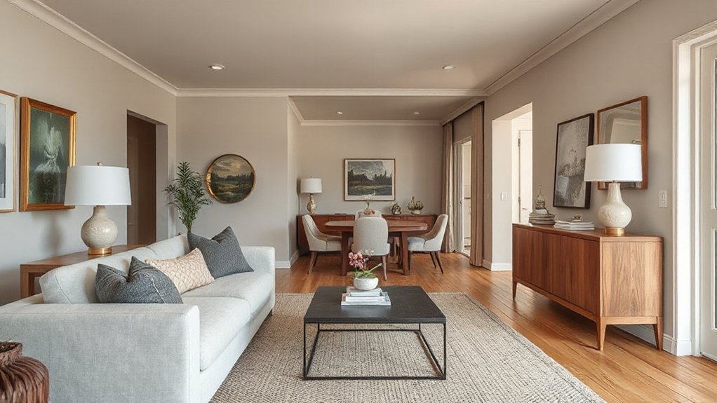
Consistent scale and proportion guarantee every piece feels part of a single story. You create harmony by anchoring each room to a baseline size, then echoing that proportion in furniture, art, and accessories. When scale aligns with space, you invite ease, not effort, into every corner.
Focus on balance rather than uniformity, letting larger pieces ground the room while smaller elements provide detail. This is scale harmony in action, a practice that sharpens focus and elevates mood.
- Measure key pieces against the room’s height and width to guarantee they breathe together.
- Pair bold, tall items with lower, lighter accents to maintain proportion balance.
- Use a consistent rhythm—repeated shapes or finishes—to weave coherence throughout.
Create a Subtle Art Palette That Narrates the Story
A subtle art palette tells your story without shouting it. You select hues that complement architectural bones and natural light, then let them work in quiet conversation rather than overt statements.
Use a restrained core: a versatile base, a couple of midtones, and a single accent that doesn’t dominate. Color storytelling unfolds through layering, texture, and finish—matte, satin, or a whisper of sheen—so every piece reads as part of a bigger narrative.
Curate artworks and textiles that reinforce the palette’s mood, avoiding jarring contrasts. Your aim is cohesive, not identical; subtlety strengthens your artistic narration.
Maintain consistency across rooms by repeating the same mood and temperature, then vary intensity gently for focal points, guiding perception with intentional, refined choices.
Align Window Treatments With the Overall Look
Choose curtain styles that read as a single design language across rooms, so you keep curtain style consistency from living spaces to bedrooms.
Aim for color harmony across rooms by selecting fabrics and tones that tie each area together, rather than clash.
Check proportions and scale alignments to guarantee window treatments complement window size and furniture, creating a cohesive finish.
Curtain Style Consistency
When selecting window treatments, make certain the curtain style reinforces the home’s overall aesthetic rather than competing with it. Curtain style consistency isn’t about matching every fabric; it’s about a cohesive silhouette and deliberate detailing that echo the room’s character.
Use restraint to let Pattern mix and Color blocking subtly guide your choices, creating harmony rather than clutter. Aim for a unified header and hemline, coordinating hardware, and a similar weight profile across spaces.
A thoughtful approach ensures flow from room to room while preserving individuality where needed.
1) Choose a consistent rod diameter and finish to unify look across spaces.
2) Align curtain length with architectural lines for a polished silhouette.
3) Use a shared fabric weight family to maintain rhythm and balance.
Color Harmony Across Rooms
Begin with a base color and layer tonal variation through upholstery, rugs, and drapery headers so progression feels intentional, not accidental. Consider color psychology: cooler tones foster calm in living areas, warmer shades energize dining spaces, and neutral anchors provide flexibility as you evolve decor.
Use varying saturations of the same family to create depth without visual friction. Align trim, hardware, and liners to reinforce the palette, avoiding jarring contrasts.
Consistency in undertone—cool vs. warm—ensures seamless flow from room to room while preserving individual character.
Proportions And Scale Alignments
Proportions and scale set the rhythm for window treatments, ensuring they read as an integrated part of the room rather than an afterthought. When you align height, width, and fullness with the surrounding architecture, you create harmony that doesn’t shout, it whispers.
Aim for curtain panels that stop just above the floor for a sleek line, or puddled hems for softness, but keep the rod proportionate to the window.
- Choose a proportion that mirrors architectural cues to evoke calm.
- Use color blocking to anchor the frame without overpowering other elements.
- Integrate pattern mixing thoughtfully, letting scale guide the mix.
This approach keeps your space cohesive, elevating color, texture, and form into a unified statement.
Anchor Each Room With a Unifying Accent Element
To anchor each room with a unifying accent element, pick a single signature detail—like a color, texture, or pattern—and repeat it in small but deliberate ways. You’ll create cohesion without monotony by treating this detail as your color anchor.
Use Accent Elements sparingly across furniture, textiles, and accessories, so the room reads as one composition rather than a collection of parts. Choose a stable Color Anchor—perhaps a deep navy or warm terracotta—and weave it through throws, cushions, frame mats, and a single standout rug or artwork.
Maintain restraint: repetition should feel intentional, not thematic overload. Balance contrast with neutrals to preserve clarity.
This approach ties rooms together while preserving individuality, guiding your eye and reinforcing a cohesive, polished home aesthetic.
Plan a Cohesive Rug Strategy Across Rooms
A cohesive rug strategy ties rooms together while preserving individual character, so start by establishing a consistent scale and motif that travels from space to space. You’ll create harmony with deliberate pattern pairing and intentional rug layering that feels natural, not forced.
- Establish a unifying base: pick a dominant rug size and color family that repeats softly in each room.
- Vary textures, not colors: use complementary pile heights and weave qualities to echo rhythm across spaces.
- Layer thoughtfully: place a flatter rug beneath a textured accent for depth that guides movement.
This approach delivers continuity without stifling personality, so your path through the home remains cohesive, tactile, and inviting.
Use Lighting to Tie Rooms Together
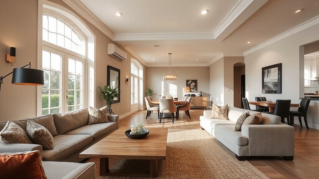
You’ll unify your spaces by keeping lighting temperature consistent across rooms, so the glow feels seamless rather than jarring. Choose unified fixture styles to reinforce a connected look.
Then layer ambience with different light levels to support function without breaking flow. Use subtle variations in intensity and layering to tie the rooms together while preserving individual mood and purpose.
Consistent Lighting Temperature
- Choose a baseline Kelvin color and apply it everywhere to avoid jarring shifts.
- Match all main fixtures within each zone to reinforce uniform mood.
- Adjust accents subtly, keeping them within the same temperature family to preserve continuity.
Unified Fixture Styles
Fixture pairing matters: pair lighting with similar metal tones or glass textures to cement a deliberate rhythm, rather than random accents. Aim for style uniformity by limiting variety to purposeful contrasts—one statement piece per zone, complemented by multiple smaller lights in the same family.
Avoid mixing wildly divergent designs that fracture the look. Consider proportion relative to room size and ceiling height so fixtures read as intentional punctuation, not decor afterthoughts.
Layered Ambience Techniques
Layered ambience uses lighting as a connective thread to blur room boundaries and create a cohesive flow. You’ll balance fixtures across spaces, so shadows repeat softly and textures register consistently. Ambient layering creates depth without clutter, while texture repetition ties surfaces together from room to room.
- Synchronize color temperature across zones to preserve a unified mood.
- Use dimmable layers—ambient, task, and accent—to flex the feel as you move through the home.
- Accent with repeats of material cues (metal, wood, fabric) to reinforce continuity.
Strategically placed sources guide the eye, prevent harsh passages, and make ceilings feel taller. Keep lines clean and proportions intentional, letting light do the talking. This approach cultivates calm, coherence, and a polished, inviting atmosphere.
Integrate Personal Touches Without Visual Clutter
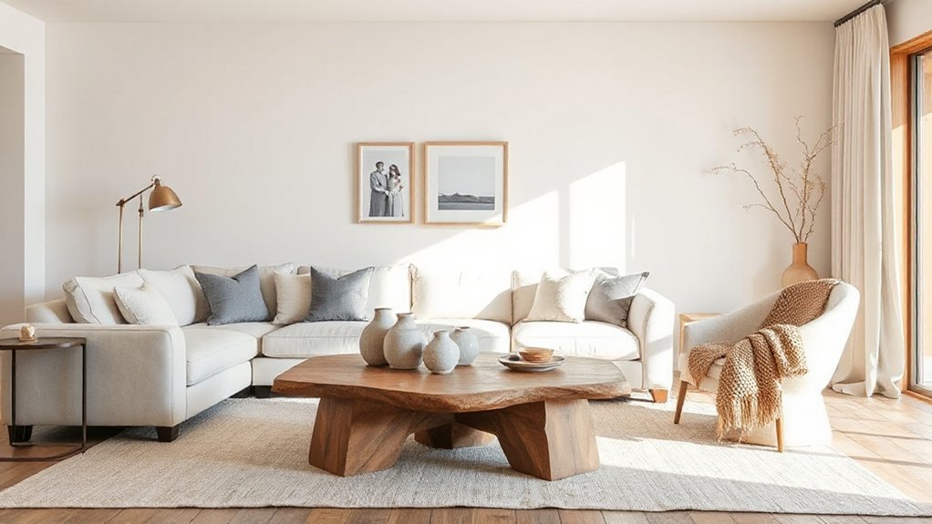
To add personality without chaos, curate a few meaningful touches that feel intentional rather than decorative clutter. You should prioritize quality over quantity, selecting pieces that reflect your daily life and values.
Aim for a cohesive collection: several core items repeated in different rooms, plus a few strategic accents. When choosing, favor fit with your palette, texture, and furniture lines to reinforce a unified feel.
Personal expression should be subtle, not overwhelming; each piece earns its place. Avoid visual clutter by limiting displays to essential items—photos in a single frame style, a curated gallery, or a handful of heirlooms.
Rotate pieces seasonally to refresh the look without creating disorder. The result is thoughtful, balanced, and distinctly yours, preserving space and flow rather than competing with it.
Organize Storage and Surfaces for Calm, Visual Quiet
Keep surfaces clean and uncluttered to calm your mind, using tidy organization that still feels intentional. Choose unified storage solutions and subtle color coordination so every item has a place and purpose.
This simple balance—tidy surfaces, calm mind, cohesive storage—creates a quiet, cohesive backdrop for your home.
Tidy Surfaces, Calm Mind
A tidy surface instantly calms the mind, so start by clearing clutter from your everyday zones and committing to a simple routine: put items away after use, wipe down surfaces, and establish containment with trays or baskets.
- Embrace daily resets to reinforce clutter reduction and surface organization, keeping visible areas calm.
- Create dedicated zones for keys, mail, and gadgets to prevent random accumulation and visual noise.
- Maintain a minimal palette and texture variety to sustain cohesive order without sacrificing warmth.
This approach elevates how you experience spaces, delivering visual quiet and improved focus. With disciplined upkeep, you’ll notice steadier energy, easier cleaning, and a more intentional, cohesive home aesthetic.
Unified Storage Solutions
Use innovative storage to maximize vertical space—wall shelves, slim cabinets, and nested bins—so you maintain clean lines without sacrificing function. Prioritize hidden compartments within desks, coffee tables, and media consoles to conceal cords, remotes, and cables.
Choose a cohesive material palette, matching hardware finishes for visual quiet. Label where appropriate, but avoid clutter indicators. Regularly assess use, removing items you no longer need.
With disciplined zoning and strategic hides, your home sustains a calm, cohesive aesthetic that feels deliberate and serene.
Subtle Color Coordination
- Align tones across furniture, textiles, and containers for a unified field.
- Introduce color contrast through accents sparingly, prioritizing depth over brightness.
- Vary surface materials to create subtle rhythm while preserving calm.
This approach reinforces visual quiet, guiding the eye smoothly from zone to zone.
Balance Vintage and Modern for a Timeless Feel
Blending vintage charm with modern ease creates a timeless feel you can live with daily. To balance those eras, anchor rooms with a clean layout and purposeful contrasts. Let antique accents pop against a backdrop of Modern minimalism, which keeps lines simple and clutter at bay.
Choose one or two standout vintage pieces—think a carved mirror or a mid‑century chair—as focal points, then temper them with streamlined furniture and neutral surfaces. Maintain cohesion by repeating finishes, such as brass hardware or wood tones, across the space.
When mixing textures, let tactile variety support function; avoid over‑embellishment. Finally, curate lighting that blends warm glow with crisp task light. The result is inviting, intentional, and enduring.
Test Drive Textiles Before Committing
- Observe how a fabric drapes on furniture and how it feels to touch.
- Check color consistency under different lighting and over time.
- Test for wear, lint, and snag resistance with everyday use.
Keep notes on how each option responds to sunlight, cleaning, and family activity. This disciplined approach guarantees a cohesive, lasting look across rooms, aligning choices with lifestyle realities rather than appearances alone.
Build a Quick-Reference Style Guide
A quick-reference style guide keeps your cohesive look on point without slowing you down. Create a compact document you’ll actually use: define your core palette, rule of three color pairing, and the moments you’ll apply them.
List primary, secondary, and accent swatches with hex codes or fabric samples, plus quick notes on where each belongs.
State your furniture silhouettes, textures, and finishes in one line per category to reinforce style consistency.
Include a few universal rules—avoid clashing patterns, limit metals, and maintain proportional scale across rooms.
Use the guide as a constant reference rather than a project bible. Update it when you introduce new pieces, so color pairing and style consistency stay aligned with your evolving home aesthetic.
This keeps decisions fast and cohesive.
Edit Room-by-Room in Stages
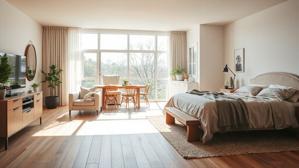
Start by planning A Room-by-Room, Stage-by-Stage Editing to map the whole project clearly. Focus on Consistent Styling Across Spaces as you move from one area to the next.
Ensuring each choice aligns with your overall palette and furniture plan. This approach keeps decisions deliberate, efficient, and cohesive from room to room.
Plan A Room-by-Room
To plan a cohesive look, tackle room-by-room projects in stages, starting with a clear sequence that aligns with your overall concept. You’ll map each space to a core element you want to emphasize, then refine flow, color, and texture without overcomplicating the plan. Focus on decisive choices that reinforce unity.
- Prioritize Color blocking to establish rhythm, then reuse the palette for furniture and accessories.
- Highlight Statement pieces in each room to anchor the design and create focal points.
- Schedule edits in logical order—start with large items, then layered textiles and art to finish with a polished, cohesive feel.
This approach keeps you aligned with the concept, delivering a crisp, intentional transformation.
Stage-by-Stage Editing
Begin with essentials, then layer in details after you validate color and form locally.
Assess color contrast in each room, ensuring elements read clearly against their surroundings instead of competing for attention.
Prioritize lighting variability as a design tool, testing how daylight and artificial sources shift mood and perception over time.
Make short decisions, then pause to observe how changes travel from one area to the next.
Document results, note what travels well, and adjust in a single pass before moving on.
This disciplined sequence preserves coherence while preserving flexibility for future refinements.
Consistent Styling Across Spaces
A consistent styling across spaces emerges when you edit room by room in stages, keeping your design language steady while you validate every choice locally. You’ll create unity by applying core elements—color, texture, and form—consistently, then adapt per room.
Use color blocking to anchor zones without shouting, and rely on pattern mixing to add personality without chaos. Your aim is a restrained rhythm, not a replica.
- Align key hues across spaces to form a seamless flow.
- Introduce one dominant pattern with two supporting textures for balance.
- Reassess each room’s accents after steps, ensuring cohesion before moving on.
Design Transitions: Everyday Use vs. Special Occasions
Design shifts are all about balance: everyday use should feel effortless, while special occasions elevate spaces without clashing with daily routines. You create progressions by outlining core elements that endure—color palette, textures, and shapes—then layer in purpose-driven accents for moments that matter.
Keep sightlines clean and scale consistent so gaps don’t widen between everyday gatherings and formal evenings. Seasonal decor can arrive briefly, then retreat, preserving cohesion without overloading rooms. Use reversible swaps, like cushions or vases, to accent rather than overhaul.
Consider Cultural influences thoughtfully, so traditions enrich rather than overpower your home’s story. This approach guarantees a unified mood is flexible, welcoming, and intentional, inviting daily ease while supporting ceremonial flair without abrupt shifts.
Budget Smarter With a Cohesion Roadmap
You can stretch your budget while keeping a cohesive look by laying out a practical roadmap that aligns spending with core design pillars. A cohesive plan starts with color psychology and deliberate budget planning that prioritizes versatility over impulse buys.
- Define a color backbone you’ll reuse across rooms, then allocate funds to items that carry the broadest impact.
- Invest in durable foundations—sofas, rugs, and window treatments—that support multiple palettes and eras.
- Schedule phased buys, syncing purchases with seasonal sales and timeless accents to preserve harmony without waste.
With a clear roadmap, you’ll avoid mismatches, accelerate upgrades, and maintain a calm, unified home aesthetic.
Refresh Cohesion Seasonally Without Breakage
Seasonal refreshes should reinforce cohesion, not disrupt it. To refresh without chaos, plan around your existing palette, textures, and proportions.
Choose one small update per room—think a textile swap, a new throw pillow, or seasonal accents in the same color family. Prioritize pieces that blend with what you already own rather than crowding with novelty.
When you adjust lighting, use warm bulbs and dimmers to shift mood without altering fundamentals.
Store out-of-season items neatly, labeling containers for quick swapping. Limit new purchases to items that complement current furniture, avoiding abrupt contrasts.
This approach supports breakage prevention by reducing clutter and maintaining scale. With disciplined curation, a cohesive look persists through each season, effortlessly.
Seasonal refresh done right preserves harmony and clarity.
Frequently Asked Questions
How Long Does It Take to Achieve a Cohesive Home Look?
It can take weeks to months, depending on scope, but you’ll see progress as you prioritize Color coordination and Style consistency. You start today, refine elements daily, and end with a cohesive, curated look you’ll love.
Can Bold Accents Still Feel Cohesive Across Rooms?
Bold accents can still feel cohesive across rooms when you maintain color consistency, repeat key hues, and balance contrast with neutrals. You’ll unify textures and finishes, ensuring bold accents don’t overwhelm but rather anchor and connect each space.
How Do I Test New Textures Without Overhauling?
You can test new textures by layering small samples and swapping one element at a time. Use texture layering and material mixing to preview impact, then refine until cohesive. This keeps momentum, minimizes risk, and clarifies your direction.
What’s the Easiest Way to Unify Different Furniture Styles?
To unify different furniture styles, mix finishes and silhouettes with intention, focus on color palette, and use a unifying rug or textures. This creates furniture harmony, letting mixing styles feel deliberate rather than erratic.
How Often Should I Refresh a Cohesive Palette?
You should rejuvenate a cohesive palette every one to two years. Color consistency matters for flow, but you’ll keep interest with subtle updates. By balancing color consistency and Style blending, you preserve harmony while revitalizing textures, accents, and mood.
Conclusion
You’ve laid the groundwork for a calm, intentional home. As you weave your vibe through color, texture, and furniture, remember: consistency isn’t stiffness—it’s a steady, quiet rhythm. Like a well-loved chorus that echoes through every room, the elements repeat and respond, guiding guests without shouting. When you refresh, do so with the same steady hand. Resort to your cohesion roadmap, and your space will feel timeless, cohesive, and quietly confident—as if it’s always been home.