
Did you know neutral palettes stay timeless across 90% of property styles, from city apartments to country homes? You’ll find it’s less about chasing trends and more about versatility: durable materials, flexible furniture, and walls that welcome personalization. Stay with me as we explore how to layer texture, leverage natural light, and create adaptable spaces that feel cohesive yet ready for change. There’s a practical path here that you can apply in any room.
Key Takeaways
- Neutral, timeless foundations anchor any property, enabling flexible styling and enduring appeal.
- Durable materials and low-maintenance surfaces ensure longevity across diverse spaces.
- Layered texture adds depth and warmth, enhancing visual interest without relying on trends.
- Flexible layouts and modular furniture support multi-use zones and easy reconfiguration.
- Subtle color strategy with movable accents maintains cohesion while allowing seasonal refreshes.
Why a Neutral Backbone Works for Any Space
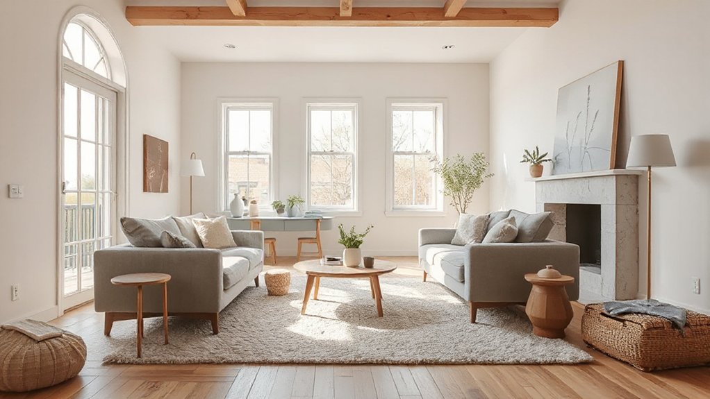
A neutral backbone anchors any space, providing a calm, enduring foundation that makes styling flexible and easy to refresh. You choose a restrained palette and let architectural details define character, rather than chasing trends.
A neutral base reduces visual noise, so color psychology can guide accents with intention, heightening mood without overwhelming the room. You’ll notice how subtle shifts in tone alter perceived scale, light, and harmony, letting you adapt to changing needs over time.
With neutral groundwork, you pair durable materials and clean lines to build confidence in future updates. You’ll control clutter by designing perimeters and focal points that stay timeless.
This approach keeps spaces adaptable, cohesive, and welcoming, while granting you precision in how you apply texture, form, and rhythm.
Layer Texture for Depth and Warmth
Layer texture adds depth and warmth by mixing materials like wood, textile, and stone so your space feels inviting and lived-in.
Use varied textures thoughtfully to create contrast and visual interest without clutter.
Start by pairing a tactile focal piece with complementary surfaces to ground the room and guide the eye.
Layer Texture For Depth
Texture layering adds depth and warmth to a space by combining tactile surfaces—think wool, linen, rattan, and smooth metals. You’re aiming for a deliberate mix of textures that creates visual interest without clutter.
Start with a solid foundation—large-scale pieces in matte finishes—to ground the room, then introduce complementary textures in smaller accents. Seek textural contrast: pair soft fabrics with sleek, cool surfaces, or rough weaves against glass or lacquer.
Sensory layering happens through proportional contrasts in weight, sheen, and pattern, not by overwhelming the palette. Use textiles, materials, and objects that repeat a unifying undertone—color, fiber, or texture—to knit the space together.
Leave breathing space to guarantee each texture can read clearly, enhancing depth without competing elements.
Warmth Through Texture
Warmth emerges when texture is layered with intention, not chance. You create depth by pairing tactile finishes with deliberate contrast. Start with a base—soft fabrics or matte paints—that invite touch.
Add textural contrast through woven rugs, brushed metals, or knobby woods to prevent flatness. A glossy surface can reflect light, while a rougher texture absorbs it, balancing ambiance.
Vary scales: a chunky knit against a sleek leather, or a nubby linen with a smooth ceramic. Consider warmth in lighting, too; warm bulbs enhance tactile finishes.
Keep repetition purposeful—repeat one or two textures across rooms for cohesion. Remember, warmth isn’t about abundance; it’s about thoughtful layering that invites you to touch, linger, and feel at home.
Let Natural Light Drive Your Color Mood
Natural light sets the color mood in a room, so observe how daylight changes hues as the day progresses and plan accordingly. You’ll see sunlit hues shift with the sun, so choose paints and fabrics that stay true under varying brightness.
Start with daylight palettes that favor long-wavelength neutrals, then layer with cooler or warmer accents as needed. Test swatches on different walls at morning, noon, and late afternoon to confirm consistency.
Use semi-gloss sheens in bright spaces to bounce light; matte finishes soften glare in shaded corners. Balance contrast to avoid harsh shifts; lighter tones open interiors, while deeper tones anchor furniture and art.
Let natural light guide your palette, then tune with accessories for harmony and crucial.
Flexible Furniture That Adapts as Life Changes
Flexible furniture helps you adapt as needs shift, so you’re not tied to one layout. Look for adaptable seating options and space-saving configurations that reconfigure without a full overhaul.
Start with a plan that anticipates change, and choose pieces that pair function with clean, lasting style.
Adaptable Seating Options
Look for nesting chairs and ottomans that tuck neatly, keeping traffic clear and spaces breathable.
Modular seating lets you reconfigure layouts in minutes, matching seating density to your current needs. Target pieces with durable upholstery and secure connectors to minimize wobble as you reassemble.
Prioritize clean lines and a cohesive color story to preserve flow when configurations evolve.
Consider height-adjustable options for flexible viewing angles and conversation, reducing clutter while boosting usefulness.
With thoughtful selection, your space stays functional, stylish, and ready for whatever life throws at you.
Space-Saving Configurations
Start with compact storage that hides clutter behind doors or within benches, so surfaces stay clear for work, dining, or play.
Choose modular furniture that can reconfigure in seconds: a sofa that morphs into a guest bed, a coffee table with lift-top storage, or wall-mounted units that shift as your space requirements change.
Opt for pieces with clean lines and dual-purpose features to reduce visual noise. Prioritize easy-to-maneuver mechanisms and durable finishes, since frequent reassembly happens.
In small or large homes, these configurations maximize every square inch while preserving style, flow, and function.
Subtle Color Pops That Stay Put (and Move)
Subtle color pops can anchor a room without overwhelming it, because strategic placement keeps them from feeling gimmicky. You’ll use Color accents sparingly, focusing on moments that draw the eye without shouting.
Choose Dynamic hues that contrast with your core palette rather than replace it, so the room remains cohesive. Apply pops in functional zones: a chair seam, a throw, or a throw pillow that can move with the space as you reconfigure furniture.
If you want to keep them put, anchor the color in one accessory group, then rotate pieces seasonally to refresh the look without changing fundamentals. For motion, swap textiles or art frames seasonally; for permanence, bind the color to a single accent wall or built-in feature.
Mix Patterns Without Chaos: Safe Rules for Layering
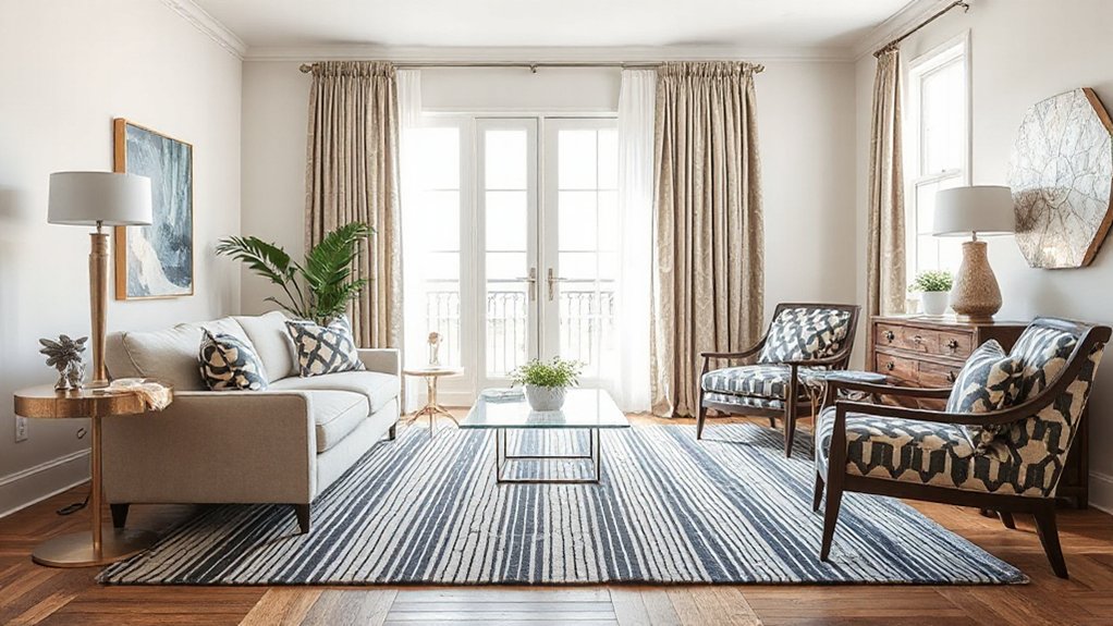
Mixing patterns without chaos starts with a disciplined approach to scale, proportion, and color. You’ll create harmony by prioritizing pattern contrast: pair large motifs with small repeats, and balance bold prints with calmer textures.
Start with a unifying color story, then introduce a single dominant pattern and two supporting ones. Limit the palette to three hues to keep the room cohesive. Vary fabric types and sheen to add depth without visual overload.
Use repeat and rhythm: repeat a motif across cushions, a rug, and a throw to anchor the space. Mix motifs thoughtfully—floral with geometric, or stripes with damask—never simultaneously loud.
Mixing motifs should feel intentional, not accidental, so every layer reinforces the room’s mood and stays visually calm.
Scale and Proportion Across Rooms
Start with a dominant element—sofa, rug, or console—that defines the focal point, then layer in seating and storage that relate in size. Aim for proportion balance between planes: wall art shouldn’t dwarf windows, and coffee tables should harmonize with sofas.
Consider negative space as a deliberate element; breathing room prevents clutter and guides movement. Test scales at eye level, adjust until paths feel natural, and maintain consistency as you move from room to room.
Consistency in scale sustains cohesion across the home.
Functional Zoning in Open Plans
Open plans hinge on clearly defined zones you can identify at a glance. Start by defining open zones, ensuring each area signals its purpose while preserving flow through spaces.
Look for opportunities for multi-functional nooks that support different tasks without clutter, so you maintain clarity and practicality in everyday use.
Defining Open Zones
How can you define open zones without breaking flow in an open-plan layout? Start by identifying distinct functions—living, dining, work, and kitchen—then assign zones with subtle cues rather than walls.
Use furniture arrangement to create logical boundaries: sofas facing away from traffic, rugs to anchor spaces, and varying ceiling heights or pendant clusters to signal shifts in purpose. Prioritize sightlines and circulation paths so movement remains intuitive.
Incorporate privacy zones where focus matters, using screens, bookcases, or plants to carve out quiet corners without isolating the room. Acoustic separation matters too: softened surfaces, targeted textiles, and strategic rug layering reduce noise transfer between zones.
Finally, guarantee lighting and color cues unify, preserving cohesion while denoting function.
Flow Through Spaces
In open plans, flow through spaces hinges on how you move between zones. You create intuitive paths by aligning furniture, storage, and lighting so sightlines and traffic avoid clashes. Define zones with subtle cues: area rugs, furniture groups, and material changes that signal purpose without walls.
Maintain a clear main corridor; keep doors and openings unobstructed to preserve sight and movement. Use color psychology to set mood for each zone while ensuring progression feels seamless, not jarring.
Apply feng shui principles by balancing elements, avoiding sharp angles in high-traffic areas, and grounding entries with a welcoming focal point. Prioritize proportional scale so larger rooms feel cohesive with smaller adjacent spaces, reinforcing a fluid, purposeful circulation throughout the open plan.
Multi-Functional Nooks
- Compact storage integration
- Creative lighting as a zoning tool
- Built-in, fold-away furniture
- Vertical shelving for display and function
- Accessible power and seating plans
Timeless Materials for Longevity and Style
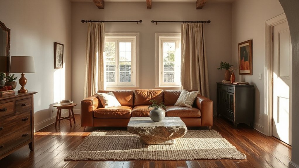
Timeless materials stay relevant because they age gracefully and require fewer replacements. You’ll see lasting impact when you choose stone, timber, and metal with proven durability and classic appeal.
Prioritize low-maintenance surfaces that resist wear without shouting novelty. In practice, lean toward finishes that patina instead of chipping, and opt for solid construction over veneers.
Sustainable sourcing matters: verify traceability, ethical mills, and responsible extraction. Pair materials with restrained detailing to avoid trends that fade.
A cohesive palette—earthy neutrals, warm woods, cool stones—enhances longevity and resale versatility. Consider vintage revival elements lightly, ensuring current compatibility and structural integrity.
Quick Accessory Moments to Reconfigure Your Look
Accessories are the quickest way to refresh a room without overhauling its core design. You can retool the vibe in minutes by swapping or repositioning small pieces that carry big impact.
Focus on Accessory layering to create depth: mix textures, heights, and finishes for cohesiveness. Use decorative accents to punctuate color stories and lighting cues without changing the furniture. This approach keeps your scheme flexible, so you can test bold ideas and dial them back swiftly.
- Layer lamps of varying heights for a focal glow
- Swap throw pillows and throws to shift mood
- Group a trio of sculptural pieces for balance
- Introduce metallic or matte finishes as accents
- Rotate wall art and trays to echo seasons and tasks
Frequently Asked Questions
How Can a Neutral Backbone Handle Bold Art Without Feeling Bland?
Color contrast and smart art placement let you keep a neutral backbone without blandness. You punch impact by pairing bold pieces with restrained surroundings, balancing scale, spacing, and lighting so the art feels intentional, not overpowering.
Which Textures Create Warmth in Small Spaces Without Crowding Them?
Textural contrast and cozy textiles create warmth in small spaces without crowding them. You’ll pair smooth surfaces with tactile textures, layer throws and rugs, and keep scale tight on furniture to maintain openness and visual breathing room.
Can Natural Light Influence Color Choices for Artificial-Lit Rooms?
Yes—you’ll notice natural lighting guides color choices in artificial-lit rooms. You’ll leverage color psychology to boost brightness, mood, and perceived space, using cooler tones for daylight areas and warmer hues where artificial light dominates.
What Are Budget-Friendly Ways to Update a Timeless Look Seasonally?
Seasonal decor swaps let you update vibes without overhauling rooms. Swap textiles, artwork, and accents weekly. Focus on Budget friendly accessories like cushions, throws, and vases. You’ll refresh timeless looks while keeping costs low and style polished.
How Do You Measure Scale When Mixing Oversized and Petite Furniture?
You measure scale by proportion ratios between oversized and petite pieces, aiming for balanced visual weight. Maintain furniture hierarchy, pairing bold statements with simpler accents, and target consistent plane heights to keep rooms cohesive and proportionally intelligent.
Conclusion
You’ve got a neutral backbone, durable details, and a design mindset that moves with life. Build around calm, collectible materials; blend texture with timeless tones; let light lift the mood. Favor flexible furniture, smart zones, and quick accessory swaps to reframe rooms in minutes. Stay steady with scale, spacing, and subtle pops that please now and endure later. Practical, polished, and perpetually possible—this approach proves every property type shines with a simple, soulful, scalable style.