
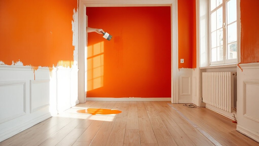

To paint a small room bold, start with 1–2 focal walls in a vivid hue and keep the rest neutral to prevent overwhelm. Test swatches at different times of day, note undertones, and choose a finish that suits the space—matte for a quiet backdrop, satin for a subtle glow. Balance with lighter ceilings, trim, and strategic lighting to expand the room. Plan your schedule to minimize disruption; follow these steps and you’ll gain access to deeper impact, too.
Key Takeaways
- Pick 1 bold hue as a room focal point, pairing it with neutrals on walls, ceilings, and trim to avoid overwhelm.
- Test large swatches at different times of day to see true color shifts before committing.
- Use satin or eggshell finishes to balance bold color with light reflections and easier maintenance.
- Consider light: position windows and lighting to enhance the bold color without washing it out.
- Repetition of core hue in decor and accents creates cohesion without excessive color saturation.
Choose Your Bold Hue for a Small Room: Criteria and Steps

Choosing a bold hue for a small room starts with purpose and restraint: pick one color that will be the room’s focal point and build around it. You’ll define the hue by its impact, not just its shade, aligning it with the mood you want.
Consider color psychology: how warm tones energize, cool tones calm, and muted shades recede visually. Narrow your options to two or three contenders that harmonize with existing furnishings.
Test swatches on large wall areas at different times of day to observe light interaction.
Evaluate paint durability by reading coats, primers, and finish options; matte hides flaws less, while satin or semi-gloss resists fingerprints and humidity.
Decide once you confirm the balance between vibe, practicality, and upkeep.
How Light Affects Bold Color Perception
Light plays a bigger role than you might think in how bold colors read in a small room. In daylight, bold hues can feel energetic and expansive, especially when you contrast them with bright whites or cool neutrals.
At night, artificial light shifts perception; warmer bulbs boost orange and red undertones, while cool LEDs can emphasize blue and green notes. To control impact, consider color psychology: how you want the space to feel, then select a finish accordingly.
Paint finishes matter: matte minimizes glare and makes color read softer, satin reflects more light for brightness, and semi-gloss amplifies saturation in trims. Test samples on wall sections at different times of day, and adjust lighting or finish choices to preserve the intended bold effect.
Matching Undertones to Read Calm, Not Strident
Undertones matter when you read a color, so start by testing its real warmth or coolness on the walls you’ll actually paint.
Balance color temperature by comparing swatches on the same room lighting, then confirm the calm vibe before committing.
Remember: test on actual walls to verify the undertone reads as you intend, not just on a sample card.
Undertone Matters When Reading
Undertones can make a big difference in how comfortably you read a color. When you choose a bold wall, test the undertone under multiple lighting conditions, because subtle shifts can alter mood and legibility. You’ll notice that cooler undertones tend to feel calmer, while warmer ones can read more intimate or energetic; neither is inherently bad, but matching intent matters.
Rely on practical checks: view swatches near your reading area, observe after dawn and dusk, and compare against a neutral backdrop. Color psychology informs these choices, guiding you toward undertones that reduce eye strain and enhance focus.
Historical trends show designers favor balanced undertones for readability over loud, saturated cores. In practice, trust what feels steady, letting undertone fidelity support calm, not strident, reads.
Balance Color Temperature
To balance color temperature, start by pairing undertones with the room’s purpose and lighting. You control how bold a color feels by aligning warm or cool undertones with nearby spaces and daylight.
If you want calm, lean toward balanced or slightly warm undertones under soft, diffuse light, avoiding extremes. Use practical checks: compare swatches beside trim, flooring, and fabric, not in isolation, to see how they read at eye level.
Apply artistic techniques like layering subtle undertones in multiple coats to prevent muddy undertone shifts.
Consider color psychology: cool tones feel serene but can look clinical if overpowered; warm tones feel inviting but may appear strident in small rooms without adequate contrast.
Test samples at various times of day, adjust until temperature remains harmonious.
Test On Actual Walls
Now take the paint you’ve chosen and test it on actual walls, not just swatches. Start by applying large enough patches in multiple lighting moments—morning, afternoon, and artificial dusk—to see undertones in action. Don’t rely on a single swipe; paint patches about a square foot so you can compare against trim, ceiling, and existing furniture.
Observe how the hue shifts with natural light, then judge calm versus strident energy. Note how Wall art interacts with the color and whether prints read cohesive or clashy.
Consider furniture placement next: if the shade dominates, rotate pieces to balance visual weight and prevent overwhelming the room. Seal your evaluation with a second, clean coat test to confirm lasting tone before committing.
Balance Bold Color With Neutrals for Space and Harmony
Mix bold color with neutrals to keep the room feeling balanced and calm. You’ll anchor the space by choosing a primary bold wall or accent shade, then temper it with neutral walls, ceilings, and trim.
Use color psychology to guide your choices: grounded neutrals like warm grays, taupe, or off-whites help a vibrant hue feel intentional rather than overpowering. Limit bold tones to one or two surfaces to avoid visual clutter.
Plan furniture placement to maximize light and flow, keeping larger pieces neutral so the color acts as a feature rather than a chaos driver. Introduce texture through textiles, rugs, and artwork in complementary neutrals.
This approach preserves harmony while you enjoy the bold statement.
How to Plan Your Paint Schedule to Minimize Disruption
To minimize disruption, plan around luck-free windows when you’ll have steady, predictable drying times.
Protect non-painted areas and set up containment before you start, so you don’t spill or smudge nearby surfaces.
Factor prep time and drying windows into your schedule to keep the project efficient and on track.
Schedule Around Luck-free Windows
Scheduling around luck-free windows means you plan around predictable drying times and natural light so disruption stays minimal. You map tasks to ambient conditions, not calendar hype. Begin with primer and edges during morning light, then roll large walls when humidity stays low. Use standard drying intervals, not guesswork, to avoid backtracking.
Match coats to your room’s activity rhythms—pause work when midday glare makes color reading unreliable. Keep doors open to facilitate airflow without dust migration, then close during final topcoat to maintain tone consistency.
Luck-free windows also guide when to evaluate color perception—Color psychology helps you confirm mood before committing to a bold choice. Finish with a single, precise topcoat, inspecting edges under neutral light for crisp, durable results.
Protect Non-Painted Areas
Protecting non-painted areas starts with deliberate barriers and smart scheduling. You’ll shield floors, trim, outlets, and fixtures with painter’s tape, drop cloths, and plastic sheeting that stays in place until the job’s done.
Create a clear workflow: designate zones for painting, wipe down surfaces between steps, and limit foot traffic through the space. If you have wall murals or artwork, cover them carefully and remove loose items to prevent accidental splatters.
When you plan coats, stagger tasks to minimize rework, and cue in any necessary light changes that won’t linger on walls longer than needed. For artistic finishes, apply sealer or glaze in controlled passes to avoid staining adjacent surfaces.
Keep a tidy edge line to preserve existing textures.
Prep Time and Drying Windows
Schedule surface prep, primer, and color coats in distinct blocks, allowing adequate cure time between steps. Consider color psychology to choose a hue that harmonizes with furniture and natural light, reducing the need for touch-ups.
Use paint technology to match finish to room use—eggshell or matte for walls, satin for high-traffic areas—without compounding drying delays. Ventilate consistently during and after each coat, and keep temps within manufacturer recommendations to prevent delays.
Label cans, note dry times, and stagger projects to restore function quickly while maintaining quality.
Pro Prep: Cleaning, Repairs, and Priming Essentials
Pro prep starts with a clean slate: wipe down every surface, remove dust, and repair cracks or holes before you lay a single coat. You’ll create a solid base by repairing siding, filling gaps, and sanding rough spots so primer adheres evenly.
Prime bare wood or repaired areas to prevent stains from bleeding through and to even out porosity.
- Assess surface integrity and choose the right primer for your material
- Clean, dry, and dust-free surfaces before any paint touches them
- Address repairs first, then seal with a stain-blocking or spot primer as needed
- Plan color impact with color psychology and lighting techniques in mind
This prep guarantees crisp edges, minimal coats, and long-lasting bold color.
Edge Work: Cutting In Cleanly and Avoiding Visible Brush Marks

Now that the prep work is solid, you can sharpen edge control by focusing on clean cuts along ceilings, trim, and corners.
Edge work hinges on a steady hand and confident brush technique. Load your brush with just enough paint to coat without drips, then wipe the edge clean on the can rim.
Begin with a light, deliberate pull along the boundary, keeping a consistent angle to prevent thick blobs. Use short, controlled strokes near trim and ceiling lines, stopping just short of the target and feathering inward.
Check for skimmed ridges by running a dry brush along the edge to smooth any ridges. Maintain a damp-but-not-wet technique to avoid bleed, and pause at junctions to align lines.
This method minimizes visible brush marks and enhances room cohesion.
Test Color in a Tiny Space Without Spoiling It
Testing a color in a tiny space won’t waste time or paint if you do it right. You’ll test in a small section first, using swatches on the wall, not the paint can. This minimizes waste and lets you compare under lighting.
- Check color psychology: observe mood shifts in the space at different times of day.
- Move a representative piece of furniture to evaluate visual weight and balance.
- Use sample boards in the room’s corner to gauge cohesion with existing textiles.
- Revisit with the door closed to see how the color reads when the space feels sealed.
Ceiling Color Tricks to Expand the Look of a Room
Ceiling color is a simple way to alter how spacious a room feels without changing its size. You’ll look for light, cool tones to bounce more light downward and create an airy impression. Choose whites, soft blues, or pale grays with a satin or eggshell finish for durability and easy cleaning, since ceilings take knocks from dust and humidity.
Consider color psychology: cooler whites can feel expansive, while a very subtle tint may add perceived height without narrowing the space. For bold color rooms, a bright ceiling can visually lift the back wall, balancing impact.
Confirm paint durability by selecting products labeled for ceilings, with good stain resistance and washability. Apply thin coats, avoid drips, and maintain even coverage for a clean, lasting finish.
Accent Strategies: Neutrals, Wood Tones, and Metallics
You’ll balance a bold wall color with neutral harmony tones to keep the space cohesive. Add metallics for punch and wood accents to warm the room without competing with the color.
Use these elements—neutral tones, wood, and metallics—as anchors to guide furniture choices and finish selections.
Neutral Harmony Tones
You’ll use restrained palettes to set mood and cohesion, letting bold color on a single feature wall pop without overpowering. Color psychology guides your choices: warm neutrals feel intimate; cool neutrals read contemporary.
Pair wood accents to add natural texture, then introduce metallics as precise highlights to lift the space.
- Choose a dominant neutral base
- Add a warmer or cooler undertone for personality
- Introduce wood tones for texture
- Use a minimal metallic touch as an accent
Color psychology informs mood; paint durability matters—opt high-quality, washable finishes for long-term smoothness and resilience.
Metallics And Wood Accents
Choose finishes like brushed brass, copper, or nickel on hardware, frames, and light fixtures to reflect light and add warmth. Pair these with wood textures—open-grain shelves, a live-edge desk, or a veneered console—to ground the room and introduce natural tactility.
Keep metals cool against warm woods or vice versa to prevent clashes. Limit the palette: one metallic element and one wood texture can be enough.
Guarantee alignment with the bold wall color by maintaining clean lines and minimal ornament. This balance preserves impact while preserving comfort and cohesion.
When to Use an Accent Wall vs. Full Coverage
When you’re deciding between an accent wall and full coverage, start by evaluating the room’s size, light, and focal points. Use color psychology to determine impact: deeper tones feel cozy, lighter tones enlarge space. Consider paint durability in high-traffic zones, especially near entrances and desks. An accent wall works well where you want emphasis without overwhelming the room.
- Choose a single wall to highlight with a bold color or deep shade.
- Reserve full coverage for small rooms with strong architectural features.
- Pair the accent with lighter neutrals to balance intensity.
- Test swatches at different times of day to confirm read and mood.
Wall Texture and Finish: Satin, Matte, or Eggshell?
Choosing the right finish and texture matters just as much as color when painting a small room. You’ll weigh wall texture and finish options to find the balance between look and durability.
Satin, matte, and eggshell each affect sheen and maintenance differently. Satin offers a subtle glow with good wipeability, ideal for high-traffic walls or kitchens. Matte minimizes flaws and creates a smooth, quiet backdrop, but it’s less forgiving and can stain easier in busy spaces. Eggshell sits between, delivering a soft sheen with modest cleanability, suitable for living areas that see daily use.
Consider lighting, room function, and how much texture you want to read in photos. Choose a finish that supports your bold color while staying practical for everyday life.
Choosing Accents That Reinforce the Bold Palette
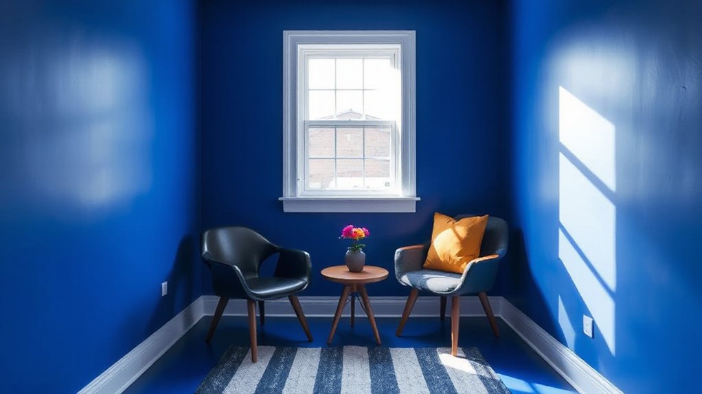
When you choose accents, aim for color harmony by repeating a core bold hue in smaller doses across decor pieces.
Balance your palette by using proportional accents—more of the dominant shade, intentional pops in secondary tones, and sparing touches for contrast.
Keep the rhythm simple and practical: align textiles, art, and finishes to reinforce the bold palette without clutter.
Accent Color Harmony
Bold accents should reinforce—not compete with—the main color. You’ll blend hues that support the mood of your bold choice, using color psychology to guide contrast and energy. Choose accent tones that echo key undertones in the wall color, creating coherence rather than chaos.
Reference historical palettes to avoid jarring clashes and to cultivate timeless appeal. Keep neutrals in play to ground the space, letting your bold color breathe without overwhelming.
- Match undertones across accents (warm with warm, cool with cool)
- Use derived hues rather than direct replicas for depth
- Vary saturation to maintain visual hierarchy
- Limit metallics and patterns to targeted focal points
This approach yields harmony, clarity, and a decisive, polished result.
Proportional Accent Balance
To reinforce a bold palette, balance your accents proportionally by assigning clear roles: the wall color dominant, secondary accents support, and tertiary highlights punctuating with precision. You’ll strengthen clarity by limiting the number of accent items and grouping related pieces.
Choose a primary accent that ties the room’s mood to the bold wall color, then add 1–2 secondary accents that echo its hue or complement it. Use 1 tiny tertiary highlight to draw attention to architectural features or focal decor.
Consider color psychology: cooler secondary tones calm intensity, warmer accents energize spaces. Guarantee paint durability by selecting a finish appropriate for each surface and cleanability needs.
Keep proportions consistent from room to room, so the bold palette feels intentional, cohesive, and timeless rather than chaotic. Continuous restraint yields lasting impact.
Maintenance and Long-Term Care for Bold Walls
Keeping bold walls looking sharp requires a simple routine and smart products. You’ll protect color longevity with consistent cleaning, careful dusting, and prompt addressing of scuffs. Choose non-abrasive cleaners and a soft cloth to avoid dulling the finish. When fingerprints or spills occur, blot gently—don’t rub.
Maintain color balance by coordinating wall art and furniture placement to minimize frequent contact and sun exposure.
- Clean with a mild, non-ammoniated solution and microfiber cloth
- Dust weekly, using a soft brush to lift particles from corners
- Address spills immediately with blotting, then touch up if needed
- Rotate wall art and rearrange furniture placement to reduce wear and sun fade
Avoid overexposure to direct sunlight; use UV-filtering window treatments to preserve vibrancy.
Renovation Timeline: Step-by-Step Application Timeline
A step-by-step application timeline keeps a bold-wall project on track and guarantees consistent results. You start with a planning phase, aligning color psychology goals with room function, lighting, and furniture layout.
Next, prepare, selecting the right paint technology for durability and finish, then schedule a realistic sequence: primer, first coat, second coat, and a final inspection. Allow adequate drying times between coats, accounting for humidity and ventilation.
Cut in edges first, then roll large areas for uniform coverage. Maintain a rolling checklist to track each phase, adjust for delays, and verify color accuracy in multiple lights. Document any adjustments to the formula or sheen.
Finish with a curing window before move-in tweaks. A disciplined timeline minimizes touch‑ups and preserves the bold color’s impact.
Masking, Tape, and Protection Without Pain
Masking, tape, and protection should vanish as a pain point and become a smooth, predictable step. You’ll set up a clean edge quickly, using smart methods that reduce touch-ups and wasted material. Start with quality tape, a painter’s shield, and drop cloths that stay put so you stay focused on color.
- Use low-tack tape along trim to avoid tearing paint.
- Shield floors with a wide drop cloth and porch-protecting painters’ film.
- Pre-cut masking for outlets and fixtures to speed up progress.
- Plan your approach with Creative color combinations and Historical color palettes in mind to minimize changes mid-project.
Keep your workspace organized, and your edges crisp, for a professional result every time.
Real-Life Small Room Transformations With Bold Colors
Real-life small-room makeovers prove that bold color can feel expansive, not overpowering. You’ll see how quick shade swaps transform perception: lighter accents, high-contrast trim, and deliberate focal walls expand depth without crowding.
Color psychology matters—cool tones open tight spaces, warm hues cozy a corner, and saturated accents guide sight to key features. When choosing paint finishes, you’ll favor eggshell or satin for walls to balance glow with durability, and matte ceilings to push the ceiling visually higher.
In practice, you plan a single bold wall or two coordinated hues, then keep furniture and art simple to avoid clutter. Lighting matters far beyond appearance; bright, even illumination prevents color from feeling flat.
Real-life results prove bold color scales gracefully with smart planning.
Common Mistakes to Avoid in Compact Spaces
In tight spaces, lighting can make or break the bold color, so plan around brightness and contrast to avoid dull outcomes.
Test colors on the wall before committing, and consider how finish and texture will read in the room to prevent mismatches.
Balance sheen, texture, and fixture reflections to keep the space cohesive and visually honest.
Lighting Effects Matter
Good lighting can make a small room feel bigger and more usable, but many mistakes undercut that potential. You’ll want lighting that enhances the bold color without glare or shadows. Focus on balance, not brightness alone, and pick fixtures that complement wall hues and color psychology goals.
- Use layered lighting: ambient, task, and accent to control mood and depth.
- Choose warm to neutral bulbs for beige-to-rich tones to preserve paint durability and true color.
- Avoid harsh downlights that wash out the color or create hotspots.
- dimmers or multiple switches let you adapt scenes for different activities.
Test Colors First
Testing colors before you commit saves time, money, and repaint headaches in a compact room. First, sample large swatches on multiple walls, not just a patch on the corner. Live with them for 24 hours to see how light shifts, which ties into color psychology and mood.
Don’t rely on small chips; they flatten depth and hue. Build a controlled test area, then compare at different times of day to gauge true tone.
Consider wall textures; matte surfaces absorb color differently than eggshell or satin, altering perceived depth. Rule out dramatic shifts unless you’ve vetted them in real space.
Finally, avoid over-committing to a single hue; introduce a coordinated secondary shade for trim or an accent wall to reduce risk.
Finish and Texture Balance
- Match sheen to function: walls in eggshell or matte, trim in satin to define edges without glare
- Limit color variety to two tones for depth without distraction
- Test in natural light to avoid abrupt shifts that dilute perceived space
- Use durable finishes in high-wear areas to preserve look over time
FAQ: Quick Answers for Bold Colors in Small Rooms
Bold colors can make a small room feel punchy and intentional, but you’ll want clear guidance to avoid overwhelming the space. First, ask what mood you want: energizing involves warmer hues; calm tones lean cooler. This is color psychology in action, guiding your choices rather than chasing trends.
For practicality, use a single bold wall or accent items instead of painting everything; balance the room with light neutrals on other surfaces. Test samples on different walls at various times of day to see how lighting shifts the tone.
Employ contrast techniques to prevent flatness: pair bold shades with pale trim, or a bright color against white and natural textures. Finally, plan an exit strategy—have a repaint option if it feels cramped.
Frequently Asked Questions
How Can I Choose a Bold Hue That Won’T Feel Overpowering?
Yes—start with a muted base, then add a bold accent wall. Use color psychology to pick hues that energize without overwhelming, and choose paint finish options like eggshell or satin for depth and reflection.
What Lighting Setups Maximize Bold Color Impact Without Glare?
To maximize bold color impact without glare, use layered lighting: accent lighting to spotlight the hue, and rely on natural brightness from windows. Balance with dimmable fixtures, diffuse sources, and color-neutral walls to avoid harsh reflections.
How Do I Prevent Bold Walls From Shrinking a Small Room Visually?
To prevent bold walls from visually shrinking a room, choose light, reflective wall finishes, balanced with furniture selection that stays slim and low-profile, and incorporate wall texture to add depth without crowding the space.
Which Ceiling or Trim Colors Best Support a Bold Wall Look?
Choose a light ceiling and crisp trim to balance bold walls; color coordination matters, and accent accessories amplify that effect. Keep tones harmonious, contrast subtly, and let white or pale neutrals guide the eye upward and across the room.
How Long Should I Wait Between Coats on a Bold Color?
You should wait about 2–4 hours between coats for bold color, depending on temperature and humidity. This timing helps color psychology stay true and prevents streaks. Use the same paint sheen for consistent depth and durability.
Conclusion
Bold colors in small rooms can punch up perception without overwhelming—just pick a shade with the right undertone, balance with neutrals, and plan a smooth execution. Use light to your advantage, and don’t fear masking and timing your coats. Keep trims crisp, ceilings light, and furniture minimal to avoid crowding. As the saying goes, a little color goes a long way—like a splash that invites, not shouts. Ready to paint with intention and calm.