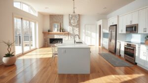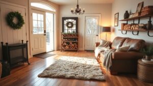
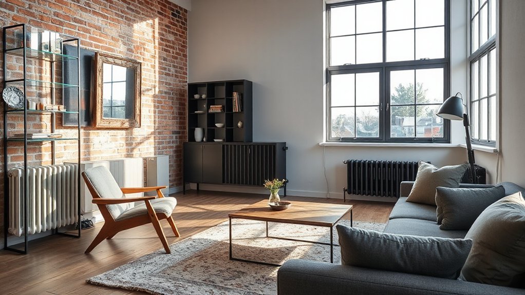

The quirky art of mixing old and new comes down to three checks: context, scale, and contrast. Start by honoring context with intentional materials, patinas, and sightlines. Keep scale in harmony with room size and ceiling height, so vintage elements don’t overwhelm. Use contrast—pair textures, colors, and forms from different eras to read clearly. Build a unifying design language, choose a dominant era for each room, and layer textures for tactile depth. If you keep exploring, you’ll reveal richer cohesion and character.
Key Takeaways
- Balance context, scale, and contrast to blend past and present without clash, anchoring with intentional choice, proportion, and texture pairing.
- Respect sightlines and anchors; let statements complement established features to avoid overwhelm or dilution of either era.
- Use layered lighting and cohesive palettes so vintage charm remains visible within modern clarity and efficiency.
- Mix durable, timeless materials with restrained color to let antique surfaces breathe and modern elements read as deliberate.
- Document decisions, test layouts, and communicate with trades to maintain cohesion, reversibility, and disciplined budgets.
What Makes Old and New Feel Balanced: The Three Checks
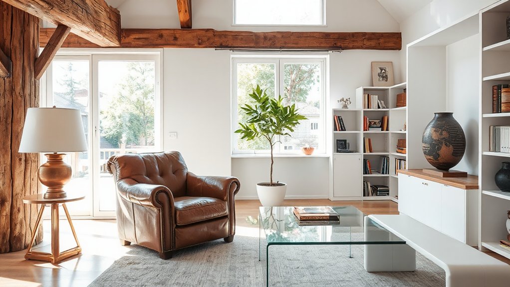
To balance old and new, start with three simple checks: context, scale, and contrast. You’ll quickly see how Historical context informs your tone, while Cultural influences shape the feel of every corner.
Context guarantees the past isn’t pasted over; it guides material choices, finishes, and patinas that feel intentional rather than borrowed.
Scale keeps pieces resonant rather than overpowering—dimension, proportion, and rhythm align so that antique and contemporary elements coexist.
Contrast provides clarity: pair textures, colors, and forms that define each era without fighting.
As you evaluate, ask how each element tells your story and supports daily use.
When these checks align, you’ll achieve a balanced space that reads cohesive, confident, and comfortable.
Identify Quirks and Anchors That Define Your Space
Quirks and anchors aren’t just the decorative odds and ends of a space—they’re the fingerprints that define it. You map what stands out as architectural quirks and identify what grounds movement and use as spatial anchors.
Start by listing features that resist easy categorization: stair angles, window proportions, ceiling heights, or ceiling treatments that consistently draw the eye. Then note the elements that organize flow—doorways, sightlines, and furniture groupings that guide how you live.
Prioritize reliability: those quirks should support daily tasks, not distract from them. Use anchors to anchor furniture, light, and rhythm without forcing sameness.
Finally, test how each choice reads from different viewpoints, ensuring the mix feels intentional, cohesive, and adaptable over time.
Establish a Unifying Design Language: Voice, Materials, Rhythm
A unifying design language ties your space together by aligning voice, materials, and rhythm into a cohesive conversation. You establish this by choosing a clear set of touchpoints you’ll repeat with intention.
Material pairing becomes your practical tool: mix textures and weights that communicate the same story, from cabinetry to upholstery to hardware. Maintain voice consistency across fixtures, finishes, and accents so that furniture, surfaces, and architectural details speak the same language.
Rhythm emerges as you alternate scale and cadence—bold statement pieces punctuated by calmer intervals, then reintroduce related motifs to reinforce cohesion. Resist scattershot experimentation; instead, curate elements that support a shared mood.
When done well, your space feels deliberate, resilient, and unmistakably yours.
Choose a Dominant Era to Anchor Each Room
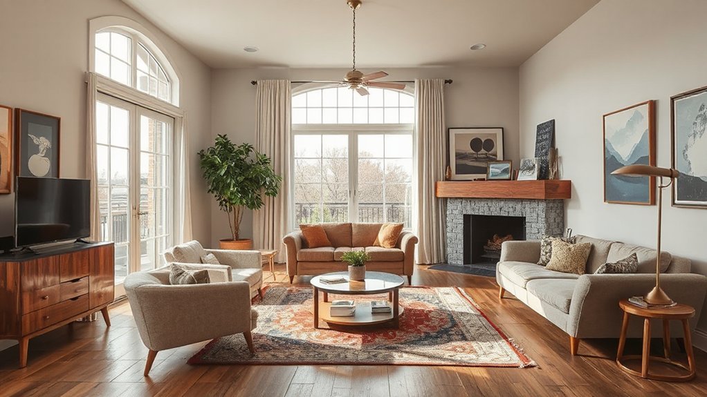
Choosing a dominant era for each room gives your unifying design language a concrete anchor. You pick a clear era for the room’s backbone, then let other periods orbit it.
Start with a defining feature—perhaps a midcentury silhouette, a Victorian proportion, or a bold postwar color scheme—and let that frame guide furniture scales, lighting, and built-ins.
Use Historical references to ground the vocabulary: even if you mix, the core era should resonate through a motif, a pattern, or symmetry.
Consider Cultural influences that travel across styles—artisan techniques, material palettes, or social attitudes—that can harmonize disparate pieces.
This anchored approach reduces guesswork, preserves cohesion, and yields rooms that feel intentional rather than scattered.
Maintain a pragmatic edit: critique until every element reinforces the chosen era.
Mix Textures and Materials for Tactile Contrast
Texture and material variety keeps a space engaging, so mix tactile finishes deliberately to spotlight contrast. You blend textures to guide movement and mood, not just decoration.
Begin with fundamental pairings: hard, sleek surfaces next to soft, earthy fabrics create immediate shift that reads as intentional design. Aim for Material pairing that respects scale and era—think a carved wood leg with a polished metal surface, or a rough plaster wall against a satin textile.
Layer in textiles, leathers, stone, and glass to build depth without clutter. Keep progressions smooth by repeating a subtle motif across textures, and avoid overloading one area.
The result feels curated, lived-in, and durable, proving tactile variety can anchor both old and new elements with confidence.
Color Strategies That Bridge Eras Without Shouting
Color strategies can align eras without shouting, using restrained palettes that respect both old and new elements. You’ll favor neutral bases—greige, taupe, or soft ivory—then layer with deliberate accent colors drawn from both periods.
Aim for color harmony by balancing warm and cool tones so neither era dominates. Choose one unifying shade as a throughline, and repeat it in textiles, art, and casework to create steady rhythm.
In era integration, you’ll pair vintage-inspired patterns with modern solids to avoid visual clutter. You’ll test light reflection to maintain continuity across rooms. Keep finishes matte or satin to prevent harsh contrasts.
This approach guarantees cohesion, subtle dynamism, and a polished feel that respects history while embracing contemporary function.
Timeless Silhouettes: Furniture That Pairs Across Decades
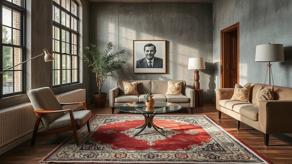
Timeless silhouettes bridge decades by focusing on form over fads, so your furniture reads as cohesive rather than dated. You’ll find that clean lines and balanced proportions act as a neutral stage for any era.
Choose pieces with durable silhouettes—rectilinear desks, gently curved armchairs, low-profile sofas—that tolerate changing textures and colors. Accessories should echo, not compete: use antique embellishments sparingly to add personality without overwhelming the form.
Pairing a vintage chair with a contemporary sofa creates dialogue, not dissonance. When you mix styles, prioritize restraint: limit ornament to a single statement feature per room.
This approach supports Contemporary minimalism, letting space breathe. In short, timeless silhouettes anchor a room, while carefully selected details personalize it across decades.
Lighting as a Unified Connection Across Eras
Lighting serves as the thread that ties eras together, so you can plan illumination that feels cohesive rather than conflicting.
You’ll balance period-appropriate fixtures with modern efficiency and controls to create a steady, unified brightness.
Start by mapping focal zones and choosing dimmable layers that adapt as styles evolve.
Lighting Through Timelines
By weaving together vintage fixtures and modern LEDs, you’ll see how lighting can unify spaces across eras rather than clash with them. You approach timelines as a practical map, not a decorative gimmick.
Focus on lighting evolution as a conversation between eras, where each era’s character informs the next rather than competes with it. Prioritize cohesive color temperature, scalable controls, and compatible dimming profiles to maintain steady ambiance.
Use chronological integration to plan focal points, transitions, and task lighting that honor heritage while enabling contemporary routines. Keep hardware choices modular, allowing future updates without reevaluation of the whole scheme.
Your goal is consistency, not uniformity, so lighting serves as a flexible thread weaving past and present into a single, breathable space.
Unifying Brightness Across Eras
To unify brightness across eras, start by calibrating color temperature and luminance so old and new elements read as one. You’ll achieve this with a measured approach: set a neutral baseline, then introduce era-appropriate accents without breaking the overall glow.
Control lighting contrast by balancing high- and low-intensity sources, ensuring focal points don’t overpower surrounding details. Use dimmers, layered layers, and task lighting to ground spaces in a shared luminance story.
Maintain color harmony by selecting comparable spectral qualities across fixtures, avoiding jarring shifts as you move through moments of the timeline. Test scenes at different hours, adjusting for daylight changes and material finishes.
In practice, this disciplined alignment yields cohesive ambiance, elevating both vintage charm and modern clarity without sacrificing personality.
Art and Accessories as Conversation Starters
Art and accessories can spark conversation by telling a story about your space. When you curate shelves, walls, and surfaces, you guide attention with deliberate art curation and thoughtful accessory placement.
Choose pieces that echo your daily routines, then juxtapose them with unexpected finds to invite questions rather than answers. Position a single, meaningful object at eye level to anchor a vignette; flank it with items that contrast in texture or era to provoke dialogue.
Use scale deliberately: oversized statements balance refined minis, creating rhythm that feels intentional rather than crowded. Rotate pieces seasonally or after travel to refresh the narrative without clutter.
This approach keeps rooms engaging, cohesive, and genuinely expressive.
Flooring and Soft Finishes to Unify Disparate Pieces
Start by choosing flooring that bridges old and new elements, using a shared tone or finish to create cohesion across disparate pieces.
Consider soft finishes—area rugs, textiles, and wall treatments—that echo color or texture from both eras to knit the spaces together.
Use deliberate contrasts sparingly, letting one unifying material lead the dialogue between vintage and contemporary pieces.
Flooring Pairing Harmony
When you’re pairing flooring with soft finishes to unify disparate pieces, start by establishing a unifying tone: choose a dominant floor color or texture and echo it in throws, rugs, and upholstery. You’ll create a grounded baseline that guides material progressions across the room.
Seek Flooring contrast only where it reinforces depth—light planks against dark textiles, or textured carpet with smooth upholstery—so contrast supports rather than competes. Maintain clean edges where floors meet walls, ensuring progressions feel deliberate, not accidental.
Use a restrained palette across finishes to avoid visual jarring. Before you switch tones, verify alignment with lighting and traffic patterns; harmony depends on consistent rhythm.
With purposeful choices, the space reads cohesive, sophisticated, and intentionally layered.
Soft Finish Cohesion
Soft finishes can be be the glue that ties disparate pieces together after you’ve set the floor tone. When you select carpet, rug, or wall-to-wall textiles, aim for a cohesive touch that echoes the room’s material palette without duplicating textures.
Choose kitted fibers and pile heights that read as a single move, so texture harmony emerges rather than clashes. Maintain finish consistency across furniture, drapery, and built-ins by matching sheen levels and undertones, even if colors differ. This approach prevents abrupt shifts and reinforces a unified narrative.
Use subtle, recurring motifs—linen-like textures, low-sheen woods, or matte ceramics—to reinforce continuity. In practice, test samples side by side, ensuring deliberate cadence from floor to ceiling for enduring, polished cohesion.
Scale, Proportion, Rhythm: Avoiding Visual Clashes
Scale, proportion, and rhythm are the tools you use to prevent visual clashes when mixing old and new in any property type. You aim for clear hierarchy: balance bold historic elements with contemporary details, without overwhelming either era.
Start with scale consistency, ensuring furniture and fixtures relate to room dimensions and ceiling height. Use proportion to pair similar massing across additions and originals, so a modern sofa doesn’t dwarf a vintage console.
Rhythm emerges through repeating motifs, materials, and textures in punctuated intervals, guiding the eye smoothly.
Color harmony matters: anchor schemes with shared neutrals or complementary tones to unify disparate pieces.
When in doubt, measure a key element from each era and align its footprint.
Thoughtful curation, not excess, keeps everything cohesive and timeless.
Budget-Friendly Blending: Practical Rules of Thumb
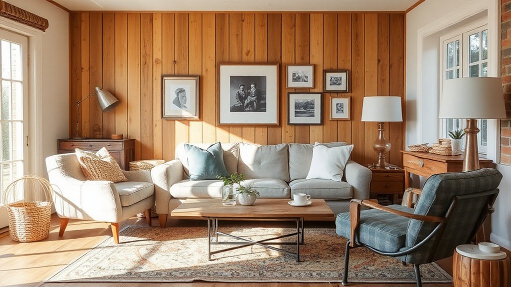
Budget-friendly blending isn’t about compromising style; it’s about smart choices that merge old and new without breaking the bank. You’ll prioritize budget considerations by setting a clear limit for each project phase and tracking shows of value, not just costs.
Start with a focal piece that anchors the room, then layer affordable accents that echo its character. When selecting materials, assess material compatibility—wood, metal, stone, and textiles should share a unifying undertone, finish, or era cue to avoid jarring contrasts.
Reuse where feasible, repair rather than replace, and shop for surplus or builders’ remnants to stretch dollars without sacrificing impact. Plan progressions deliberately—one recurring material family can unify disparate elements and streamline installation.
Finally, document costs and outcomes to refine future decisions with confidence.
Handling Mismatched Authenticity With Charm
You’ll blend time threads gently, letting vintage pieces speak without overpowering modern elements.
Seek authenticity harmony by balancing textures, tones, and scale so mismatched pieces feel intentional.
When in doubt, lean on a few quiet anchors to unite the room and keep the vibe polished.
Blending Time-Threads Gently
Start with a restrained palette to unify disparate pieces, then let key anchors—like a vintage desk or a modern sofa—set the rhythm.
Time threads appear in joinery, patina, and finish, so emphasize continuity over imitation.
Use proportion and scale to keep harmony: overlook one element’s eccentricity, balance it with simpler surroundings.
In practice, layer deliberately, then declutter to prevent visual fatigue.
This approach honors provenance while embracing change, proving that thoughtful juxtaposition strengthens character.
For the reader, the outcome is a polished, cohesive environment where each era speaks with confidence.
gentle blending, time threads, you master the balance.
Authenticity Harmony Tips
- Ground choices in tangible history, not merely decor
- Celebrate cultural motifs as accents, not mandates
- Pair patina with clean surfaces for balance
- Use consistent hardware to unify diverse eras
- Let light reveal textures and stories, not just shapes
Vintage Meets Modern Balance
The key to vintage-meets-modern balance is intentional restraint: choose a single, telling old piece to anchor the room, then braid in modern elements that enhance its story without competing with it. You achieve harmony by spotlighting texture and patina, not clutter.
Let Antique embellishments appear as deliberate accents—an ornate mirror, a carved table leg, or a faded textile—kept small and purposeful. Pair them with Modern minimalism: clean lines, neutral tones, and uncluttered surfaces that let the antique breathe.
Resist overmatching; contrast is your ally. Use lighting to cast warmth on the vintage piece while preserving functional clarity elsewhere.
In practice, this balance reads refined, lived-in, and coherent, showing that history can feel current when modern restraint guides the narrative.
Layout Tricks for Mixed-Era Spaces
If you want a cohesive mixed-era space, start with a clear layout plan that respects both old and new elements. You’ll measure sightlines, anchor focal points, and place statements where they won’t clash with established features. Zigzag traffic flow to keep movement intuitive, not chaotic.
Balance scales so vintage pieces don’t overwhelm modern ones, and vice versa. Prioritize historical accuracy in detailing and align a neutral palette to unify textures. Emphasize material durability by choosing sturdy surfaces that withstand daily use without shouting “new.” Choose lighting that highlights character while guiding the eye through transitions.
You’ll create a sense of belonging where contrasts feel intentional rather than accidental.
- Purposeful zoning that honors history and current function
- Thoughtful alignment of era-specific motifs
- Durable materials that age gracefully
- Subtle contrast to avoid visual fatigue
- Calm, cohesive color grounding across eras
Case Study: Historic Townhouse With Modern Whimsy
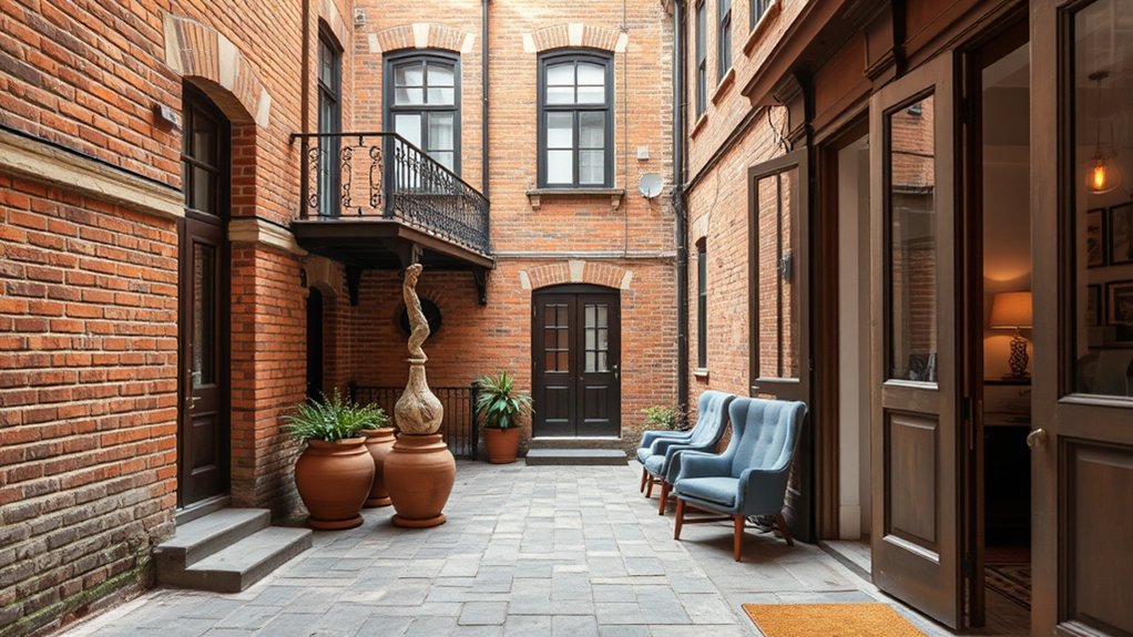
Nestled between historic charm and contemporary whimsy, this townhouse proves you can honor old bones while celebrating playful modernity. You approach the project by prioritizing architectural juxtaposition: preserve original molding and stair details while introducing clean, modern fixtures that don’t overwhelm the era’s essence.
You rehang period doors with new hardware that nods to the past without imitation, and you select a restrained palette that lets antique surfaces breathe. You balance preserved elements with strategic whimsy—unexpected tile, sculptural lighting, and bold textiles—so rooms feel intentional, not cluttered.
You document decisions for Historical preservation considerations, ensuring alterations are reversible where possible and compliant with guidelines. You communicate clearly with trades, keeping timelines tight, budget disciplined, and the result coherent, refined, and uniquely expressive.
Case Study: Midcentury Bungalow With Vintage Warmth
You’ll see how Vintage Warmth meets a Modern Twist to keep the midcentury charm intact while updating the footprint for today.
This case study shows a clean, timeless blend that prioritizes practicality without sacrificing character.
Vintage Warmth, Modern Twist
A midcentury bungalow proves that vintage warmth and modern polish aren’t mutually exclusive. In this case study, you blend Antique charm with a Contemporary flair, keeping spaces livable while elevating detail.
You prioritize clean lines, tactile textures, and purposeful lighting that reads timeless rather than dated. Practical choices—open shelving, brass accents, and warm woods—form a coherent story without shouting.
You test layouts for flow, preserving retro soul while adding today’s conveniences. The result feels lived-in, confident, and polished, not precious.
You’ll notice how softer palettes and vintage fabrics soften angles, making rooms feel inviting and efficient at once.
- Warm materials meet crisp silhouettes
- Subtle retro patterns, modern practicality
- Thoughtful lighting that flatters surfaces
- Artful brass accents, restrained palette
- Cozy textures with clean, durable finishes
Midcentury Charm, Updated
Midcentury charm meets refreshed practicality in this bungalow case study, where vintage warmth is preserved while modern conveniences are woven in with intention. You’ll notice clean lines and purposeful hardware that nod to the era without shouting.
Retro revival informs color choices, embracing creamy textures, teak accents, and sculptural lighting that feels deliberate, not decorative. You’ll embrace functional layouts that prioritize flow between living, dining, and kitchen, keeping traffic predictable and spaces breathable.
Modern minimalism grounds the look, trimming excess while highlighting essentials like stainless appliances and concealed storage. Practical updates include improved insulation, resilient finishes, and smart controls tucked behind paneling so the aesthetic remains seamless.
The result is timeless comfort that reads current, not nostalgic.
Timeless Blend, Practicality
In this midcentury bungalow, timeless warmth meets practical design through intentionally integrated vintage elements and modern efficiency. You’ll feel historical contrast without sacrificing function, as classic lines align with contemporary systems for seamless daily use. The result is a space that respects the past while staying current, with practical integration guiding every decision.
You’ll notice how heritage textures pair with energy-saving features, creating a cohesive narrative rather than a collage. By prioritizing durable materials and thoughtful layouts, you experience a home that ages gracefully and remains effortless to live in.
- Historical contrast informs smarter material choices and finishing touches.
- Practical integration keeps vintage charm aligned with modern convenience.
- Thoughtful space planning enhances flow and usability.
- Sustainable upgrades preserve warmth without compromising character.
- Calm, polished aesthetics reinforce timeless appeal.
Common Pitfalls and Recovery Strategies
Common pitfalls often derail projects when mixing old and new design, but you can spot and fix them before they snowball. You’ll keep scope grounded, set clear guidelines, and insist on consistent material quality.
Respect proportion, not just style, because mismatched scale breaks harmony quickly. When restoration challenges appear, document each decision, test its impact, and revert if necessary.
Prioritize authenticity dilemmas by distinguishing genuine period features from clever imitators, avoiding gimmicks that undermine credibility.
Build a tight palette: two or three anchor tones, with accents that echo rather than imitate. Coordinate hardware, lighting, and textures to weave a unified narrative.
Communicate openly with contractors, schedule milestones, and verify finish samples in real settings.
Finally, review progress regularly, adjusting plans to preserve character while embracing practical updates.
Frequently Asked Questions
How to Start Mixing Eras Without Overpowering the Space?
Start by balancing Vintage contrasts with Modern accents, so you don’t overwhelm the space. You’ll create clarity by choosing a few bold vintage pieces, pairing them with sleek, restrained decor, and maintaining consistent color tones throughout.
What Are Quick Signals of Mismatched Authenticity?
Antique contrast signals misalignment: you notice worn marks beside flawless reproductions, uneven patina, or mismatched hardware. A single anecdote—your friend’s faux-vintage lamp—proves this. Seek modern harmony, consistent finishes, and authentic provenance to avoid pitfalls.
How to Prioritize Budget When Blending Periods?
You should prioritize budget by balancing needs with impact, targeting key areas first. Allocate for Vintage charm where it matters most, then allocate remaining funds to Modern contrast accents that elevate the space without overwhelming it.
Which Lighting Choices Unify Old and New Best?
Lighting choices that unify old and new best: mix warm Edison bulbs with cool LEDs, balance shadows, and layer sources. You’ll favor vintage charm and modern contrast, using dimmers, texture, and strategic highlights to guide the eye.
How to Test Texture Combos Before Committing?
You test texture combos by swatching, layering, and comparing lighting. Use texture contrast to reveal depth and material harmony to unify tones, then iterate until you confidently pick pairs you love and that perform well in real spaces.
Conclusion
You’ve learned to blend epochs like a deft DJ, letting quirks hum and anchors hold the groove. Start with a unifying voice, then layer eras by dominant room, texture, and rhythm. When a clash sparks, rescue it with a shared material or color and a conscious layout tweak. Trust your eye, not rules, and let surprise be your ally. In the end, your space should feel alive, balanced, and unmistakably yours.