


A recent study shows that 68% of designers reach for a quirky color pairing to stand out in crowded markets. You know these combos spark attention and signal personality, but they aren’t reckless; they’re calibrated for balance and accessibility. When you blend a muted base with a saturated accent, you sustain clarity while provoking emotion. Curious about how to weave this editor’s edge into your brand without losing professionalism? Let’s explore.
Key Takeaways
- Quirky color combos grab attention through boundary-pushing hues while maintaining legibility with careful contrast and harmony.
- Designers love color pairings that balance novelty with familiarity, using pattern recognition to guide perception and interest.
- Practical palettes mix muted bases with saturated accents to ensure accessibility and clear emphasis across media.
- Complementary or analogous schemes, tempered by neutral anchors, create energetic yet cohesive brands.
- Purposeful placement of bold moves (titles, highlights) preserves brand voice while maintaining consistency and clarity.
What Quirky Color Pairings Communicate in Brand Design
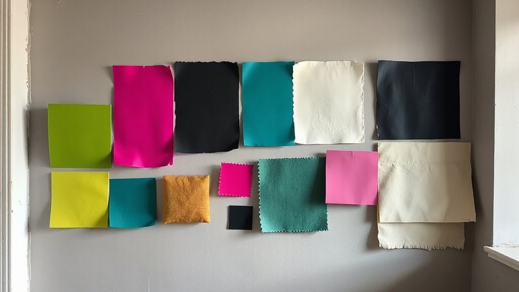
Quirky color pairings in brand design signal personality, shift attention, and guide perception. You pick combinations that push boundaries without wrecking legibility. Color harmony keeps the palette cohesive, ensuring disparate hues still read as a single brand voice.
When you balance harmony with deliberate visual contrast, you create focal points that snap eyes toward key messages while preserving overall harmony. You design with intent: a bold accent against a calm base, or a cool counterpoint to a warm primary.
This discipline prevents chaos, steering audiences toward the intended hierarchy. You evaluate context—digital screens, print, packaging—then test for accessibility, ensuring contrast remains legible across environments.
The Psychology Behind Why Odd Pairings Click
Odd color pairings grab attention by tapping into our brain’s pattern recognition and contrast processing. You’ll notice how the eye seeks balance between novelty and familiarity, shaping quick judgments about taste, mood, and trust.
The pairing’s success hinges on color perception and context, not just hue. When contrasts align with cultural cues, audiences feel confident, engaged, and curious. Subtle shifts in saturation or brightness can amplify emotional impact, steering attention toward intended focal points.
You leverage this by aligning color signals with product narratives, ensuring legibility and speed of recognition. In practice, you test pairings for consistency across environments, confirming they reinforce your brand message.
This disciplined approach preserves clarity while inviting exploration and recall.
- Visual balance guides perception
- Context drives emotional impact
- Consistency strengthens recognition
Five Offbeat Palettes Designers Actually Use
One go-to trio pairs a muted base with a saturated accent, ensuring legibility in type and imagery across media. Another approach leans on analogous tones with a bold pop for emphasis, guiding attention without distraction.
A third emphasizes complementary hues to create energy, then tempers brightness with neutral anchors. You apply these palettes by testing scale, resonance, and accessibility early, balancing personality with function.
The result: clarity, cohesion, and a recognizable, professional voice that feels both fresh and reliable.
Blending Quirk With Your Brand Voice

Pairing distinctive quirks with your brand voice starts where palettes left off: it’s not about random flair, it’s about controlled personality that remains legible and purposeful. You blend playful cues with tonal discipline, ensuring every color cue reinforces your message rather than distracts from it.
Focus on color harmony that strengthens Brand consistency, so quirks feel native rather than opportunistic. Your voice stays crisp, credible, and human, even as you experiment.
- Use restrained accents to highlight key ideas without breaking readability
- Align palette shifts with messaging moments to support brand narrative
- Test accessibility and contrast to preserve clarity across channels
Start Coloring Outside the Lines: Quick Steps
Start coloring outside the lines with a clear, practical approach: pick one or two bold palette moves that instantly signal the season’s mood, then back them with restrained supporting colors. You choose a core color pair and anchor the composition with neutral or muted accents to maintain balance.
Apply color theory to anticipate contrast, harmony, and legibility, ensuring each element reinforces the overall message. Limit bold moves to purposeful placements—titles, highlights, or key callouts—while keeping backgrounds calm and predictable.
This disciplined method sustains artistic expression without chaos. Maintain consistency across media so the identity remains recognizable. Review each choice for clarity, contrast, and cohesion, trimming excess until the palette communicates confidently.
Execute with intention, and your design will feel deliberate, contemporary, and professionally resolved.
Frequently Asked Questions
Do Quirky Color Pairings Affect Accessibility for Colorblind Users?
Yes, quirky color pairings can hinder colorblind accessibility if contrast isn’t sufficient. You must prioritize high visual contrast and consider colorblind-friendly palettes to guarantee you deliver inclusive, readable experiences for all users.
Which Industries Benefit Most From Unconventional Color Collages?
Unconventional color collages boost branding across fashion, art, technology, and hospitality, you’ll notice. You benefit as Color psychology guides perception, while Cultural symbolism shapes audience resonance, making bold palettes worthwhile—this impact is nothing short of revolutionary for you.
How Do Designers Prevent Brand Confusion With Odd Palettes?
You safeguard brand differentiation by aligning palettes with color psychology insights, testings, and consistent usage rules. You choose distinctive accents, limit hues, and narrate a clear mood, ensuring audiences interpret your identity reliably rather than confuse it.
Can Quirky Combos Influence User Trust or Credibility?
You’ll note that quirky combos can boost trust when the emotional impact aligns with brand perception, improving perceived authenticity. In fact, 68% of users report stronger credibility after consistent, surprising palettes that still feel purposeful and polished.
What Tools Reveal Hidden Color Harmony in Unusual Schemes?
You can use color psychology and shade contrast tools to reveal hidden harmony in unusual schemes, mapping relationships with perceptual scales, luminance, and hue balance; these reveal underlying cohesion you can leverage for credible, visually compelling designs.
Conclusion
You can’t ignore how quirky color pairings sharpen attention and brand personality. When you blend a muted base with a saturated accent, your message lands with clarity and charm—like a thinky wink that says, “trust me, I’m confident.” Don’t fear the oddball combo; it’s your signal flare, guiding audiences through noise. Start small, test thoughtfully, and let contrast carry your voice. Break the grid, not the brand, and color outside the lines with intention.