
Awkward corners aren’t liabilities; they’re opportunities to define a room’s character. You’ll transform those angles with bold color, texture, and smart storage that respects scale. Start by reading the geometry, then pair lighting and multi-functional furniture to maximize flow. The result should feel intentional, not crowded, with plants or art softening edges. There’s more to shape and strategy than you expect, and the right approach will prove these nooks can anchor your space—if you push just a bit further.
Key Takeaways
- Assess and map corner geometry to reveal angles, sightlines, and traffic flow, using precise measurements for deliberate placement.
- Use angular-inspired furniture and color/textures to transform corners into intentional design moments.
- Layer lighting (ambient, task, accent) to shape corners, reduce shadows, and highlight architectural features.
- Integrate slim storage and modular components that hug corners, preserving floor space and visual calm.
- Zone corners for multi-use functions with adaptable furniture and soft separations to balance practicality and aesthetics.
Why Awkward Corners Deserve Design Love

Corners aren’t just empty space to fill; they’re design opportunities begging for intention. You’ll see awkward nooks as chances to assert purpose, not problems to patch.
When you embrace corner symmetry, you create balance that guides the eye and steadies the room’s rhythm. You don’t need grand gestures; precise placement, proportional shelves, or a slim console can anchor traffic flow without crowding the area.
For angular aesthetics, lean into sharp lines, but temper with soft textures to avoid rigidity. Use color blocking or a contrasting material to highlight the shape without shouting.
You’ll gain visual cohesion and practical utility, turning an often overlooked area into a deliberate moment of design. Your space becomes calmer, more intentional, and unmistakably, yours.
Assess Your Corner’s Geometry in 3 Simple Steps
Start by measuring corner angles precisely so you know the space you’re working with.
Then visualize how furniture will flow through the area to avoid awkward bottlenecks.
This sets the stage to optimize the corner with smart placement and clear paths.
Measure Corner Angles Precisely
To measure corner angles precisely, start by confirming you’re working with a true 90-degree reference if you’re aiming for standard walls, or identify the exact angle if the corner is non‑rectilinear. This sets the foundation for reliable measurements and consistent results.
- Use a digital angle finder to capture angle calibration with one-handed ease, noting the reading immediately.
- Cross-check with a traditional carpenter’s square and a tape measure to verify consistency from multiple points.
- Record both the internal and external angles, then average values to refine accuracy for future references.
Visualize Flow With Furniture
Visualizing how your furniture will flow through the corner starts with a quick, practical assessment of the space. You’ll sketch the footprint, noting doorways, alcoves, and natural traffic paths.
Next, prioritize furniture placement that guides the visual flow, allowing sightlines to remain clear and movements unhindered. Place key pieces along walls or angles that echo the room’s geometry, then test routes by walking the intended path.
Avoid clutter that interrupts circulation; choose compact, multifunctional items when possible. Balance is essential: guarantee powerful silhouettes don’t crowd softer lines, and leave negative space to soften progressions.
Finally, iterate with small adjustments, visualizing how chairs, consoles, and plants anchor the corner without overpowering adjacent zones. Your corner becomes cohesive, functional, and intentionally styled.
Lighting Tricks Tailored to Nooks and Angles
Strategically lighting nooks and angles isn’t about overhead brightness alone; it’s about shaping ambiance with purpose. You’ll sculpt space by mixing ambient glow with targeted task lighting, so corners feel intentional, not incidental.
- Use soft, indirect ambient light to warm the perimeter, avoiding harsh shadows that flatten depth.
- Pair discreet task lighting on desks or shelves to support detail work without crowding the scene.
- Add a directional accent light to highlight architectural quirks, creating a focal point without glare.
This approach keeps the area usable and atmospheric, emphasizing function alongside mood. With thoughtful layering, your nook becomes a balanced micro-environment—bright where needed, quiet where you want contemplation, and unmistakably curated.
Floating Storage That Fits Tight Angles
Floating storage is a practical solution for tight angles, letting you reclaim floor space without sacrificing accessibility. You’ll design wall-backed systems that hug corners, delivering storage without crowding the room.
Choose slim cabinets or open shelving that fits the plane of the wall, keeping lines clean and unobtrusive. Install corner shelving at eye level for quick access, and use adjustable shelves to adapt as needs change.
For a polished touch, integrate cable channels or hidden brackets to keep the surface clear. Pair this approach with angled accents—pieces cut to follow the wall’s bend—to reinforce the geometry without shouting.
Keep finishes cohesive with nearby furniture so the storage reads as intentional architecture, not clutter.
Built-In Seating as Sculpture and Storage

Built-in seating can double as sculpture and storage, turning a functional element into a focal point that anchors the room. You’ll design benches or banquettes that shape the corner, then conceal their core with drawers or cubbies for everyday items, tools, or throws.
To emphasize form, pair clean lines with unexpected materials and let vintage textiles add warmth. Position the seating so it frames the space and invites use, not avoidance.
1) Plan a low, sculptural silhouette that blends with architectural angles.
2) Integrate storage beneath a hinged lid or sliding panels, using labeled compartments.
3) Illuminate the feature with statement lighting that highlights texture and depth.
This approach delivers practical seating, storage, and visual impact in one cohesive unit.
Wall Treatments That Soften Sharp Corners
Wall treatments can soften sharp corners by adding depth, texture, and warmth to the room’s edges. You’ll create approachable boundaries with practical solutions that stay neat and intentional.
Start with textured paint to add subtle depth without overwhelming the space; choose a finish that harmonizes with your lighting and furniture.
Decorative wall decals offer temporary, removable growth opportunities, letting you tailor the feel without committing to permanent changes.
Consider soft molding or rounded corner guards that blend into the design, reducing visual harshness while preserving function.
For higher ceilings, extend a continuous wall treatment downward to visually lower the edge, easing abrupt shift.
Maintain balance by keeping patterns and textures restrained, ensuring the corner remains a refined feature rather than a focal clash.
Color Strategies to Visually Fuse Irregular Spaces
Color can be your unifier when spaces feel irregular or oddly shaped. You can use color as a practical tool to visually align domains, circulation, and furniture prompts. By applying thoughtful hues, you normalize angles and edges without shouting a design statement.
- Use color psychology to set mood and guide movement, choosing calming tones for tight pockets and energizing ones for transitional zones.
- Seek hue harmony through adjacent or analogous palettes, keeping a cohesive thread that smooths abrupt boundaries.
- Test light values across surfaces, pairing lighter ceilings with mid-tones on walls to visually expand irregular nooks.
The result is polished, decisive, and purposeful, with color acting as a subtle connector rather than a loud disruptor.
Gallery Nooks That Celebrate Shape
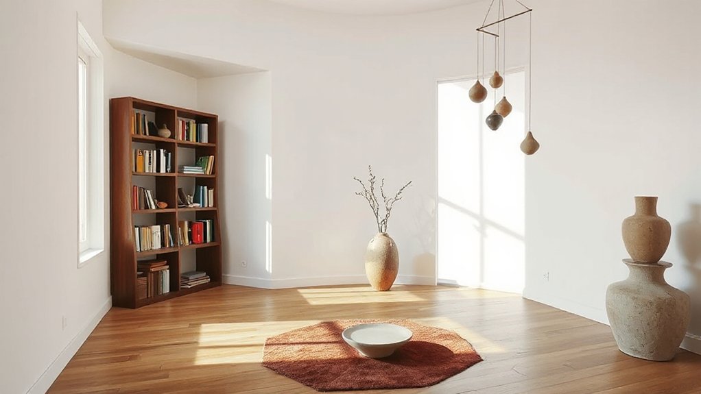
Gallery nooks can be the moment where architecture truly celebrates shape. You’ll design these recesses as deliberate stages, not afterthought alcoves, with clean sightlines that invite focused viewing.
Embrace curved walls, stepped alcoves, or tilted panels to frame a vignette, then let texture and light do the talking. Place Artistic murals that echo the nook’s geometry, drawing the eye along its contour and creating a dynamic focal point without clutter.
Pair the space with Vintage accents—iron brackets, petrified wood, and midcentury paraphernalia—that reinforce character while maintaining restraint. Keep seating low and sculptural, so you don’t crowd the plane.
Install hidden storage behind curved doors to preserve the shape’s purity. In practice, balance display with circulation to ensure function follows form.
Compact Plant Ideas for Curved Corners
Curved corners invite plants to hug the space rather than crowd it, so choose compact, architecture-minded plantings that fit the nook’s radius and sightlines. You’ll maximize impact with purposefully scaled greenery that enhances flow and avoids visual clutter.
Focus on low, vertical growth and shelves that respect the curve, so every inch counts.
- Indoor herbs in a slim tiered planter, keeping fragrance near the prep zone without crowding the view.
- Succulent arrangements in stacked, angled pots that mirror the nook’s radius for a cohesive silhouette.
- A small, airy herb-and-succulent combo in a curved trough, softening edges while offering harvestable greens.
Maintain clean lines, good drainage, and labeled herbs for easy maintenance and consistent appearance.
Turning Corners Into Multi-Use Mini Rooms
You can turn a corner into a true multi-use nook by pairing a small desk or seating with smart storage, so it serves as workspace, reading spot, or guest retreat.
Use clever corner zoning to define each function—think a bench with drawers for storage, a foldable screen, and a compact vertical shelf to separate zones.
Aim for cozy dual-purpose areas that feel intentional rather than crowded, so the space remains inviting and efficient.
Nook as Multi-Use Space
Corners aren’t just intersections—they’re opportunities. You can transform a nook into a functional, multi-use space without sacrificing style. Use smart zoning to define zones for work, reading, and display, while preserving openness.
1) Creative storage: install low cabinets, floating shelves, and a hidden drawer system to keep supplies and mail tidy without crowding the footprint.
2) Lighting enhancements: layer task, ambient, and accent lighting to adapt the mood and boost focus or coziness as needed.
3) Flexible furniture: choose a compact desk that doubles as a console, or a fold-out chair-and-table duo that tucks away when not in use.
With thoughtful design, your nook becomes a practical mini-room you actually use.
Clever Corner Zoning
Turning corners into multi-use mini rooms starts with smart zoning that respects flow and sightlines. You’ll map traffic paths, then define purpose zones that blend with your overall scheme. Use low-profile screens, shelving, or sofas to carve function without blocking light or movement.
Emphasize corner symmetry with balanced furniture pairs or mirrored accents to create a cohesive feel from every approach. Angular accents—think trapezoid desks, polygonal coffee tables, or angled wall panels—signal distinct zones while preserving a unified look.
Layer materials and color so entrances read clearly and edges stay soft, not boxed. Keep storage tucked into the nook edge, and maintain visual openness with open shelving.
Finalise with lighting that highlights progressions, not barriers.
Cozy Dual-Purpose Areas
Finding cozy, dual-purpose corners is about smart, unobtrusive function. You turn awkward nooks into practical mini rooms by selecting compact furniture, hidden storage, and soft lighting that reads two ways—workable and relaxing.
In these cozy nooks, every inch earns its keep, and dual purpose spaces feel intentional, not cluttered.
- Prioritize a small desk or fold-away surface that tuses as a reading perch when needed.
- Install modular storage that tucks into corners, keeping supplies close yet out of sight.
- Choose seating with built-in storage and a neutral palette to blend into multiple uses.
This approach keeps zones flexible, stylish, and reachable, ensuring your corners serve both productivity and rest without demanding more footprint than you can spare.
Custom Furniture Hacks for Nonstandard Footprints
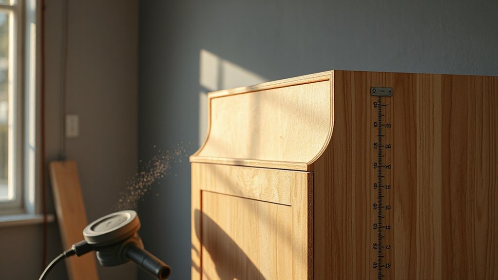
You don’t have to reinvent the wheel to fit an unconventional footprint; smart, custom furniture hacks can tailor any space. In tight corners, modular pieces shine: build a lean, L-shaped desk with removable ends to reclaim elbow room, or design a pedestal table that slides beneath a wall cabinet when you don’t need it.
Opt for multi‑functional storage—drawers under benches, hidden compartments in coffee tables—to keep clutter out of view. Choose silhouettes that mirror the room’s flow, not force it to conform.
Incorporate Vintage accents and Industrial textures to signal character without sacrificing utility. Precision cuts, flush hardware, and solid joinery matter; they prevent wobble and misalignment.
Measure, mock-up, and prototype before committing, ensuring every inch serves a purpose.
Sculptural Screens to Guide Flow and Function
Sculptural screens do more than divide space—they sculpt the way you move and use a room. You’ll position them to choreograph traffic, create intimate nooks, and subtly steer daily routines toward efficiency. When you design, think in terms of flow guidance: how people pass, pause, and proceed around a corner or doorway.
The right form balances openness with interruption, so you retain sightlines while guiding behavior.
- Place screens where they interrupt chronic back-and-forth detours, nudging paths toward natural progressions.
- Choose materials and profiles that read as intentional furniture, not clutter, to reinforce flow without shouting.
- Layer screens with lighting and accents to emphasize movement zones and quiet work or lounge zones.
Use sculptural screens to organize space with purpose, reducing wasted steps and boosting function.
Mirrors to Expand and Reflect Tight Spaces
Mirrors are space multipliers you can deploy to open up tight corners. Think through Mirror Space Maximizers and how a strategically placed panel or frameless mirror expands perception without crowding the room.
You’ll start by outlining practical placements that create Reflective Nook Illusions for a brighter, more functional feel.
Mirror Space Maximizers
If a cramped room feels claustrophobic, placing a strategically chosen mirror can instantly expand the space and reflect light deeper into the room. You’ll harness mirror illusions to create depth, while reflective surfaces bounce brightness across walls, making boundaries disappear.
- Position large, unobstructed mirrors opposite light sources to maximize glare-free glow.
- Use double mirrors or a mirrored wall panel to multiply perceived space with clean, continuous lines.
- Choose frames that stay slim or glassless for a seamless, modern finish that amplifies openness.
Strategic placement matters: avoid clutter around the mirror, keep reflections intentional, and refresh angles as furniture shifts.
With disciplined alignment, you’ll transform tight corners into light-filled, usable zones without sacrificing style or function.
Reflective Nook Illusions
Strategically placed mirrors can transform tight nooks into bright, usable spaces by multiplying light and visually extending boundaries. In Reflective Nook Illusions, you’ll leverage balanced mirror pairings to create depth without crowding.
Position mirrors opposite windows or light sources to amplify daylight, then use frameless or slim-framed panels to keep the line of sight clean. The goal is reflective illusions that baffle the eye, not clutter.
Prioritize scale: choose mirrors that suit the alcove width and install at eye level for natural viewing. Combine mirror surfaces with minimal décor to avoid busy reflections that trap attention.
Mind the grout or seams, keep the finish precise, and let illusionary reflections guide you toward a more spacious, practical result.
Texture Ideas That Enhance Irregular Geometry
Curved or angular corners can benefit from textures that emphasize their shape rather than mask it. When you choose textures, think contrasts that reveal geometry. You’ll create depth and definition without clutter, guiding the eye along the curve or edge.
The right texture choice should complement light and scale, not overwhelm the space.
- Fabric textures with tactile depth on seating or throws to accentuate contour without bulk.
- Layered wall treatments that cast subtle shadows, highlighting irregular angles while staying cohesive.
- Matte and low-sheen finishes combined with precise grout or seam lines to emphasize geometry rather than distract.
Texture decisions stay practical: test in daylight, consider maintenance, and favor materials that age gracefully.
Hidden-And-Highlight Storage Solutions
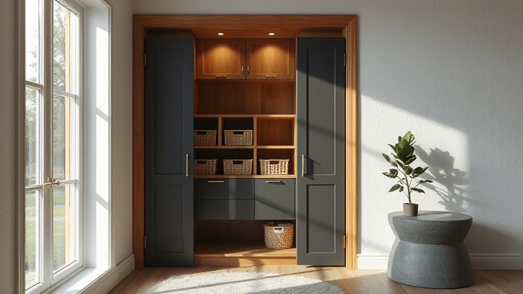
Hidden storage isn’t about sacrificing style; it’s about making spaces work harder without shouting for attention. In corners, you’ll design storage that hides in plain sight and still serves daily needs. Think hidden compartments integrated into cabinetry, desk overhangs, or wall niches with reversible lids.
Use pull-outs, swing-out trays, or pocket doors to convert awkward nooks into usable shelves without crowding sightlines. The goal is clean lines, not clutter, so choose components that blend with your finish and hardware.
Consider storage puzzles that maximize capacity in tight footprints—think rotating tiers, nested boxes, or modular inserts that snap into place.
Flooring Tricks to Unify Divergent Angles
When rooms diverge into multiple angles, flooring can knit them together with a deliberate, disciplined approach. You unify divergent spaces by choosing a single flooring direction, or by laying a continuous pattern that travels through passages, so the eye reads one flow. This steadies furniture placement and reinforces a cohesive feel, even when angles vary.
Color blending across zones keeps the palette calm, so contrasts don’t shout.
- Run the boards or tiles in a consistent direction across adjoining areas to minimize jolts.
- Use a shared trim or connection strip that echoes the main color story for a seamless look.
- Introduce a unifying texture or low-contrast grout to keep visuals calm and grounded.
Quick Lighting Layout Checklist for Awkward Nooks
Nervous about lighting in awkward nooks? Start with a concise plan: map the space, note focal tasks, and choose three reliable light sources.
Prioritize layered lighting—ambient, task, and accent—to control brightness without glare. Position ambient fixtures higher than eye level to wash walls and enhance perceived space. Then add task lighting where you read or cook.
Use adjustable options—spotlights, swing-arm sconces, or dimmable LEDs—for flexibility. Guarantee corner symmetry by balancing light on opposite walls; avoid single heavy fixtures that emphasize angles.
Test color temperature around 2700–3000K for warm readiness, and tune with dimmers to shift mood. Keep cables tidy, cords hidden, and choose fixtures with narrow profiles to avoid shrinking the nook.
This checklist fosters consistent lighting ambiance and practical, polished results.
Before-And-After Cues for Small-Space Trials
Before-and-after cues aren’t just about looks; they’re your real-time feedback loop for small-space trials. You’ll judge impact by function, flow, and feel, not just surface polish. Track practical shifts that reveal true potential, then iterate with purpose.
- Observe how traffic shifts with each swap, noting bottlenecks or comfort gaps in quirky aesthetics.
- Compare perception vs. reality: does clutter vanish or merely reposition in unconventional layouts?
- Measure behavior changes—sitting, leaning, reaching—to confirm what actually enhances efficiency and mood.
Harness these cues to validate decisions, refine scale, and preserve harmony between form and function. Your approach stays disciplined, not decorative, ensuring small spaces achieve bold personality without compromising usability.
This mindset anchors the design, guiding you toward confident, repeatable results.
Maintenance and Adaptability: Keeping Quirky Corners Stylish Over Time
Maintenance and adaptability are what keep quirky corners from turning into afterthoughts; with a practical, proactive approach, you’ll keep them stylish and livable over time. To sustain impact, schedule periodic decor maintenance—check surfaces, trim pins, tighten fixtures, and refresh textiles before wear shows.
Embrace adaptable design by selecting modular furniture, removable fronts, and neutral anchors that blend with evolving palettes. Document color codes, material specs, and cleaning routines so replacements align with intent, not impulse.
Protect character with strategic lighting, ventilation, and humidity control to prevent deterioration. When needs shift, reconfigure rather than replace: swap panels, rewrap cushions, or relocate plants to preserve flow.
Track outcomes, learn what thrives, and iterate. Consistency in care and flexible layouts keep quirky corners relevant year after year.
Frequently Asked Questions
How Can Awkward Corners Influence Room Perceived Scale?
Awkward corners can visually shrink or enlarge a room depending on furniture placement. You influence spatial perception by aligning grids and mirrors, maintaining visual balance with color and scale, and using lighting to preserve proportional relationships throughout the space.
What Budget-Friendly Tweaks Transform Odd Nooks Instantly?
Decorating theory suggests odd nooks can fool the eye—you’ll see it work instantly. Add decorative shelving and a color accenting punch; you’ll transform scale, depth, and function with budget-friendly tweaks you can implement today.
Which Materials Resist Irregular Corner Wear and Tear?
Wear-resistant materials like reinforced metal, high-density laminates, and tough hardwoods resist irregular corner wear; prioritize corner reinforcement during installation to extend longevity and maintain a pristine profile. Choose durable coatings and edge guards for added protection and ease.
Can Awkward Corners Serve as Focal Points Without Visual Clutter?
Yes, awkward corners can dominate gracefully. You’ll turn them into corner shelving with accent lighting, minimizing clutter. You get a practical, polished setup that reads as intentional, not accidental, while you confidently showcase displays and maximize any awkward space.
How Measure Safety in Tight, Irregular Layouts?
You measure safety in tight, irregular layouts by evaluating clearances, load paths, and egress routes, then verify with professional codes. Use custom lighting to illuminate hazards and color accents to delineate safe zones and walkable paths.
Conclusion
You’ve seen how awkward corners can become your boldest design move. As you apply the tricks—lighting, floating storage, built-in seating—you’re not just filling space; you’re shaping mood. The next step, though, stays unseen: how you’ll adapt when life nudges the room again. Will you keep the balance or let a new angle demand a rethink? Stay ready, stay curious, and let the corner reveal its next surprising chapter. The room will thank you when you least expect it.