
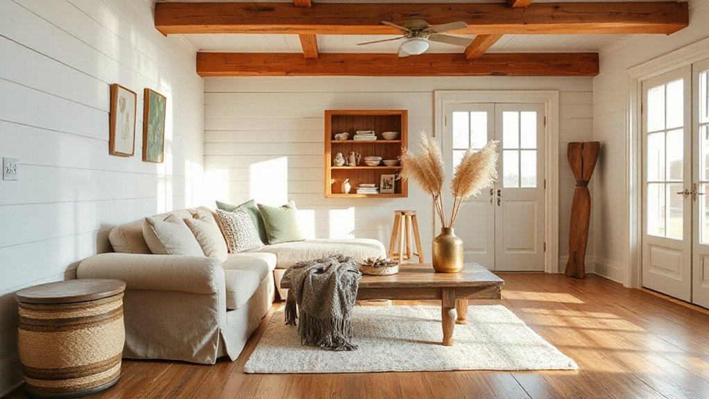

Choose a cozy farmhouse palette by starting with a soft neutral canvas and layering two to three core tones that read calm from afar and warm up close. Ground warmth with warm neutrals, and bring life through gentle contrasts, textures, and natural materials like linen and wood. Keep finishes matte, mix linen, wool, and cotton, and introduce vintage metals for depth. Test swatches in different light and layer textures; you’ll see cohesive warmth emerge—and there’s more to explore beyond this.
Key Takeaways
- Start with a calm, cohesive wall palette in warm neutrals (creamy off-white, soft gray, warm beige) for gentle, welcoming contrast up close and from afar.
- Ground the space with natural materials (wood, linen) and matte finishes to preserve warmth and timelessness.
- Layer textures with textiles (knits, linen, wool) and subtle patterns to add depth without visual clutter.
- Introduce two/three core tones and repeat them across textiles, rugs, and hardware for visual continuity.
- Test swatches under multiple lighting (2700–3000K) and adjust until tones stay inviting in all daily activities.
Choose Your Cozy Farmhouse Color Family
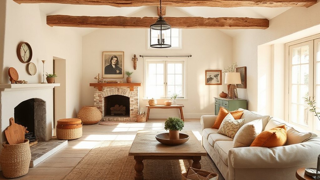
Choosing your cozy farmhouse color family starts with evaluating how the space will feel daily. You’ll choose a core mood, then align finishes and textiles to support it. Think Farmhouse color psychology as your guide: warm neutrals ground the room, while gentle contrasts keep it lively without shouting.
Seasonal color palettes can inform your picks, ensuring hues breathe with the year’s light and weather shifts. You should consider wall tones that read softly from afar and deepen up close, so rooms feel inviting at dawn and dusk.
Use your palette to steer furniture stains, antique accents, and fabric choices, keeping consistency across rooms for cohesion. Finally, test chips under different lighting, confirming your selections maintain balance through daily routines.
Choose Your Neutral Canvas
Your neutral canvas sets the tone for every other element in the room, so start by selecting wall tones that feel calm from across the space and reveal deeper warmth up close. You’ll anchor the room with a subtle base, then layer texture and light to keep it inviting.
Choose Farmhouse paint options that lean soft gray, creamy off-white, or warm beige to avoid sharp contrasts. Consider a single, consistent backdrop or a gentle two-tone approach to preserve cohesion as furniture shifts.
For neutral palette ideas, favor undertones that harmonize with natural materials like wood and linen. Prioritize matte finishes to soften reflections, and test large swatches at different times of day.
Aim for timeless restraint, then introduce character through textiles and accents.
Make Earthy Accents the Star
Start with earthy hues as your anchor to set a warm, cohesive tone throughout the space. Let natural textures—woodgrain, stone, linen—highlight the layers you add, rather than overwhelm the room.
Keep rustic accents layered in thoughtfully, so they support the palette without competing with it.
Earthy Hues as Anchor
Earthy hues anchor a cozy farmhouse, so make them the stars by selecting deep clay, warm taupe, and olive green as your core palette and letting other accents orbit around them. You’ll build cohesion by applying these tones across key surfaces: walls, cabinetry, and textiles, then sprinkle contrast with lighter neutrals in trim and linens.
In a Farmhouse kitchen, bold clay tones feel grounded yet approachable, while taupe backs up cabinetry and stonework with effortless polish.
For outdoor garden connections, carry olive green into planters, seating, and shading to extend the palette outdoors.
Keep finishes matte to preserve warmth; avoid glossy interference that shifts the room’s warmth.
Use understated patterns and natural textures to maintain calm, purposeful balance throughout the home.
Natural Textures Highlight
Natural textures keep earthy accents at the forefront by letting materials do the talking. When you prioritize tactile surfaces, your space reads authentic, not fussy. Farmhouse textures and natural finishes create depth without shouting, so you can rely on subtle contrasts to guide the eye.
- Choose raw materials—linen, jute, and untreated wood—that age gracefully and reveal their character.
- Opt for matte finishes and stone-feel ceramics to enhance the tactile story without overpowering the palette.
- Layer textures selectively, balancing soft textiles with sturdy surfaces to maintain warmth and coherence.
This approach keeps the décor grounded, practical, and timeless.
You’ll notice that honest materials elevate the room, proving that restraint is the most effective form of decoration.
Rustic Accents Layered In
Layer rustic accents in as anchor points for your color story, letting earthy elements take center stage. You’ll layer textures and motifs so the room reads cohesive, not busy.
Begin with vintage textiles as your foundation—think muted plaids, washed linens, and burlap-wrapped cushions that soften hard lines.
Introduce natural materials—reclaimed wood, terracotta, and woven jute—in deliberate quantities to create visual rhythm.
Keep a tight color palette, focusing on warm taupes, soft greiges, and charcoal accents to ground the space.
Farmhouse signage can anchor walls and cue intention without shouting.
Balance age-forged charm with clean lines and functional silhouettes to preserve practicality.
Finish with thoughtful lighting and purposeful decor: the goal is welcoming, not cluttered.
Balance Warmth With Soft Whites and Creams
Soft white balance creates a calm canvas, so you can layer with creams and textures without shouting.
Build a creamy neutral palette that stays warm by adding tactile elements like linen, wool, and wood grain.
Keep the interplay intentional—use soft whites and creams as your quiet base and let texture do the talking.
Soft White Balance
How do you balance warmth without drifting into yellowed tones? The answer lies in selecting soft whites with subtle undertones and pairing them with creams for depth.
Consistency matters; keep your whites cohesive across surfaces to avoid muddy transitions in natural light. Use warm accents sparingly to enhance insulation against glare, not to shout warmth.
- Test undertones at different times of day to confirm harmony.
- Introduce textures—linen, wool, wood—to add dimension without color shifts.
- Consider lighting quality; choose bulbs that echo daylight for a true soft white.
This approach supports a timeless farmhouse exterior and outdoor decor, ensuring warmth stays inviting rather than overwhelming.
Creamy Neutral Palette
A creamy neutral palette brings warmth into your space without shouting color, pairing soft whites with gentle creams for depth and cohesion. You’ll balance contrast through subtle variations in tone, not loud accents, so textures do the talking.
In a Farmhouse kitchen, choose warm whites for cabinetry and a slightly creamy wall to create a seamless backdrop that highlights wood elements and vintage hardware. Introduce matte linen or wool textiles to add softness without visual clutter.
For a Rustic bedroom, layer neutrals with natural fibers and minimal pattern to keep the room calm and inviting. Keep finishes uniform—oil-rubbed bronze hardware, oak or pine, and white陶 paint—to preserve cohesion.
The result is timeless warmth with streamlined polish.
Warmth With Texture
Texture is the secret to giving warmth without overwhelming soft whites and creams. By layering fibers, we create depth that feels cozy and refined. You’ll balance warmth with clean canvases by selecting textures that read as soft, not bulky, and by harmonizing contrast.
- Choose texture contrast through varying weaves and patterns to keep surfaces interesting without shouting.
- Mix cozy fabric like wool blends, cotton corduroy, and linen—aim for tactile diversity that stays light.
- Add subtle texture with rugs, throws, and cushions that echo the palette’s creams and ecru tones.
This approach delivers practical warmth—cozy yet polished—while ensuring the room remains airy and cohesive.
Add Texture to Keep Spaces Inviting
Add texture to your space to invite lingering and warmth. In practical terms, layering surfaces creates visual interest without clutter. Begin with Textured wall panels to add dimension at eye level, then balance with softer elements that absorb sound and light.
Knitted throw blankets draped over sofas or chairs invite touch and comfort, while preserving a clean silhouette. Mix fabrics like linen, wool, and cotton in varied weaves to prevent monotony and keep the room feeling intentional.
Use rugs to anchor seating zones; choose low-pile textures for easy maintenance and higher-pile for that cozy bounce. Limit bold patterns to one focal area, letting textures carry depth.
Maintain a cohesive palette, and let natural light highlight the tactile details you’ve chosen.
Pick Timber-Focused Furniture Silhouettes
Timber-focused silhouettes shape the room’s rhythm, so choose furniture with clean, legible lines that highlight woodgrain rather than elaborate detailing.
This approach emphasizes timber silhouette impact, letting the natural warmth of the wood lead the scene.
Timber Silhouette Impact
Timber silhouettes shape a room’s mood more than you might expect: bold profiles ground open spaces, while slender legs and low, curved forms keep the look light and approachable. You’ll notice timber silhouette defines scale, texture, and invitation, delivering rustic charm without heaviness.
- Choose focal pieces with strong profiles to anchor the space, like a bulky dining table or a substantial coffee console.
- Pair lighter, airy frames with solid planks to balance weight and warmth.
- Favor curved legs and streamlined silhouettes to maintain an optimistic, easygoing vibe.
This approach keeps rooms cohesive, practical, and timeless, ensuring durability and personality. The result feels intentional, not cluttered, and invites daily use with quiet confidence. timber silhouette, rustic charm.
Warmth Through Woodlines
Warmth in a room comes from the lines of your furniture, so choose wood that feels alive and unbroken by harsh hardware. When selecting timber-focused silhouettes, prioritize clean profiles with gentle curves and sturdy joinery.
Opt for solid woods like oak, maple, or ash that age gracefully, developing character without shouting.
Farmhouse furniture benefits from proportional scale: avoid oversized pieces that crowd the view, and favor pieces that leave air around seating and storage for a breathable feel.
Pair timber with warm finishes—matte oils or low-sheen stains—to amplify texture without glare.
Include rustic lighting to accent grain and create cohesive warmth.
This approach keeps spaces inviting, practical, and timeless, ensuring your room remains versatile for daily use and seasonal changes.
Mix Heirloom Finds With Budget Updates
Pair heirloom finds with budget updates by choosing a few statement pieces and letting them anchor the room. You’ll balance history with today’s function, so every piece earns its keep. Start by prioritizing quality over quantity and mix eras intentionally. Use vintage textiles for softness and color, then ground with solid, affordable foundations.
1) Anchor furniture with one standout heirloom item, like a carved chair or quilted throw, and layer budget-friendly accents around it.
2) Pair durable, low-cost updates—paint, rugs, and lighting—with your heirloom gardening tools or jars to create a cohesive vignette.
3) Limit accessories to a curated few, rotating seasonal pieces to keep the look fresh without clutter.
This approach respects provenance while delivering practical, polished warmth.
Create Cohesion With Repeating Elements
You can create a cohesive farmhouse look by repeating intentional elements throughout the room. Start with a unifying palette and carry it through textiles, finishes, and hardware. Pick two or three core tones and echo them in your Farmhouse lighting, cabinetry hardware, and rug choices to build visual continuity.
Then, introduce texture variation with Vintage textiles and natural materials like wood and linen to keep depth without clutter. Use consistent scale and spacing for repeats—a recurring plaid in pillows, a striped candlestick, and a woven basket pattern—to signal intentional design rather than coincidence.
Maintain restraint: too many motifs dilute cohesion. Finally, let subtle echoes—milled edges, chamfered corners, and aged patina—tie the room together, creating a calm, collected farmhouse ambiance.
Layer Patterns Without Visual Noise
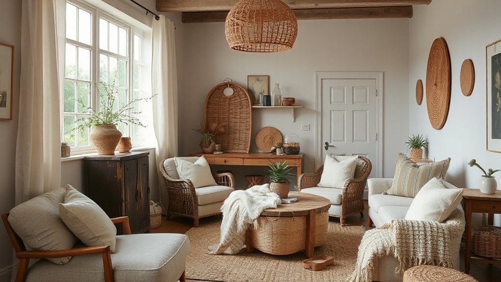
Layer texture, subtle patterns, and quiet color coordination keep your space calm while still feeling layered.
Start by pairing simple textures with understated motifs, so each element supports the other without competing for attention.
Keep the palette cohesive and let restrained contrasts guide visual interest rather than busy repetitions.
Layering With Texture
Layering texture without visual noise is a careful balance of scale, material, and repetition. You’ll create depth without clutter by choosing complementary finishes and respecting negative space. Focus on tactile layering to make rooms feel grounded and inviting.
- Pair natural textiles with simple surfaces to emphasize texture, not pattern.
- Vary textures at a similar scale—linen, wool, and cotton coexist without visual chaos.
- Introduce subtle contrast through material warmth and cool undertones for lasting cohesion.
Subtle Pattern Pairing
Focus on scale, spacing, and repetition to establish coherence; vary only elements that enhance contrast without shouting. Textile layering adds depth—think a solid base, a midweight print, and a lightweight accent, all harmonizing rather than competing.
When floral patterns appear, pair them with subdued, solid backdrops and a simple stripe or checks for grounding. Use repeating silhouettes and muted color families to weave cohesion.
Keep the palette intentionally limited, so patterns feel intentional rather than accidental. This method yields effortless warmth and a polished farmhouse look.
Quiet Color Coordination
- Choose a unifying base hue and echo it in small doses across fabrics, rugs, and décor.
- Pair pattern scales thoughtfully—large motifs paired with tiny or solid details to avoid visual noise.
- Introduce contrast through texture, not color, emphasizing natural materials and soft light.
Result: calm, polished spaces that feel intentional and inviting.
Integrate Vintage Metals and Patina
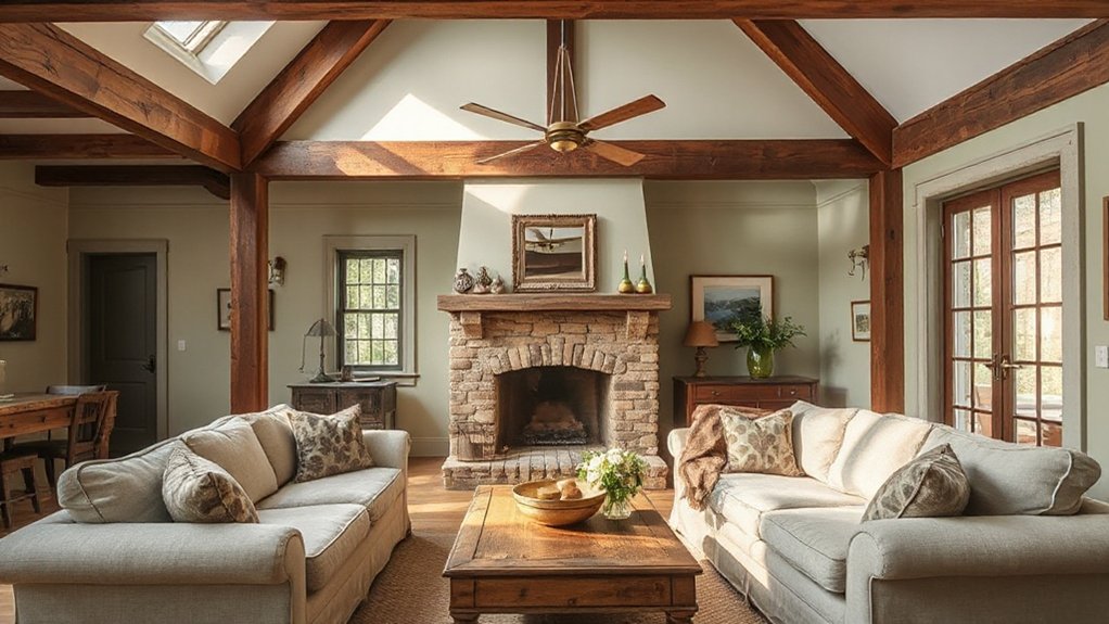
Curating vintage metals and patina can transform a farmhouse from plain to polished, because aged finishes carry character and warmth you can’t fake.
You’ll pair brass, copper, and iron with neutral walls to create depth without overpowering the room. Start with a few anchor pieces—an old-relief mirror, a cast-iron baker’s rack, or a weathered pendant—to set the tonal base.
Then introduce subtle patina finishes on hardware, lamps, and decorative accents to echo a lived-in story. Keep treatments consistent: choose one metal family and carry its warm notes through textures, like wool, linen, and wood.
Avoid overdoing it; restraint preserves authenticity. Allow patinaed details to age with the space, enhancing coziness rather than shouting for attention.
Build a Mood Board That Feels Like Home
Crafting a mood board that truly feels like home starts with a clear vision: pick a unifying vibe, then translate it into color, texture, and finishes you can live with daily. You’ll build consistency by selecting a few core elements and letting them guide every decision. Use real-world samples and photos to anchor your choices, not trends. Focus on warmth, practicality, and a lived-in charm that ages well.
- Farmhouse lighting: choose warm-toned fixtures and mix metal finishes to add character.
- Vintage textiles: layer quilts, linens, and upholstery for softness and history.
- Texture trio: combine wood, flannel, and woven details to create depth without visual clutter.
Keep it accessible, cohesive, and ready for daily life.
Smart Color Tricks for Small Rooms
Even in a small room, color can size up the space—literally. You’ll use color psychology to choose tones that visually expand walls and ceilings, not crush them. Opt for light, warm neutrals on main surfaces to reflect natural light and create an airy feel, then anchor with deeper accents to prevent flatness.
Incorporate color in textiles, cabinets, or a single feature wall rather than overwhelming every surface. Keep ceiling and trim crisp white to pull the eye upward and enhance height.
Consider paint durability when selecting finishes for high-traffic areas; durable sheens resist scuffs while staying easy to clean. Test swatches in daylight and at night, confirming your selections slim the room without sacrificing coziness.
Harmonize hues across furnishings for cohesive, spacious farmhouse charm.
Lighting That Keeps Cozy Mood All Day
Good lighting is essential to keep a cozy farmhouse mood all day, so choose sources that combine warmth, dimmable control, and soft diffusion. You’ll want lights that layer—ambient, task, and accent—to maintain texture and depth without glare. Look for vintage lighting touches that feel timeless, and pair them with practical fixtures in cozy textiles-inspired tones. Dim the mood for evenings and brighten for daytime tasks without shifting the room’s warmth.
- Choose warm, soft white bulbs (around 2700K–3000K) and dimmers for gradual *changeover*.
- Mix vintage lighting with linen shades or woven textures to echo farmhouse comfort.
- Use plug-in sconces or portable lamps to reposition light as activities shift.
This approach keeps spaces inviting, functional, and cohesive throughout the day.
Practical Paint Finishes for Durability
Practical paint finishes matter as much as color when you’re aiming for farmhouse durability. You’ll want options that withstand daily wear without looking dated. A matte finish minimizes glare and hides minor blemishes, making high-traffic walls feel softer and more forgiving. It’s ideal for living rooms, hallways, and bedrooms where you expect frequent touch-ups rather than dramatic scrubbing.
For areas subject to moisture or frequent cleaning, a gloss coating offers enhanced wipeability and easier maintenance, though it can highlight imperfections, so surface prep must be meticulous. When choosing, balance sheen with light and task needs: pair a durable matte base with selective gloss accents on cabinetry, trim, or built-ins.
Clear, practical prep yields lasting, farmhouse-ready results.
Quick Wins to Test Before Painting the Whole Room
Before you commit to a full room, run a few quick tests to validate color and finish choices. You’ll want practical, reliable results before committing significant time or expense. These quick wins surface any surprises and guide our Seasonal color schemes and Modern farmhouse accessories choices.
- Test swatches in multiple lighting moments to see true tones.
- Paint a narrow wall strip and a small sample panel to compare shear, gloss, and texture.
- Layer accessories around the edge of the space to gauge how elements read together.
Use these checks to refine color decisions, then translate findings into cohesive decor, avoiding mismatches.
Quick tests keep you confident, ensuring the final look feels intentional and comforting.
Frequently Asked Questions
How Do I Choose a Farmhouse Color for Renters?
Choose a farmhouse color for renters by selecting versatile Farmhouse color palettes that hide wear and match multiple accents, and apply Renters’ decor tips like renter-friendly paints, removable wallpaper, and neutral tones for easy, durable, stylish results.
What Lighting Makes Colors Look Cozier All Day Long?
Natural light makes colors feel cozy all day, while warm bulbs sustain that warmth after sundown. Imagine a sunlit room like a whispering jacket; you’ll notice Natural light, Warm bulbs keep ambiance steady and inviting, practical, polished, and trustworthy.
Can I Mix Vintage and Modern Textures Without Clashing?
Yes, you can mix Vintage charm with Modern contrast without clashing; blend aged textures with clean lines, balance warm woods against sleek metals, and keep a cohesive palette so each element supports the other.
Which Paint Finishes Resist Scuffs in High-Traffic Areas?
Sure, glossy finishes resist scuffs best in high-traffic areas. You’ll want durable options like satin or semi-gloss, which balance wall texture and paint durability for easy cleaning without sacrificing farmhouse charm.
How Many Color Samples Are Enough to Decide Quickly?
You’ll need about 3–5 color samples to decide quickly. Focus on Color palette coordination and seasonal color trends, comparing them in natural light and with adjacent furnishings to guarantee a cohesive, polished result you’ll love long-term.
Conclusion
You’ve got the blueprint to a cozier farmhouse, now grab the palette and start painting with intention. Think of color as your warm hearth—soft whites whispering relief, earthy accents grounding the scene, and textures like a well-loved quilt. Test, tweak, and trust your eye; small rooms crave smart contrasts, big rooms crave calm. Let lighting be your daily mood ring, shifting from amber dawn to gentle dusk. Finish boldly, live cozily, and let your home tell your story.