
Choose 1–3 color families to define your room mood, then anchor with a reliable core and layer accents for contrast. Test colors fast with 3–5 swatches placed near windows, mid-wall, and dark corners, in morning, noon, and evening light. Observe shifts, undertones, and edge effects, recording notes for objective comparison. Build a cohesive palette by starting with a unifying core, adding complementary tones, and inserting subtle pops via textiles. If you keep going, you’ll Open a confident, lasting finish.
Key Takeaways
- Define your room mood by selecting 1–3 color families and assign dominant, secondary, and accent roles.
- Test colors quickly with 3–5 swatches in varied light at different wall points; note impressions and undertones.
- Observe color shifts over morning, noon, and evening to evaluate warmth, coolness, and edge effects.
- Build a cohesive palette around a unifying core color, using near-neutrals and subtle textiles for balance.
- Finalize by comparing 3–5 swatches under multiple light conditions, ensuring mood, function, and longevity are aligned.
Define Your Room Mood: Pick 1–3 Color Families
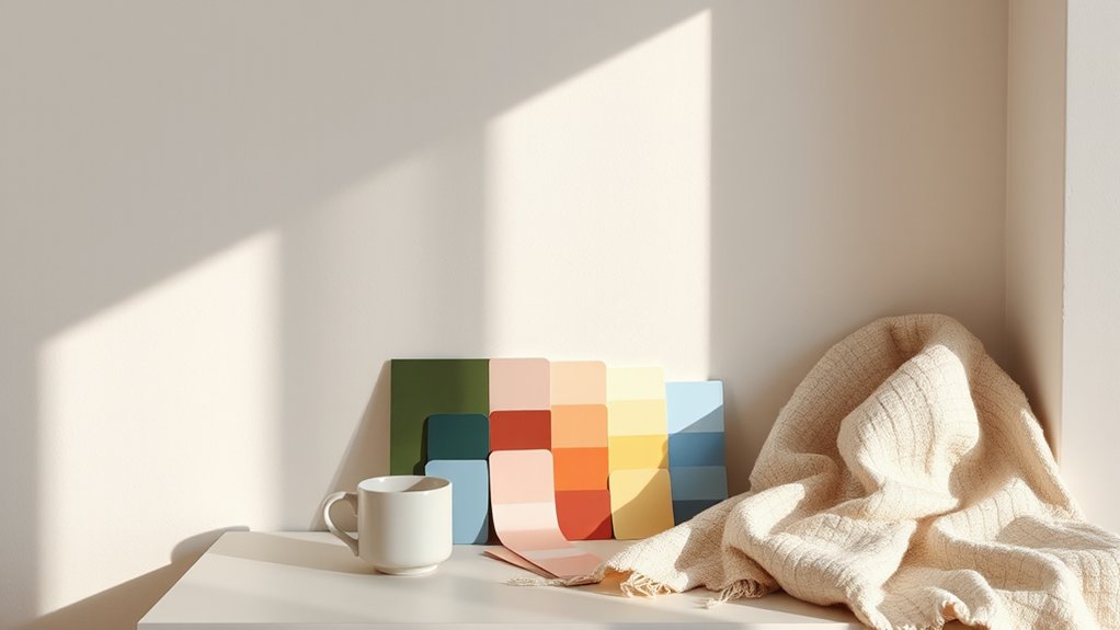
To define your room mood, start by choosing 1–3 color families that support the vibe you want. You’ll anchor the space with reliable foundations, then layer accents for contrast.
Think color psychology: cool hues calm and expand, warm tones invite coziness, and earthy palettes ground the room. If you prefer a modern feel, pick a primary with clean neutrals and one bold accent; for serene retreats, pair soft neutrals with a single subdued hue.
Confirm color coordination by testing chips in both light and shadow across a day; observe how shades shift. Limit the palette to 3 families to avoid clash, and map each family to a dominant, secondary, and accent role.
This disciplined approach yields balanced, intentional, livable rooms.
Test Colors Fast: Quick In-Home Methods
Test colors fast by using quick, in-home swatches you can trust. You’ll act on color testing techniques that produce reliable results without mess or guesswork.
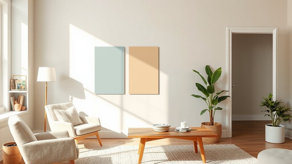
Start with three to five paint sample placements across each room, including near windows, at mid-wall height, and along the darkest corners. Compare adjacent areas under different light conditions—morning, noon, and evening—to reveal true shifts.
Use small, removable chips or peel-and-stick samples on clean walls, then observe over 24 hours. Note undertone responses and edge amplification or dulling effects.
Record impressions with brief, objective notes: hue, saturation, and temperature. Revisit the most promising options in daylight.
Keep the process controlled, repeatable, and documented for confident final selection.
Build a Cohesive Palette for Your Space
A cohesive palette starts with a unifying core color and a deliberate mix of complementary and tonal options that support it. You’ll anchor the room with this core, then layer accents that enhance rather than compete.
Choose a primary hue based on mood and occupancy, then reference the color wheel harmony to select supporting tones. Use near-neutrals as grounding anchors to prevent visual noise, and introduce subtle pops through textiles, art, or small furniture items.
Balance warm and cool undertones so lighting doesn’t skew perception. Consider color psychology to predict how each shade influences mood and function, aligning choices with room use.
Test three to five swatches together, observing under different daylight. Finalize a restrained, adaptable palette that harmonizes, endures, and feels intentional.
Frequently Asked Questions
How Do Lighting and Natural Light Affect Color Perception?
Lighting and natural light shift color perception: you’ll see warmer tones under daylight’s yellow tint and cooler ones in shade. Consider color temperature and light reflection when selecting hues to guarantee accurate, consistent results throughout the day.
Can I Test Colors on Multiple Walls Without Overload?
Yes, you can test colors on multiple walls by using testing color swatches strategically, rotating placement to compare light effects. Make sure wall color coordination stays cohesive, label each swatch, and avoid overwhelming the room with too many options.
What Sheen Level Works Best for Busy Family Rooms?
You should choose a semi-gloss or satin sheen for busy family rooms. Color psychology points to calm neutrals, while paint durability supports wipeable surfaces. A anecdote: spill-proof, easy-clean finishes keep fatigue from turning into chaos.
How Do I Choose Colors for Small vs. Large Rooms?
Choose colors by room size: use lighter shades for small spaces and deeper tones for large ones, balancing with accent pops. Color psychology guides mood, while design principles keep contrast and harmony in check—trust practical, authoritative guidance.
Should I Consider Room Function When Picking Mood Colors?
Like a compass guiding you, yes: you should consider room function when picking mood colors. You’ll align room purpose with color psychology, selecting hues that support activities and mood, ensuring practical, precise, authoritative results.
Conclusion
You’ve learned to define your room mood, test colors fast, and build a cohesive palette—so you’re ready to pick confidently. An interesting stat helps visualize impact: rooms with a cohesive color scheme feel up to 60% more balanced and welcoming. Start with 1–3 color families, test quickly in your light, and compare swatches side by side. If it feels right at a glance, you’ve found your perfect start. Refine with small accents, and enjoy the finished result.